Stitch Onboarding
A Comprehensive Approach to Seamless Onboarding: Reducing Entry Barriers and Guiding Users through the Application Setup Process.
Overview
The current onboarding process for users presents challenges characterized by high entry barriers and insufficient support during the application setup. Users encounter difficulties in seamlessly integrating into the system, leading to suboptimal engagement and potential frustration. Insufficient guidance and support further compound the issue, hindering users from fully exploiting the application's capabilities. Recognizing these challenges is crucial for devising effective solutions to streamline the onboarding experience, reduce entry barriers, and provide enhanced support throughout the application setup process, ultimately improving user satisfaction and retention.
The Vision
By focusing on lowering entry barriers, we will enhance the initial user experience, making it more accessible and user-friendly. Additionally, we propose to revamp and strengthen the support system throughout the application setup process, offering users clear guidance and assistance. Through these initiatives, our goal is to create a seamless onboarding experience that empowers users to effortlessly navigate the application, fostering a positive and productive user journey from the very beginning.
Problem Statement
The current user onboarding process poses significant challenges, marked by high entry barriers and inadequate support during application setup. Users struggle to integrate seamlessly, leading to suboptimal engagement and potential frustration. The absence of comprehensive guidance exacerbates the issue, hindering users from fully utilizing the application's capabilities. Addressing these challenges is crucial to streamline onboarding, reduce barriers, and enhance support, ultimately improving user satisfaction and retention.
My Responsibilities
In this project, I initiated the process by meticulously mapping out the entire user flow—from the initial signup stage to the point where data is successfully loaded into a warehouse. Additionally, I collaborated closely with the marketing team to comprehensively understand all touchpoints and communication elements throughout this journey. To ensure a thorough understanding, I utilized a combination of qualitative information and quantitative data, analyzing user interactions and flows. Furthermore, I conducted a competitive analysis, delving into the onboarding processes of other SaaS platforms within our industry to gain valuable insights and identify best practices.
- Surveys
- Competitive analysis
- Qualitative metrics
- User flows
- Ideate and prototype
- Systems thinking
- User testing/feedback
- A/B testing
- 3D Animation
- Defined timelines and goals
- Set and lead team meetings
- Create tasks in Jira
User Flow and Touch Points
Initiating the enhancement of our onboarding process necessitated a comprehensive mapping of the current flow. This strategic endeavor aimed to delve into the intricacies of each step our users must undertake to realize the full value of our product. The focal point of this analysis was the creation of a meticulous user flow, meticulously capturing every touchpoint in our customer's onboarding journey. Commencing from the initial signup phase and extending through each subsequent interaction, the objective was to intricately outline the entire trajectory until their data seamlessly integrates into a warehouse environment.
This systematic approach serves as a foundational step towards fostering a more refined and user-centric onboarding experience. By gaining insights into the user's journey, we are poised to optimize each touchpoint, ensuring clarity, efficiency, and overall satisfaction throughout the onboarding process. This structured user flow not only facilitates a smoother user experience but also unveils opportunities for continuous improvement, contributing to the overall success and engagement of our customer base.

Current Journey
Signup
The current onboarding process raises concerns regarding the appropriateness and efficiency of information solicitation at various stages of the user journey. Notably, the inclusion of an excessive number of required fields during account creation introduces unnecessary friction, potentially deterring users from progressing smoothly through the onboarding process. In the context of a product-led growth tool, the mandatory provision of a phone number for account creation requires reevaluation, as it may present an undue barrier and run counter to user expectations.
Moreover, the implementation of password masking, which conceals user input during form completion, is recognized as a potential impediment to a seamless onboarding experience. Research indicates that omitting a password confirmation field in favor of a single-entry approach can contribute to a higher conversion rate. As we aspire to cultivate a user-centric environment and streamline the onboarding journey, a strategic reassessment of data collection points, requisite fields, and password input practices is recommended to optimize user engagement and facilitate a more efficient and user-friendly onboarding process.
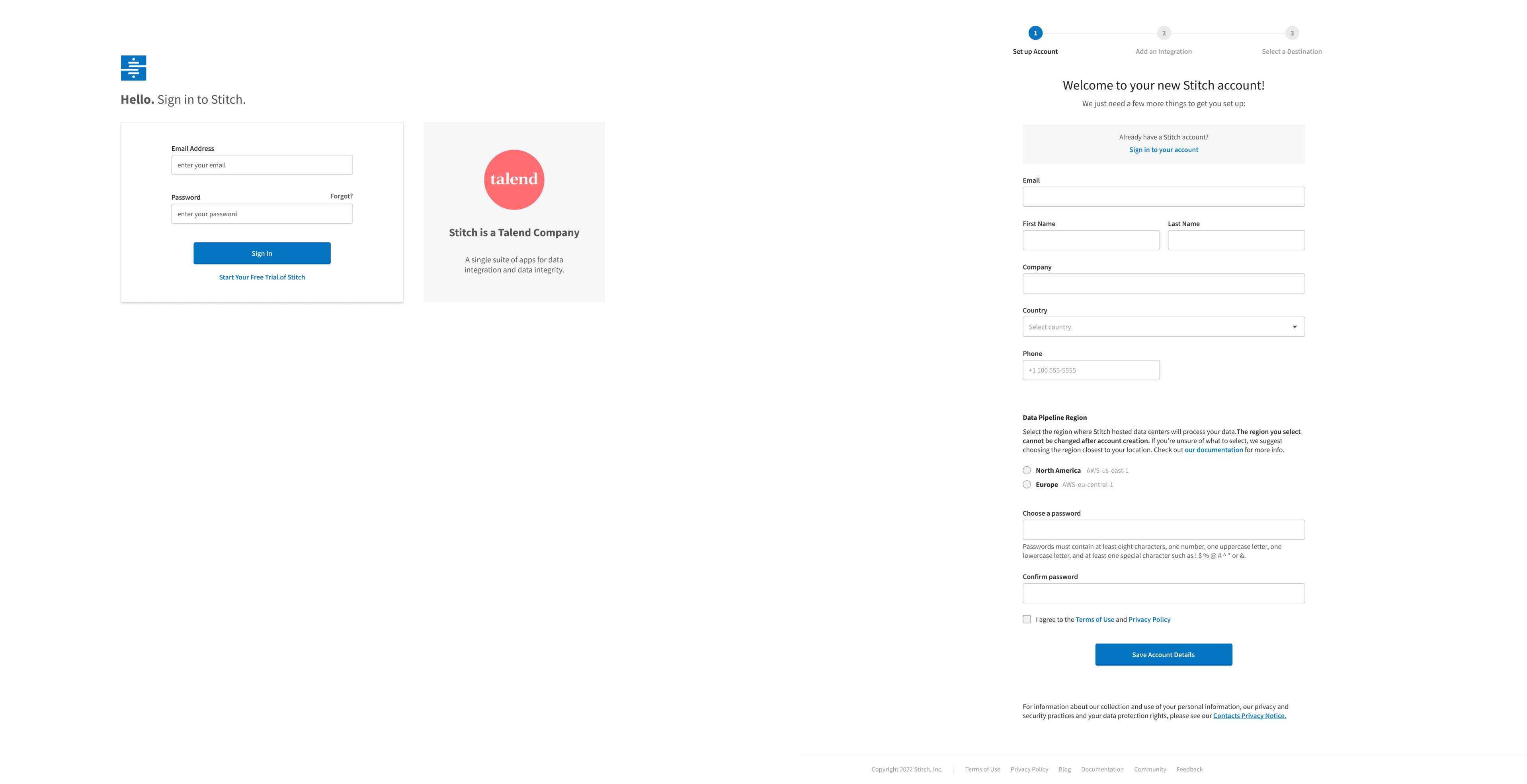
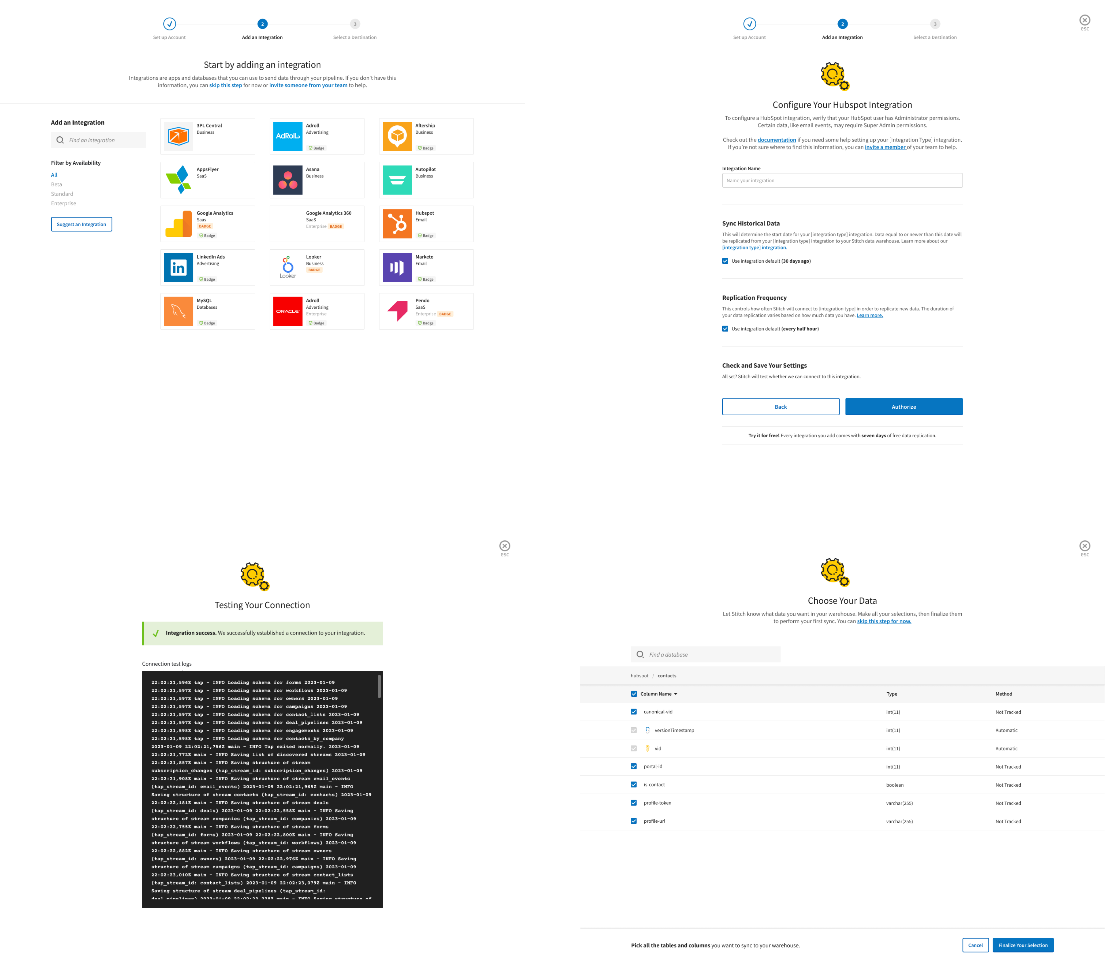
Connecting Integration
The current modal-led journey, focusing on users finding their integration and choosing data replication preferences, lacks comprehensive explanations regarding data synchronization specifics and the cost implications of replication frequency based on the chosen plan. Furthermore, variations in tables and columns across integration versions may introduce confusion about what data to replicate to the data warehouse. A more professional and user-centric approach involves refining the modal-led journey to provide detailed guidance on data synchronization, cost considerations, and handling version-specific variations in a transparent manner to ensure a smoother and clearer user experience.
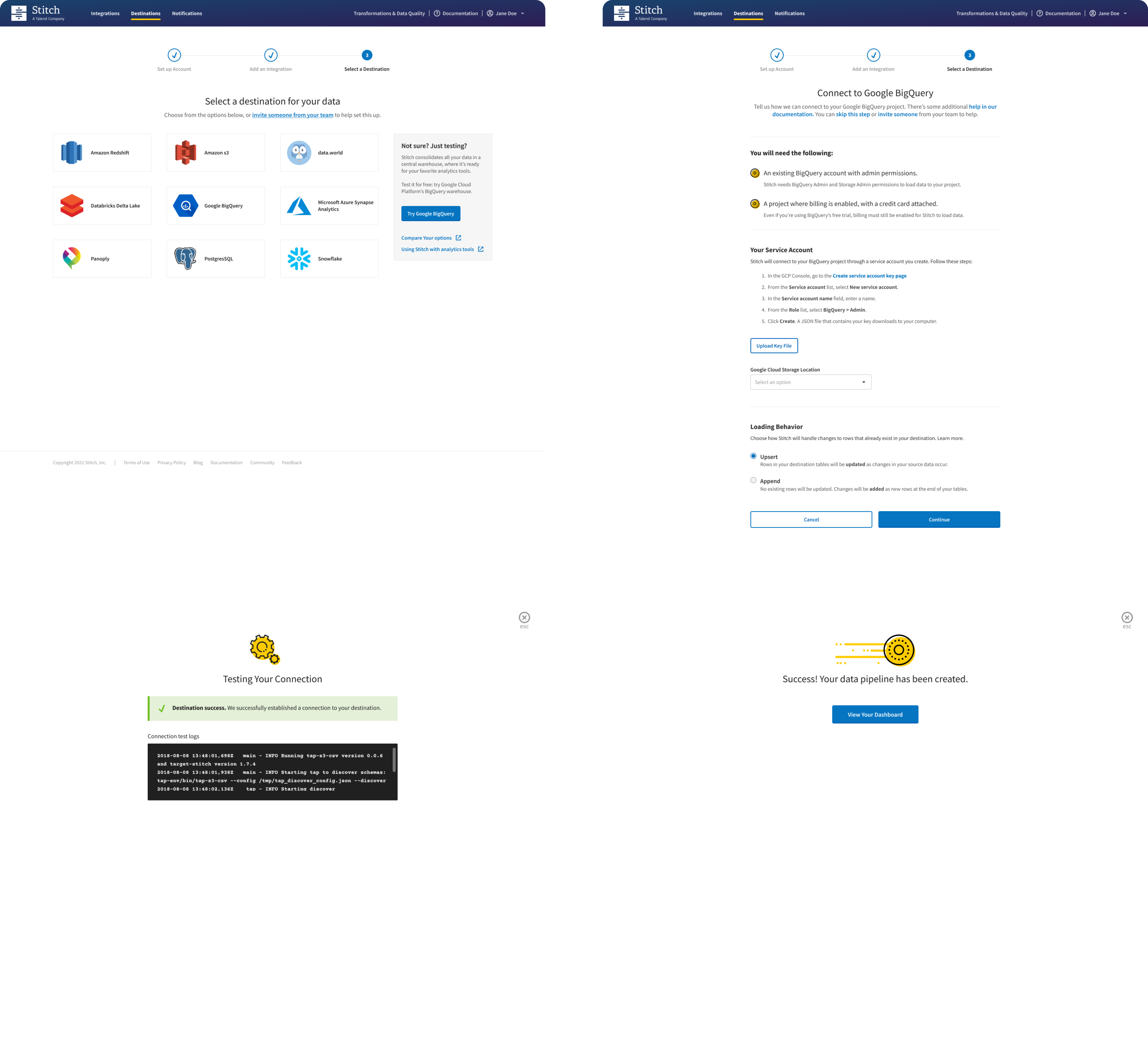
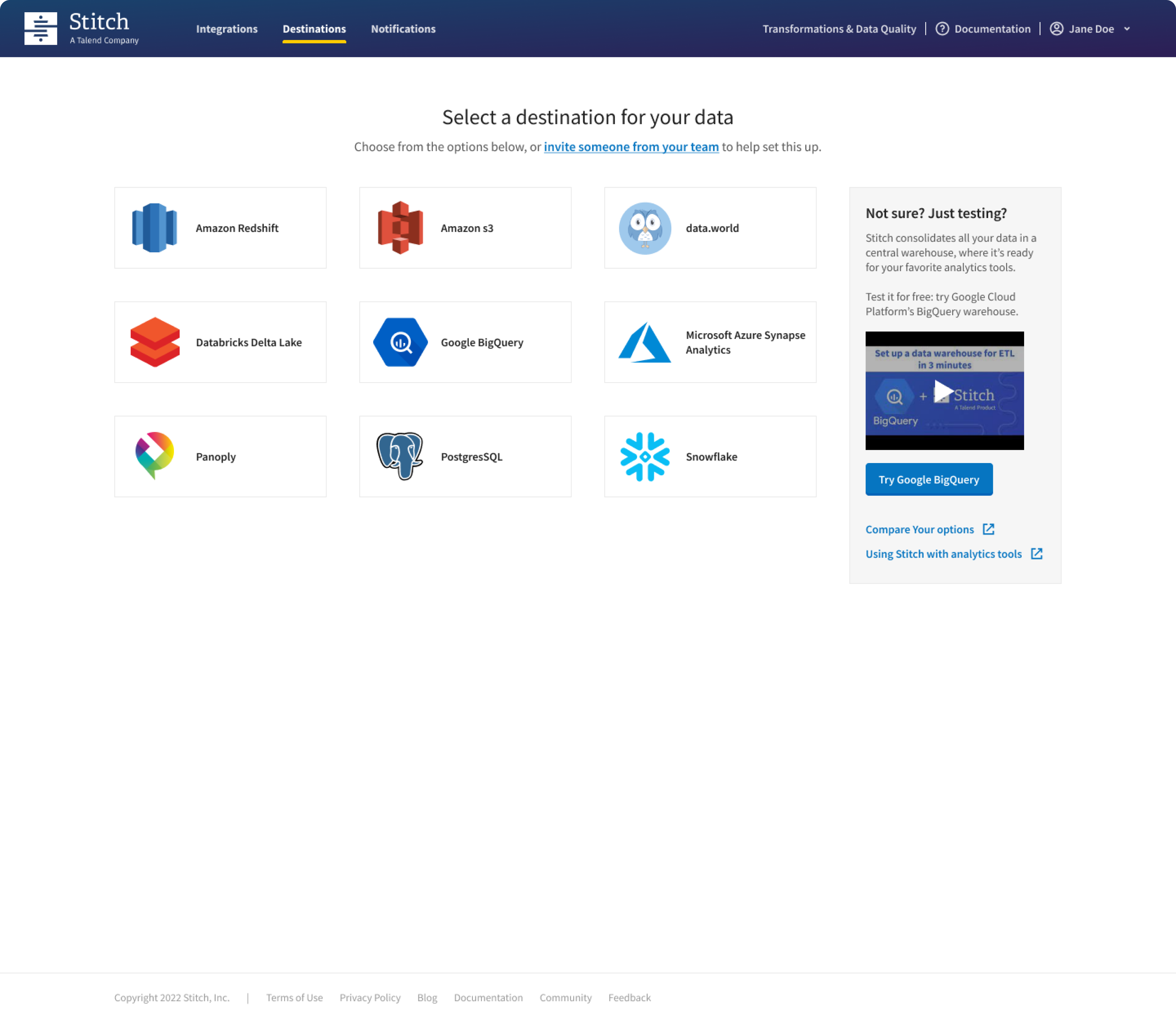
Selecting Destination
The process of setting up destinations within Stitch has been identified as a significant challenge, posing hurdles for users. A considerable number of users either lack awareness regarding the necessity of defining a destination for their data migration or encounter difficulties accessing the required information crucial for completing their data warehouse connection. This issue highlights the need for a more streamlined and user-friendly destination setup process, incorporating clear guidance, intuitive interfaces, and informative resources to empower users in efficiently configuring their data destinations. Addressing these pain points will not only enhance user understanding but also contribute to a smoother and more effective onboarding experience.
Take Away
The current user experience presents a somewhat impersonal and uninspiring atmosphere, lacking the warmth and personality needed to create a memorable journey for users. To elevate the user experience, it is crucial to infuse elements of personalization and engagement that resonate with users on a more emotional level. This could involve incorporating personalized messaging, visually appealing design elements, and interactive features that contribute to a more inviting and memorable journey, fostering a positive and lasting impression. Striving for a professional, yet personable, user experience will enhance overall user satisfaction and engagement.
Research Phase
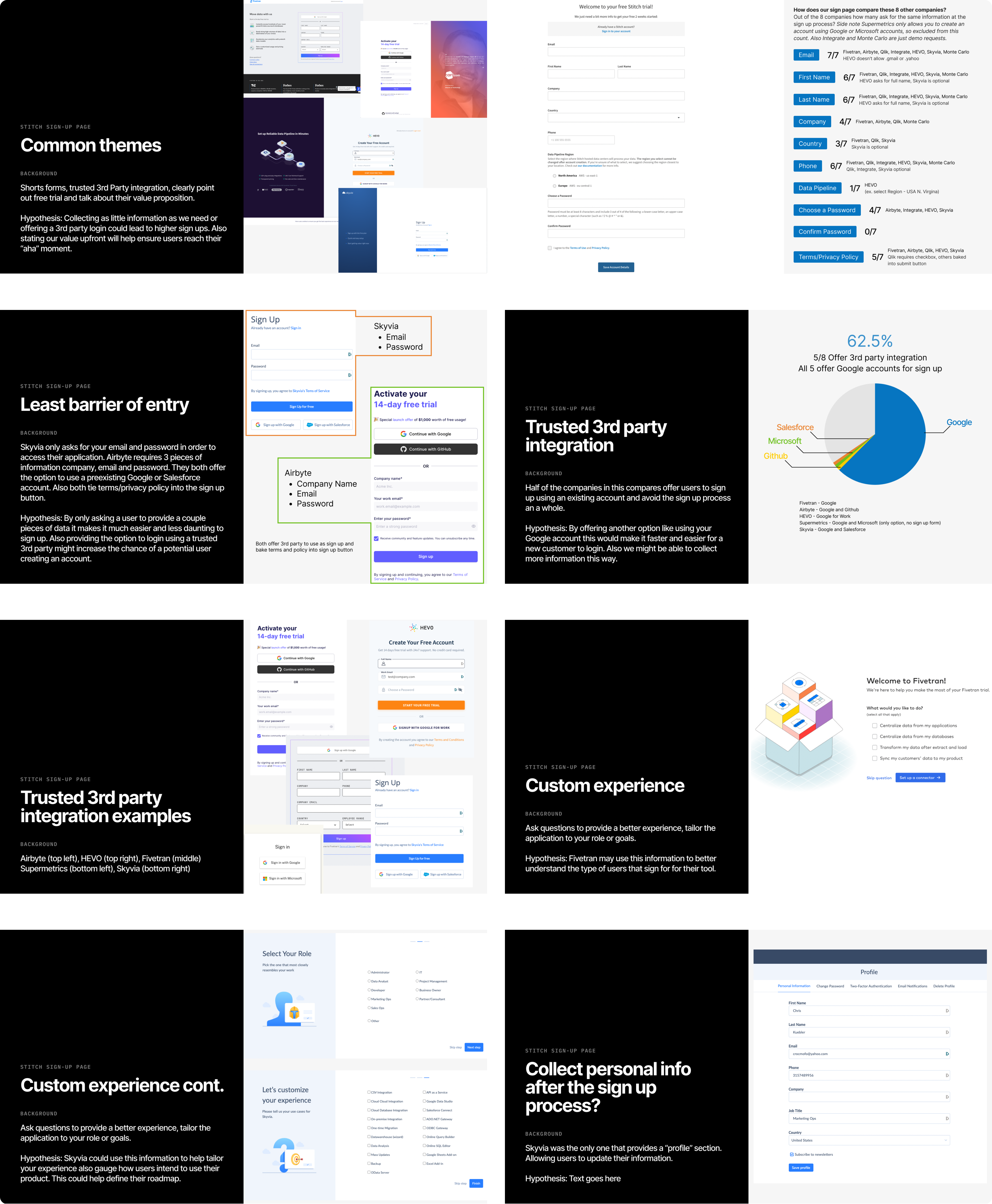
Signup Competetive Ananlysis
Conducting a comprehensive competitive analysis of the signup page has revealed significant opportunities for improvement. Notably, there is identifiable wasted whitespace that could be strategically utilized to effectively communicate the unique value proposition to users. This presents a chance to transform the onboarding experience into one that is not only informative but also engaging and supportive.
Addressing the issue of too many required fields on the signup page is crucial. By reassessing the necessity of each field and strategically redistributing the data collection process throughout the user journey, we can streamline the initial signup and reduce friction for users. Additionally, exploring the integration of third-party account options presents an opportunity to enhance user convenience and expedite the onboarding process.
This multifaceted approach to optimizing the signup page aligns with the goal of creating an efficient, user-centric experience that maximizes the communication of value, minimizes barriers to entry, and leverages external account integrations for enhanced user convenience.
Pipeline Setup
Through a comprehensive analysis leveraging both quantitative and qualitative data, we have identified a notable source of user frustration during the setup of their data pipeline. This frustration has been observed to contribute to increased drop-off rates and a surge in support tickets. Our research has also revealed a common trend where a significant portion of users expresses surprise or confusion regarding the necessity of setting up a destination for their data.
Many users frequently turn to our documentation site for assistance in navigating the setup process. This pattern indicates a reliance on our documentation resources to address queries and challenges encountered during the onboarding journey. As part of our commitment to user support and guidance, we recognize the significance of providing comprehensive and accessible documentation that empowers users to independently overcome hurdles and successfully complete their setup.
Currently only 33% of our users have success in setting up a destination. Versus 62% of users successfully setup an integration.
Proposed Solutions
To help get a better udnertiand on how to solve these problems I refernce the C.A.R.E. framework. It is a strategic approach that stands for "Connect, Align, Respond, and Empower," and it serves as a comprehensive guideline for addressing user needs throughout their onboarding journey.
By systematically applying the C.A.R.E. framework, I ensured a holistic and user-centric approach to onboarding. This methodology allowed for not only addressing immediate concerns but also proactively empowering users to navigate the onboarding journey independently, leading to increased satisfaction and efficiency in the overall user experience.
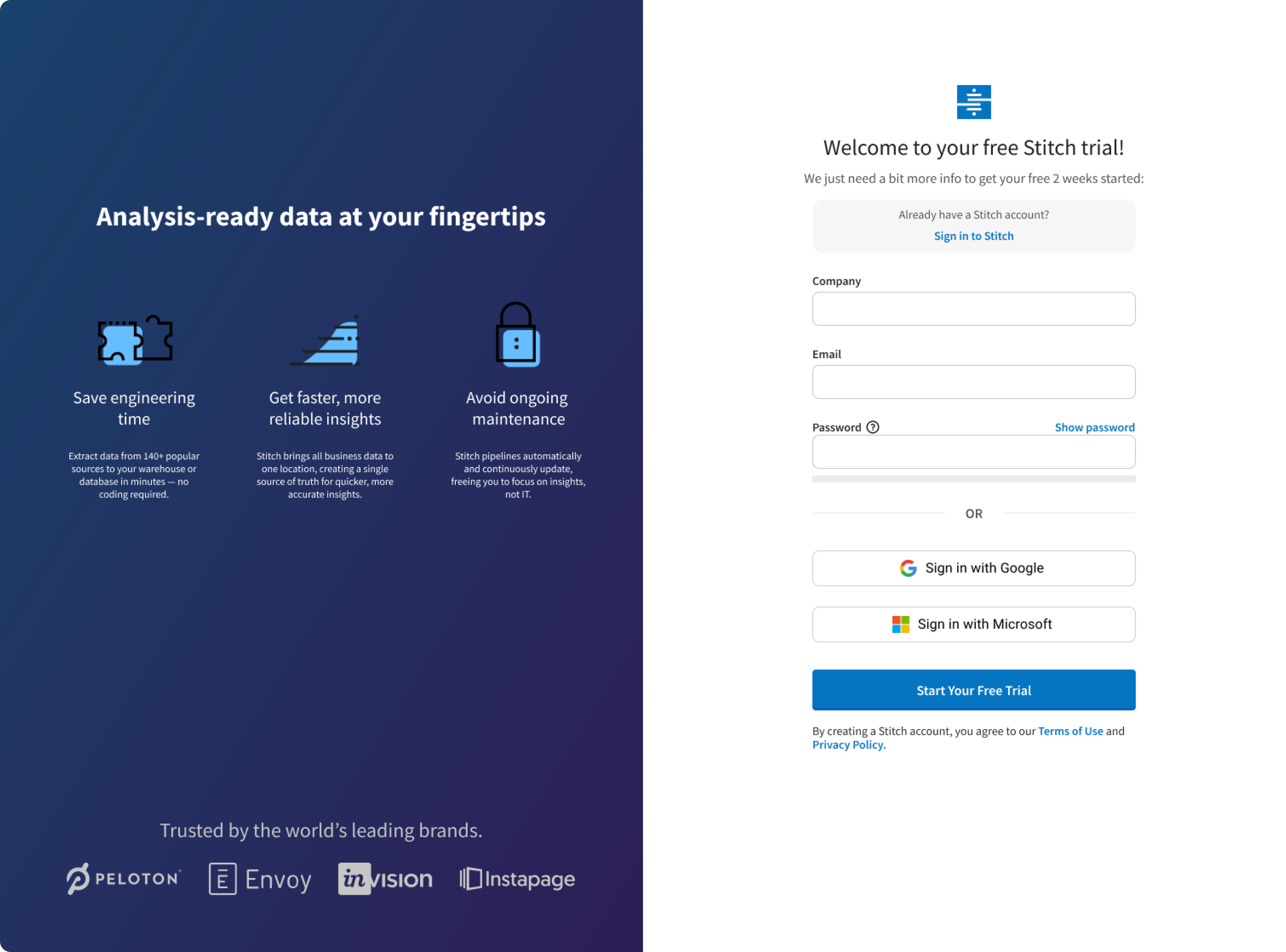
Signup Page Update
Implemented a transformative enhancement to the user interface by introducing a right panel that strategically showcases our value propositions. Simultaneously, the left panel form underwent refinement, optimizing it to capture only essential information required for seamless access to the application, thereby expediting the realization of user value. Additionally, a password confirmation toggle feature was introduced, enhancing the accuracy of user input.
Furthermore, recognizing the importance of user convenience, a streamlined authentication process was established. Users now have the option to leverage their existing Google or Microsoft accounts for a secure and efficient login experience. This multi-faceted refinement not only aligns with best practices in user interface design but also significantly contributes to an elevated and user-friendly onboarding process, ensuring that users can swiftly access the benefits of our platform.
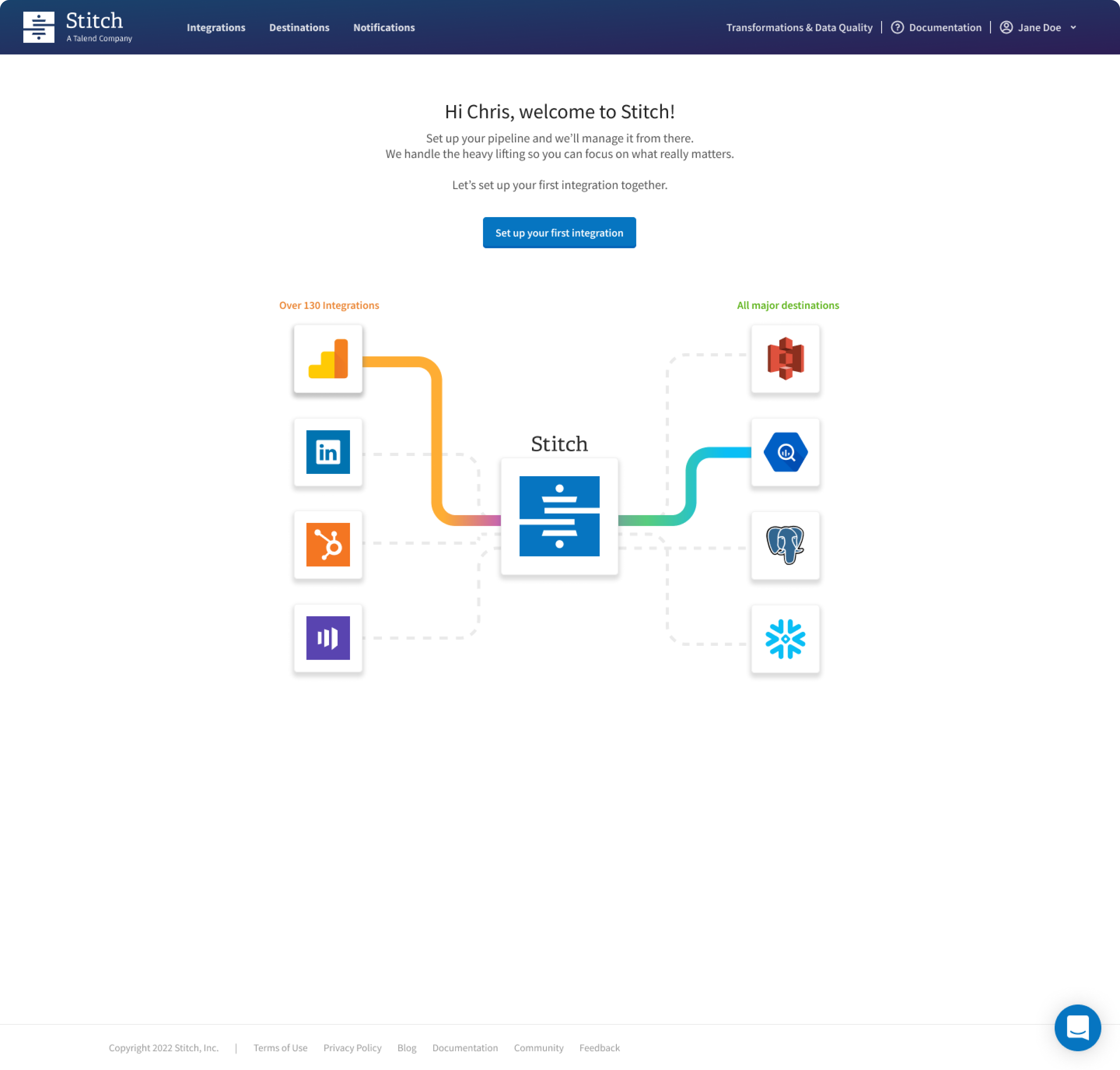
Introduction of Welcome Screen
Revamped the onboarding process by replacing the traditional modal-led journey with a personalized and inviting experience. Implemented a warm greeting accompanied by visual cues that guide users directly to accessing their value promptly upon entering the application. This strategic adjustment not only expedites the user's entry into the app but also acclimates them to the distinct look and feel of Stitch from the outset.
By immersing users in the application's environment right away, we capitalize on the opportunity to familiarize them with the platform, fostering a sense of comfort and familiarity. This approach enhances user engagement and sets the stage for delightful surprises and meaningful interactions throughout their journey with Stitch. The emphasis on a warm, visual, and user-centric welcome contributes to an overall positive onboarding experience, reinforcing our commitment to providing exceptional value from the very beginning.
Welcome Screen Animation
Integration Screen Refresh
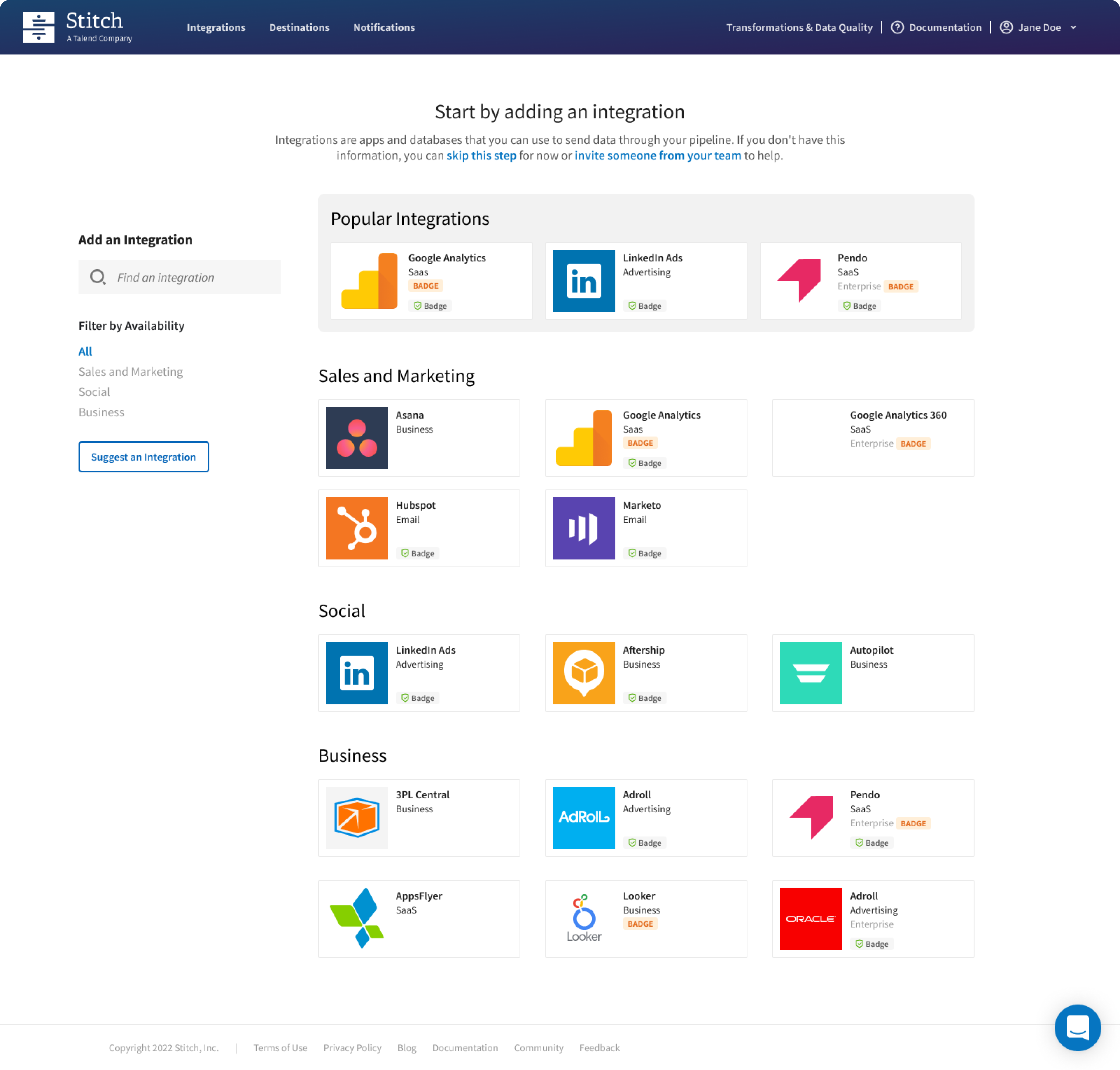
Recognizing the prevalent usage patterns among users and their preference for similar integrations, we strategically organized and presented integrations in a manner that aligns with these common behaviors. By curating and showcasing popular integrations prominently, we aimed to enhance the user experience and streamline the onboarding process.
This thoughtful arrangement not only acknowledges the users' tendencies but also facilitates a more intuitive and user-friendly navigation experience. By prominently featuring popular integrations, we aim to expedite the decision-making process for users, allowing them to quickly identify and select the integrations most relevant to their needs.
In doing so, we address user expectations, making the onboarding journey more efficient, visually appealing, and aligned with their preferences. This strategic presentation of integrations is part of our commitment to providing a user-centric and tailored experience, ultimately contributing to a more professional and seamless onboarding process for our users.
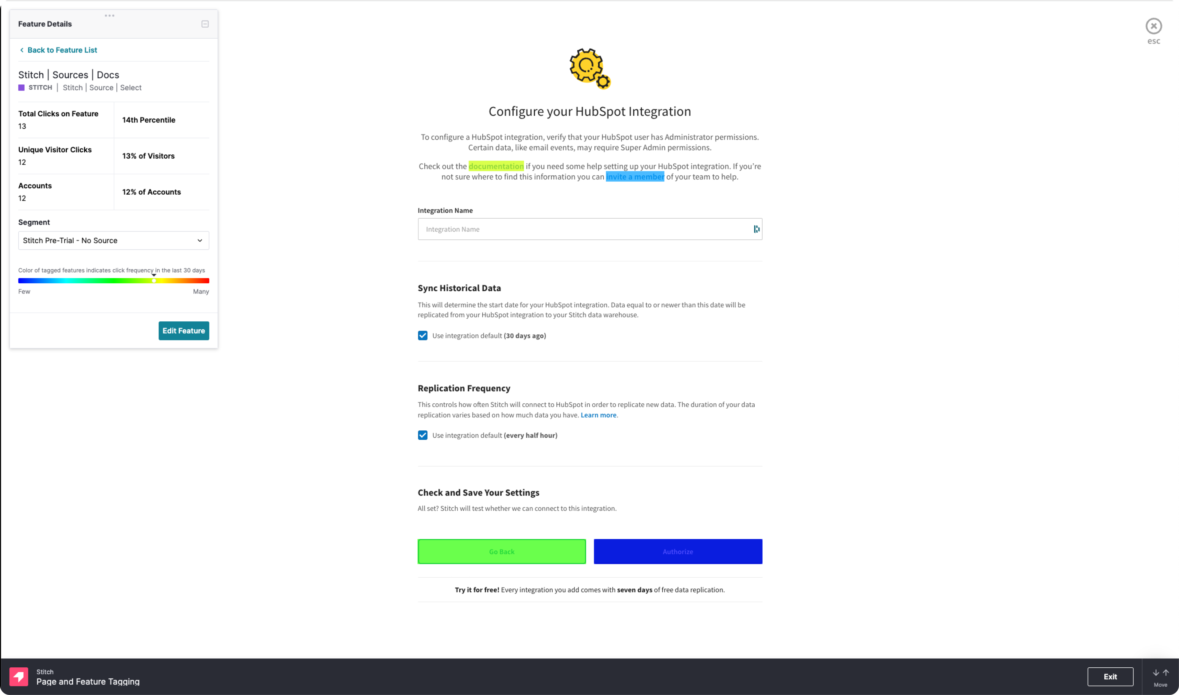
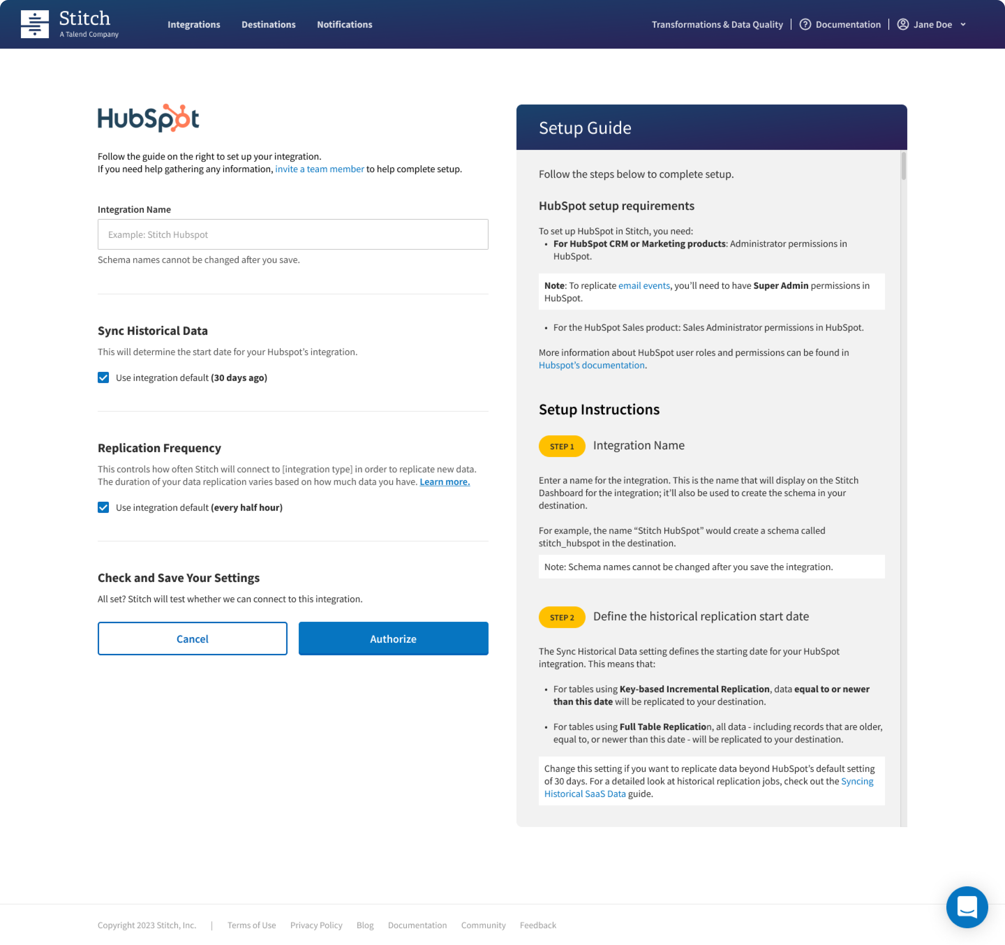
Introduction of Setup Guide
To enhance the onboarding experience, our focus is on minimizing friction and offering targeted assistance precisely when and where users need it. This involves creating an immersive and supportive journey that communicates to users that they are not alone in the onboarding process. The overarching objective is to significantly reduce the time clients spend interacting with customer support, ultimately leading to a substantial increase in the success rate of completing the pipeline..
By strategically implementing assistance mechanisms throughout the onboarding journey, we aim to proactively address potential pain points and guide users seamlessly through the process. This approach not only contributes to a smoother onboarding experience but also reinforces the perception of our platform as user-friendly and supportive.
The end goal is a streamlined onboarding process that minimizes user frustration, boosts user confidence, and, in turn, increases the overall success rate of completing the data pipeline.
Destination Page Upgrade
In an effort to elevate the onboarding experience, I worked closely with the marketing team and introduced setup videos for the most popular destinations, providing users with a comprehensive visual guide to streamline the setup process. This initiative was driven by a commitment to enhancing user comprehension and reducing friction during the onboarding journey.
Recognizing the diverse user base with varying levels of familiarity with destination setup, we also experimented with the concept of auto-provisioning a destination for users who might not have a predefined destination. This strategic approach aimed to cater to users who may be less experienced or unsure about setting up a destination, offering an automated solution to simplify their onboarding process.
The introduction of setup videos and the exploration of auto-provisioning align with our objective to provide accessible and user-friendly onboarding solutions. By combining visual guides with automated processes, we seek to accommodate different user preferences and levels of expertise, ensuring a professional and supportive onboarding experience for all users.
Outcomes and Learnings
In our continuous efforts to optimize the signup page, we initiated an A/B testing strategy. The first test involved the removal of the password confirm field, introducing an unmask feature that allows users to reveal their password as they type. Additionally, a password strength indicator was implemented, accompanied by clear criteria to meet the password threshold.
This approach aimed to enhance the user experience during the signup process by simplifying the input requirements and providing real-time feedback on the strength of their chosen password. The introduction of the unmask feature sought to empower users with greater control and visibility over their password entry.
Through this A/B testing iteration, we aimed to gauge the impact of these adjustments on user engagement, completion rates, and overall satisfaction. By implementing these changes, we aimed to create a more intuitive and user-friendly signup experience, ensuring that users could effortlessly meet the password criteria while maintaining security standards.
Findings
Collaborating closely with both marketing and legal teams, I gained a comprehensive understanding of the intricacies involved in ensuring compliance with the General Data Protection Regulation (GDPR). This collaborative effort focused on the meticulous design of form fields and the implementation of functionalities that align with the stringent requirements of GDPR, guaranteeing the careful collection, processing, and storage of user data in accordance with robust data protection principles.
Regarding the setup guide, collaboration with the engineering team revealed a challenge related to the step where users select tables for replication. It was identified that this specific step was built using legacy Angular code, and there was a lack of expertise within the team to make necessary modifications. This limitation emerged as a blocker for the introduction of the setup guide at this particular step.