Layouts & Graphics
Telling Stories and Visual Context.
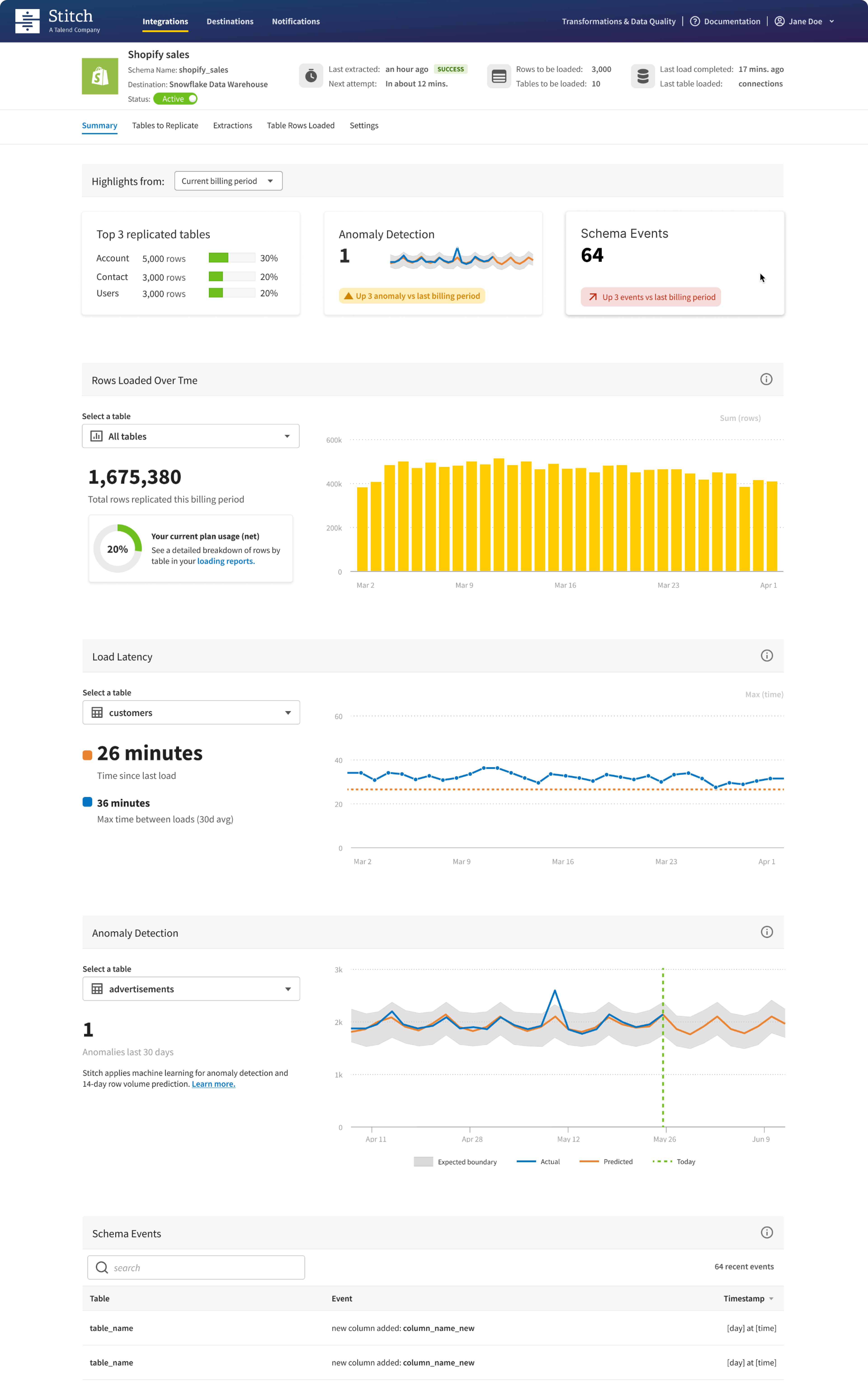
Integration Dashboard (Stitch Data)
A redesigned view focused on providing high-level metrics for tracking integration progress and allowing users to take necessary actions.
By focusing on these key features, the redesigned view aims to offer a comprehensive and user-friendly experience, empowering users to monitor and optimize their integrations effectively.
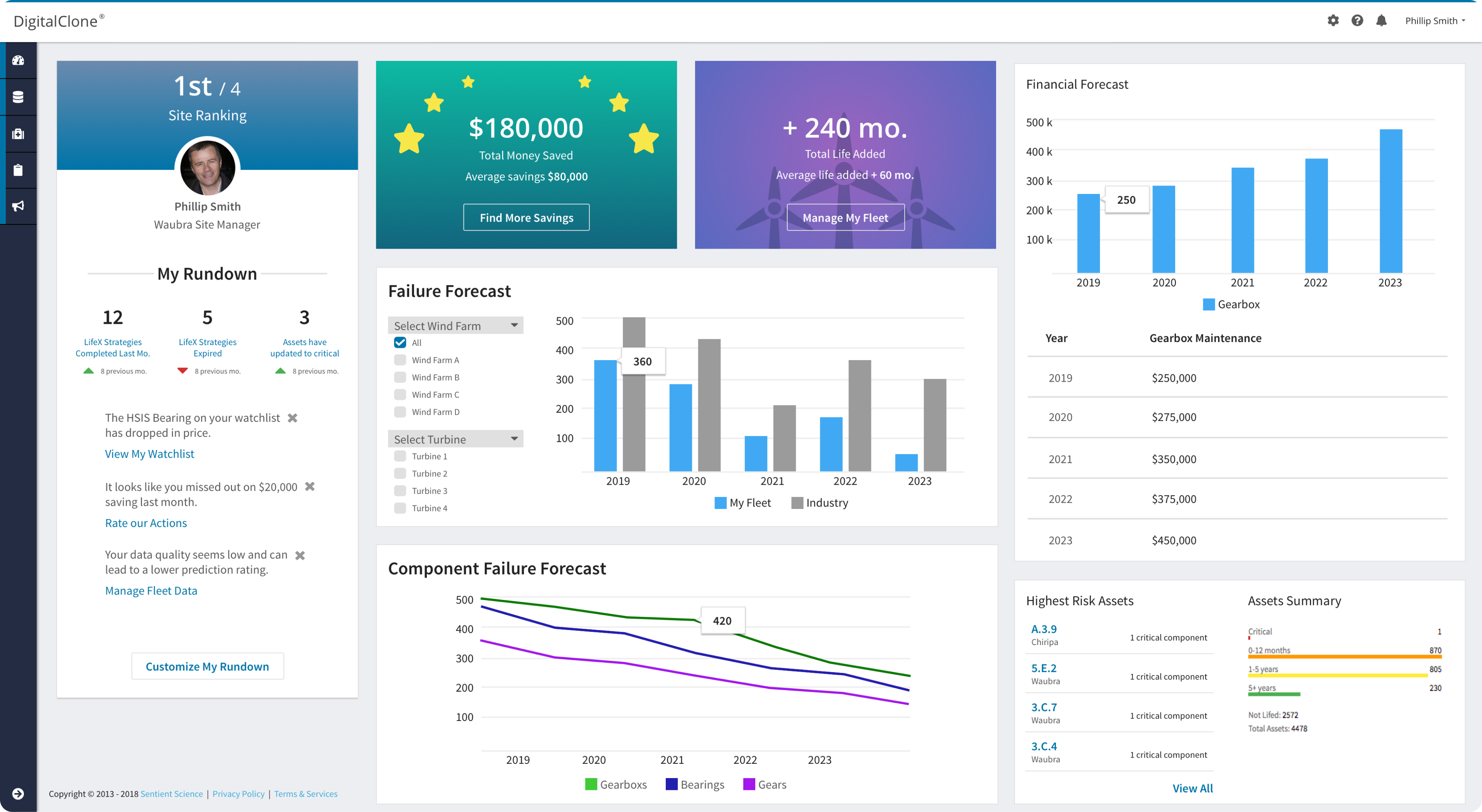
Main Dashboard (DigitalClone)
A high-level view of how customer assets are performing, encompassing metrics such as life added, money saved, financial forecasts, and failure forecasts.
Introduced a "gamification" concept allowing customers to compare their site performance against others within the company. Use visualizations to highlight strengths and areas for improvement.
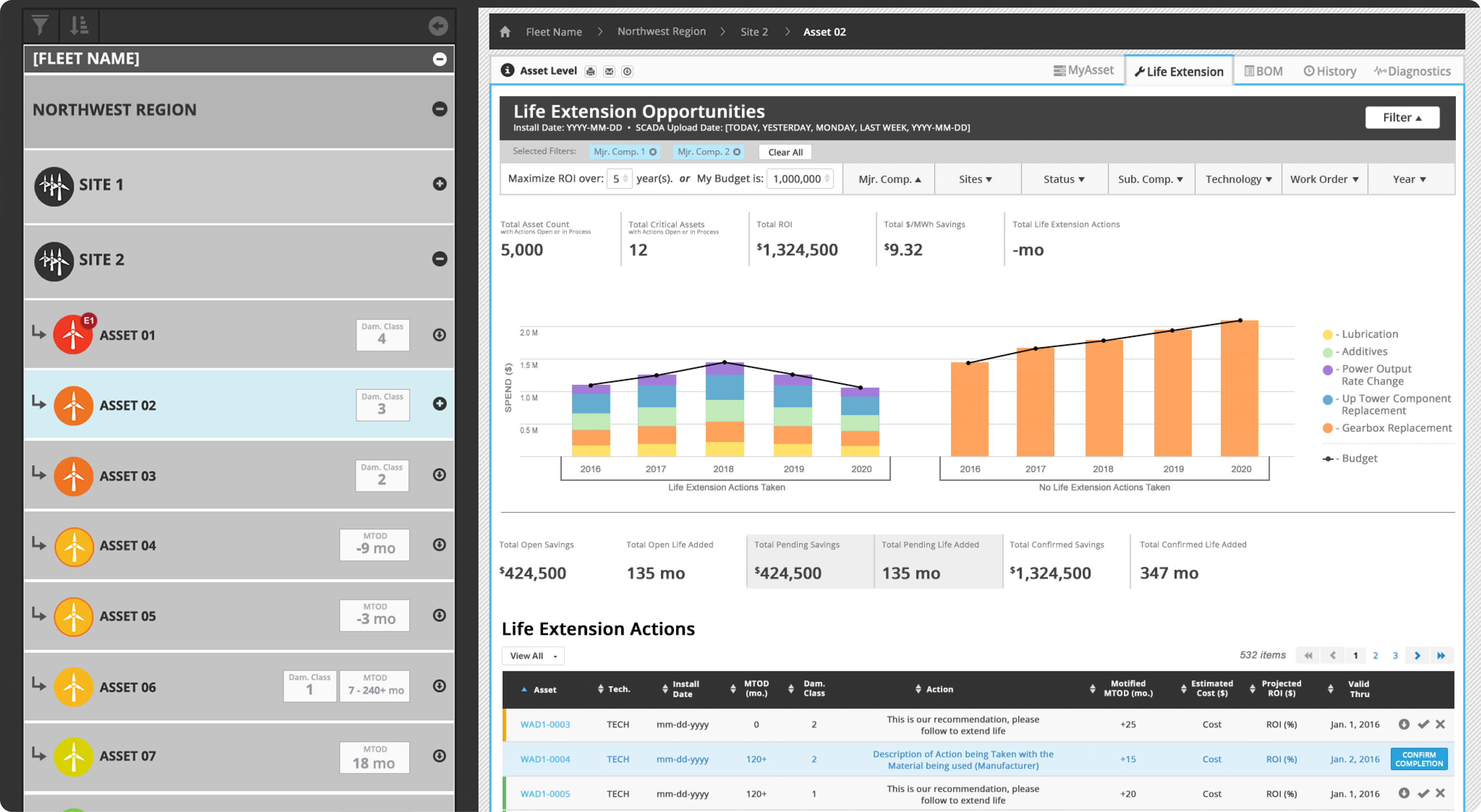
Life Extension (DigitalClone)
The Asset Life Extension Options Overview empowers finance and engineering professionals to make strategic decisions that maximize asset longevity within budgetary constraints. By combining financial considerations with engineering insights, this tool becomes an indispensable resource for optimizing asset performance and extending their operational life.
Event History (DigitalClone)
The Time Series Chart for Maintenance Teams empowers maintenance professionals with a nuanced and comprehensive tool for analyzing, interpreting, and optimizing maintenance actions over time. By providing a detailed view of historical data and actionable insights, this tool becomes an invaluable asset in enhancing the efficiency and effectiveness of maintenance operations.
Data Cards (DigitalClone)
These card concepts aimed to empower customers by showcasing their completion levels on crucial data points, facilitating a deeper understanding of component life predictions.
Content Factory (DigitalClone)
Our newly developed input collection module needed a touch of vitality and guidance. I aimed to infuse personality into the process by incorporating graphics that elucidate each step, maintaining coordination with the inputs and functionality of the module.
Educational Icons (PLS 3rd Learning)
Icons play a crucial role in enhancing the messaging for online education portals. They serve as visual cues that quickly convey information, making the interface more intuitive and engaging. From representing different subjects and courses to indicating progress and achievements, these icons contribute to a seamless and user-friendly experience.
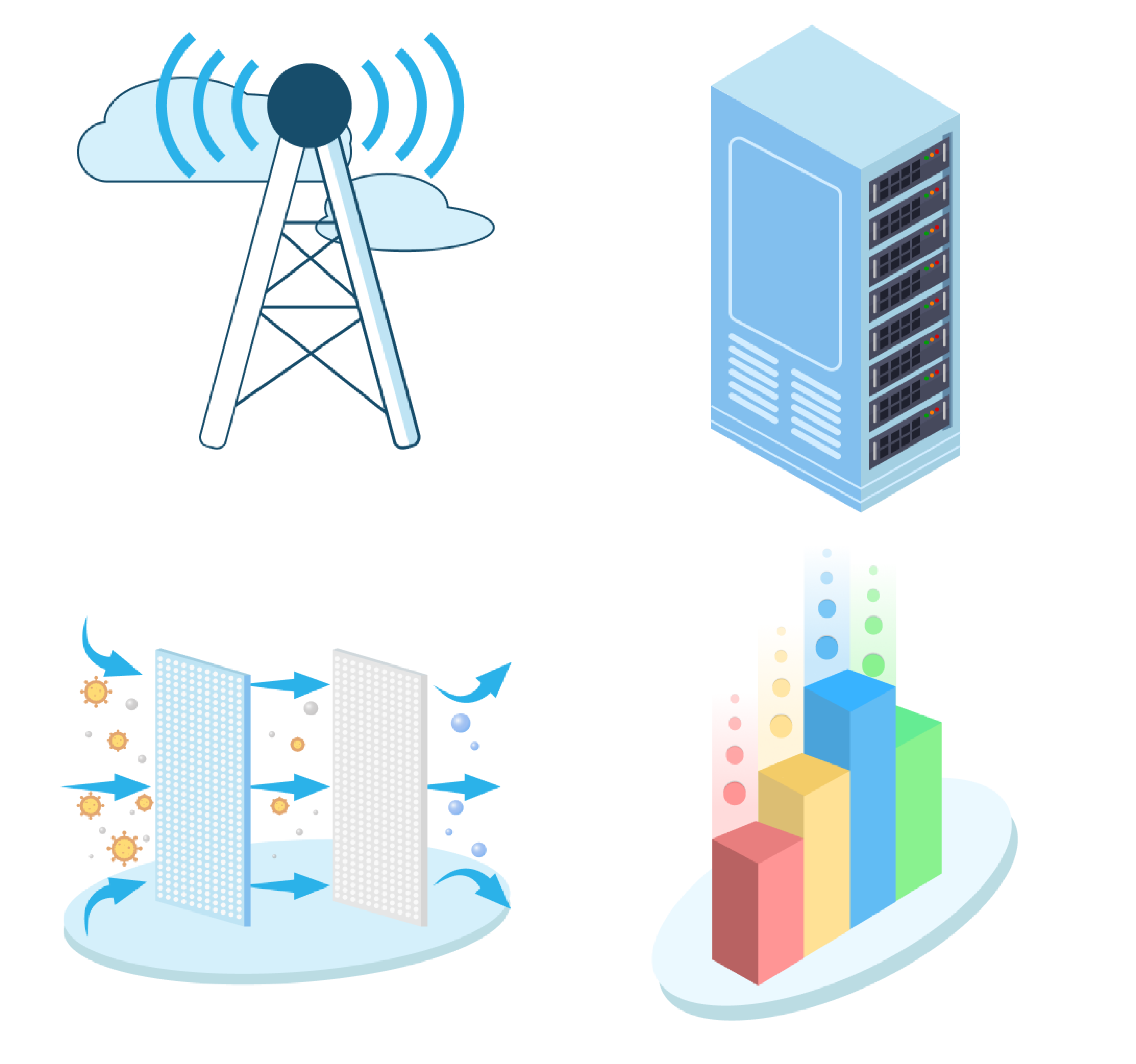
IoT devices and sensors (Intellastar)
These graphic provides a visual roadmap for users, guiding them through the various stages of their IoT journey. Each stage is accompanied by a brief caption to enhance understanding.
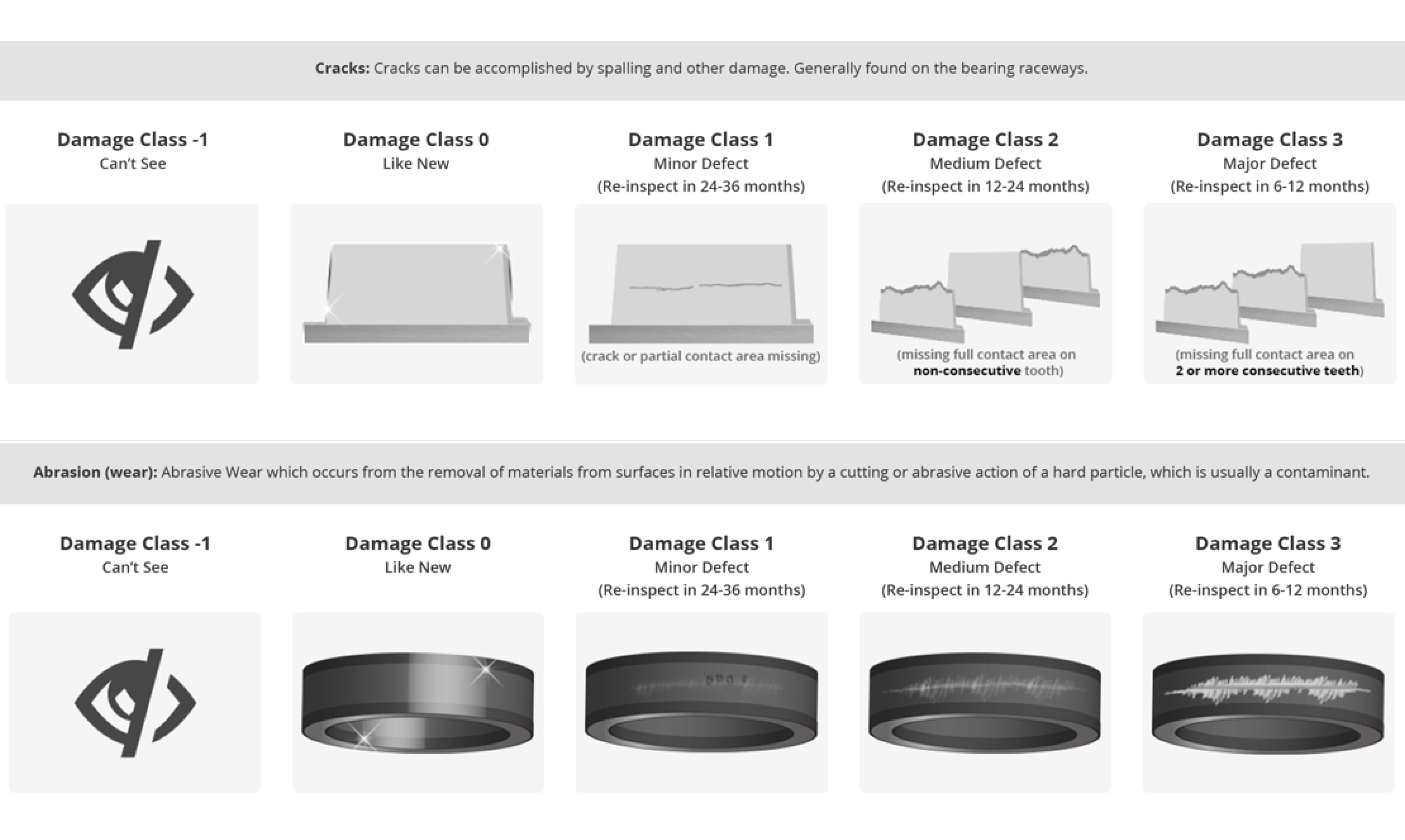
States of Damage Class (DigitalClone)
Bearing and Gears can go through different states of damge throughout there life. These graphics help engineers compare their borescope images against these images to understand what type of damage they're dealing with. (These graphics were part of an industrial magazine article).