Stitch Design System
Weaving together atomic design principles, dynamic variants, and a token-based approach, to revolutionize your digital experience.
Overview
Our UI library in Figma has encountered deficiencies, marked by the absence of specific components, guidelines, and scalability measures. This resulted in inconsistent designs, extended turnaround times, and suboptimal user experiences. Addressing and fortifying these shortcomings is imperative to enhance design coherence, streamline workflows, and ultimately elevate user satisfaction.
The Vision
Our primary objective was to establish a comprehensive design system that could serve as a shared language across our cross-functional team. This initiative aimed to foster a consistent user interface and standardized terminology, affording us more time to concentrate on effectively addressing our users' challenges. By implementing a cohesive design system, we sought to streamline collaboration, enhance efficiency, and ultimately deliver solutions that align seamlessly with user needs.
My Responsibilities
Leveraging my extensive experience and a systems mindset, I have been instrumental in developing scalable design systems, playing a pivotal role in shaping the roadmap and facilitating meaningful conversations with cross-functional team members. Through collaborative discussions, I worked towards aligning our collective goals and cultivating a shared vision for the seamless functionality of this system, with a specific focus on web and mobile applications.
My contribution extended beyond defining the strategic direction; I ensured that the envisioned design system would effectively meet the objectives and expectations of the entire team. This commitment involved maintaining and scaling the system to empower designers, developers, and product managers, fostering a collaborative environment that enhances accessibility and overall user experience. This approach addresses challenges related to inconsistent designs, and longer turnaround times, and ensures the delivery of intuitive, accessible, and pleasing user experiences.
- User interviews
- Roadmap
- Contribution model
- Atomic design
- 8pt grid
- Accessibility
- Systems thinking
- Usability testing
- Maintain Figma library
- Responsive components
- Design tokens
- Lead product team syncs
- Workshops
- Onboard team members
Strategic Collaboration and Alignment
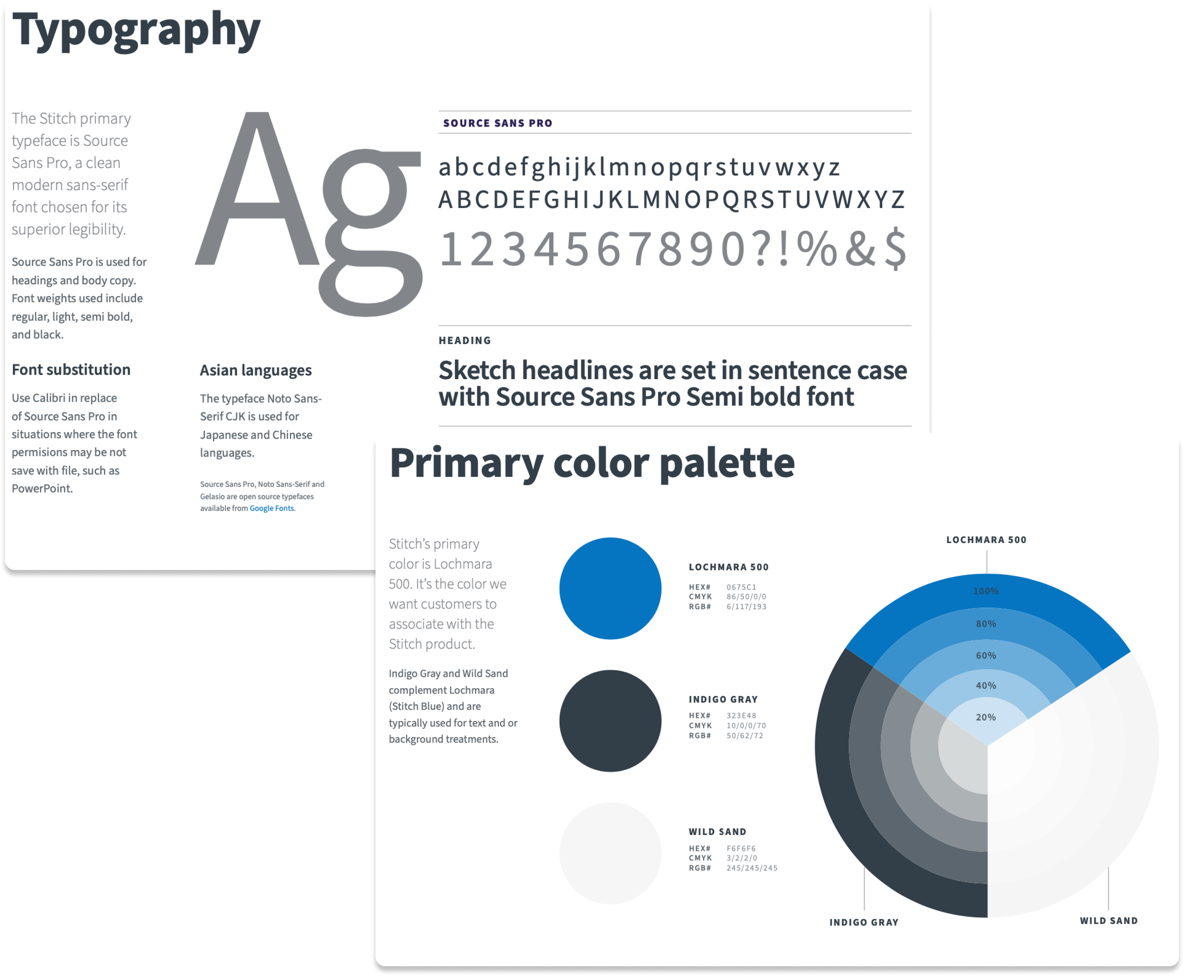
In close collaboration with another designer, I played a pivotal role in working closely with the branding team to meticulously align the style guide for Stitch Data, Inc. This comprehensive alignment encompassed crucial elements such as the color palette, typography, iconography, voice and tone, and nomenclature. By ensuring a harmonious integration of these key components, we aimed to create a cohesive and unified brand identity that resonates seamlessly across various products and touchpoints. This collaborative effort was driven by a commitment to maintaining consistency and fostering a compelling and recognizable brand presence in the market.
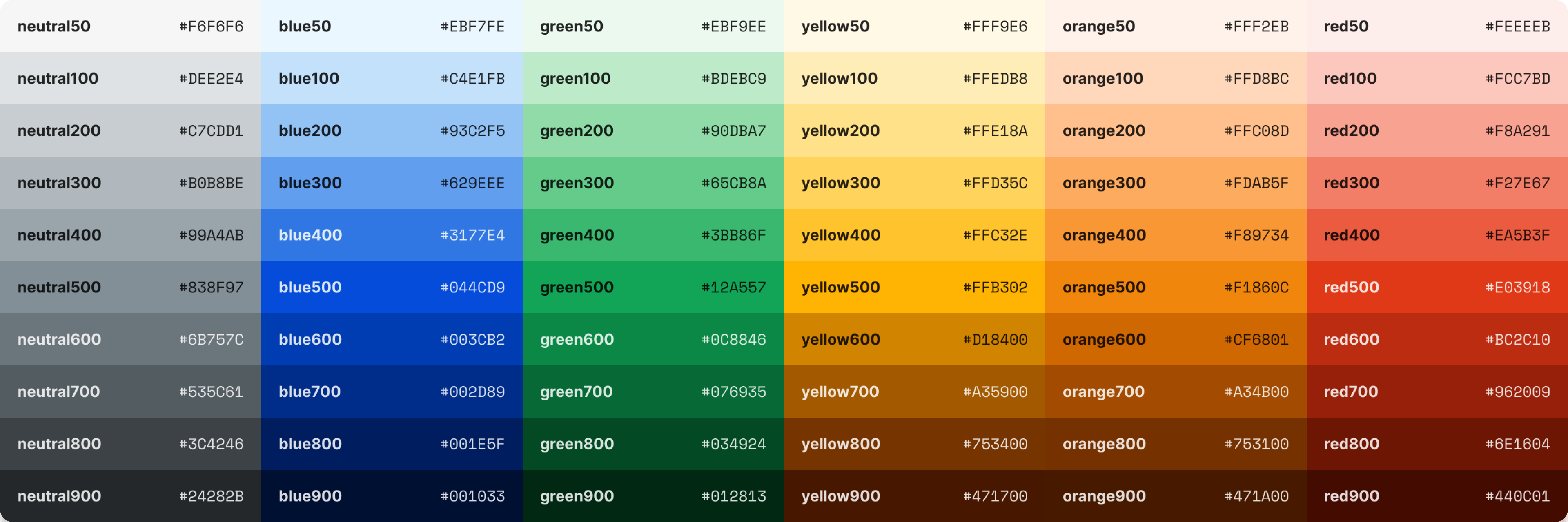
Our meticulous design process, we dedicated significant efforts to carefully selecting colors while defining their usage profiles. This strategic approach was instrumental in aligning with accessibility standards, specifically adhering to the Web Content Accessibility Guidelines (WCAG 2.0). By thoughtfully considering color choices and outlining precise usage guidelines, we aimed to create a visually inclusive and accessible design that meets the highest industry standards for web content accessibility.
From Discovery to Implementation and Beyond
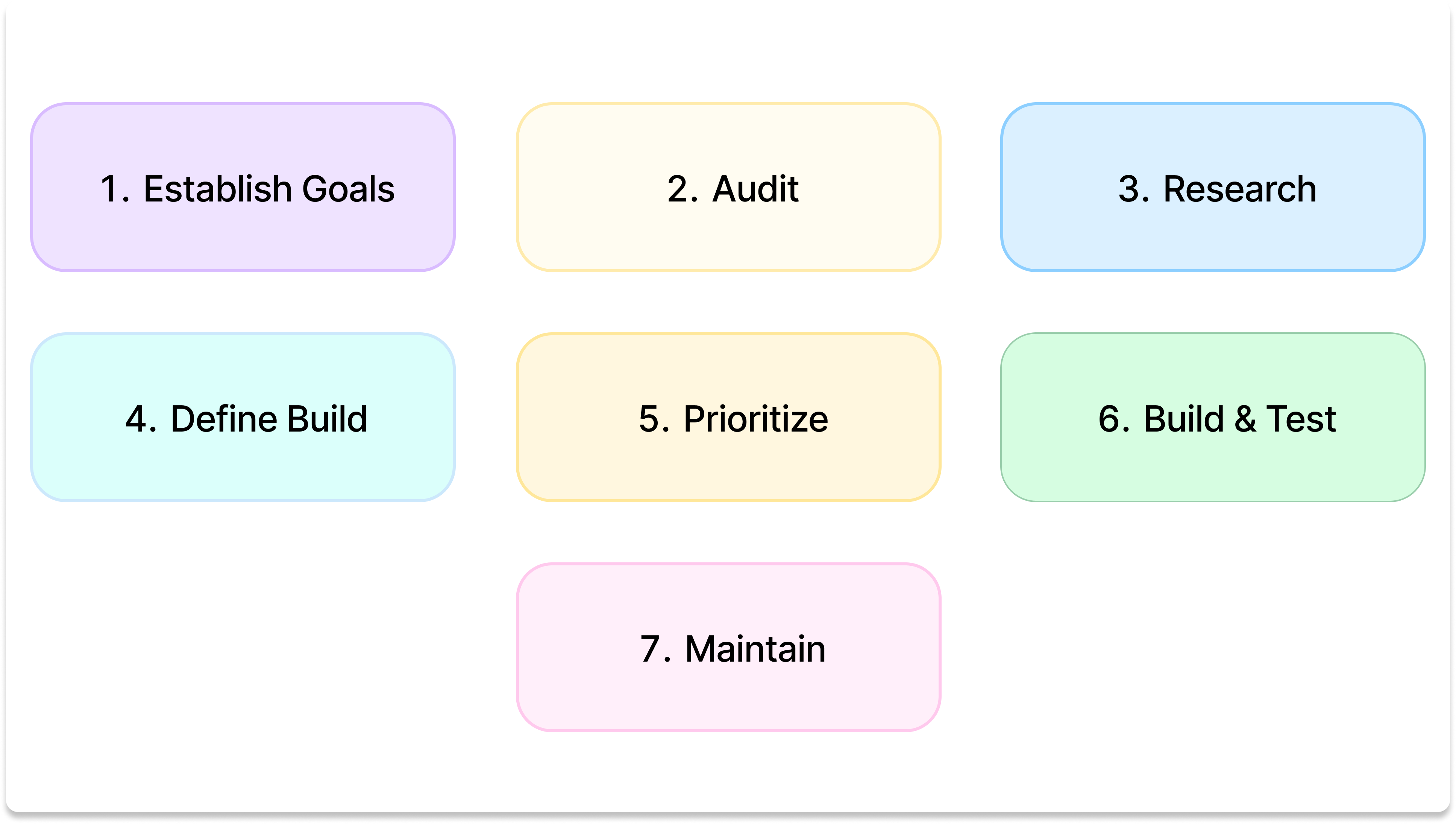
Our journey toward an effective design system began with a thorough Discovery and Research phase, allowing us to gain deep insights into user needs, understand business requirements, and identify pain points within the existing design process. This foundational research laid the groundwork for our subsequent steps.
In the Establisg Goals phase, we established key foundational principles and standards that would guide the design system's development. These principles ensure a cohesive and consistent experience across all design components, promoting a unified visual language.
Scaling and Governance strategies were developed to accommodate the growth of the organization. A strong governance model ensures the ongoing consistency and quality of the design system.
Finally, fostering a sense of Community and Support around the design system has been crucial. This involves encouraging collaboration, facilitating knowledge-sharing, and providing ongoing support for users and contributors.
UI Element Construction and Scalability
In the subsequent phase, a meticulous audit of the current application was conducted to gain a comprehensive understanding of its existing state. This rigorous examination was instrumental in identifying any prevailing inconsistencies and pinpointing areas where enhancements could be implemented to elevate the overall user experience. The aim was to not only assess the current landscape but also to strategically define areas for improvement, ensuring a more seamless and user-friendly application interface.
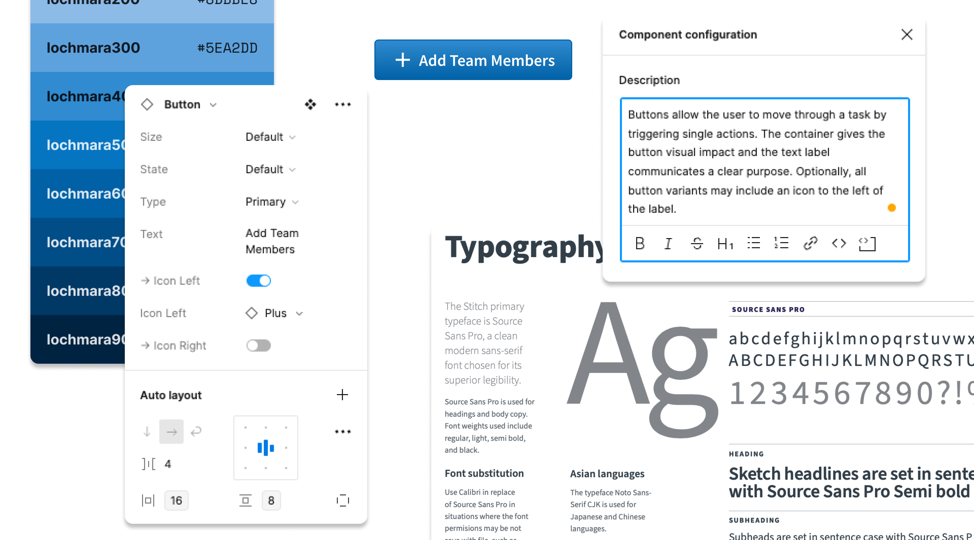
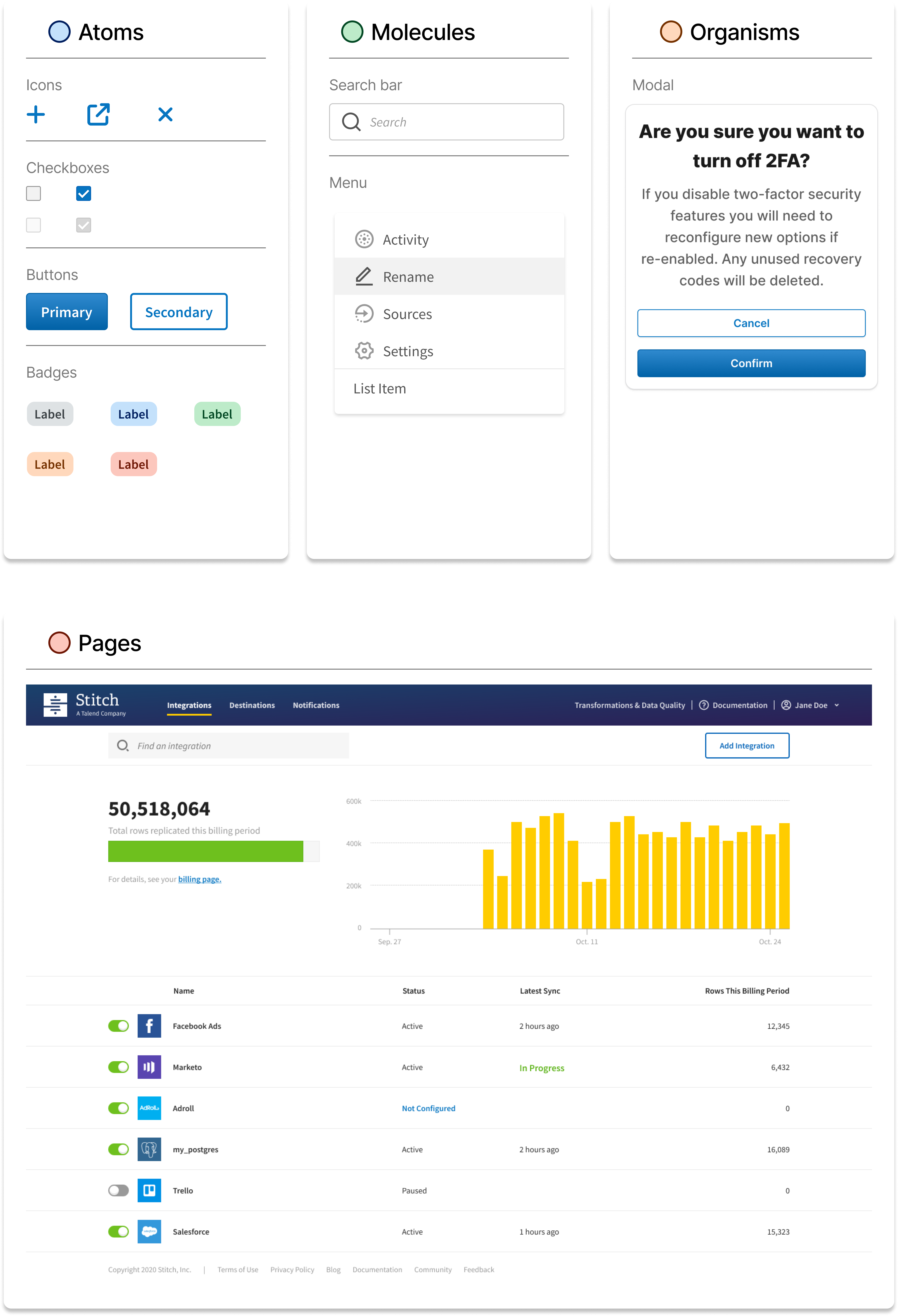
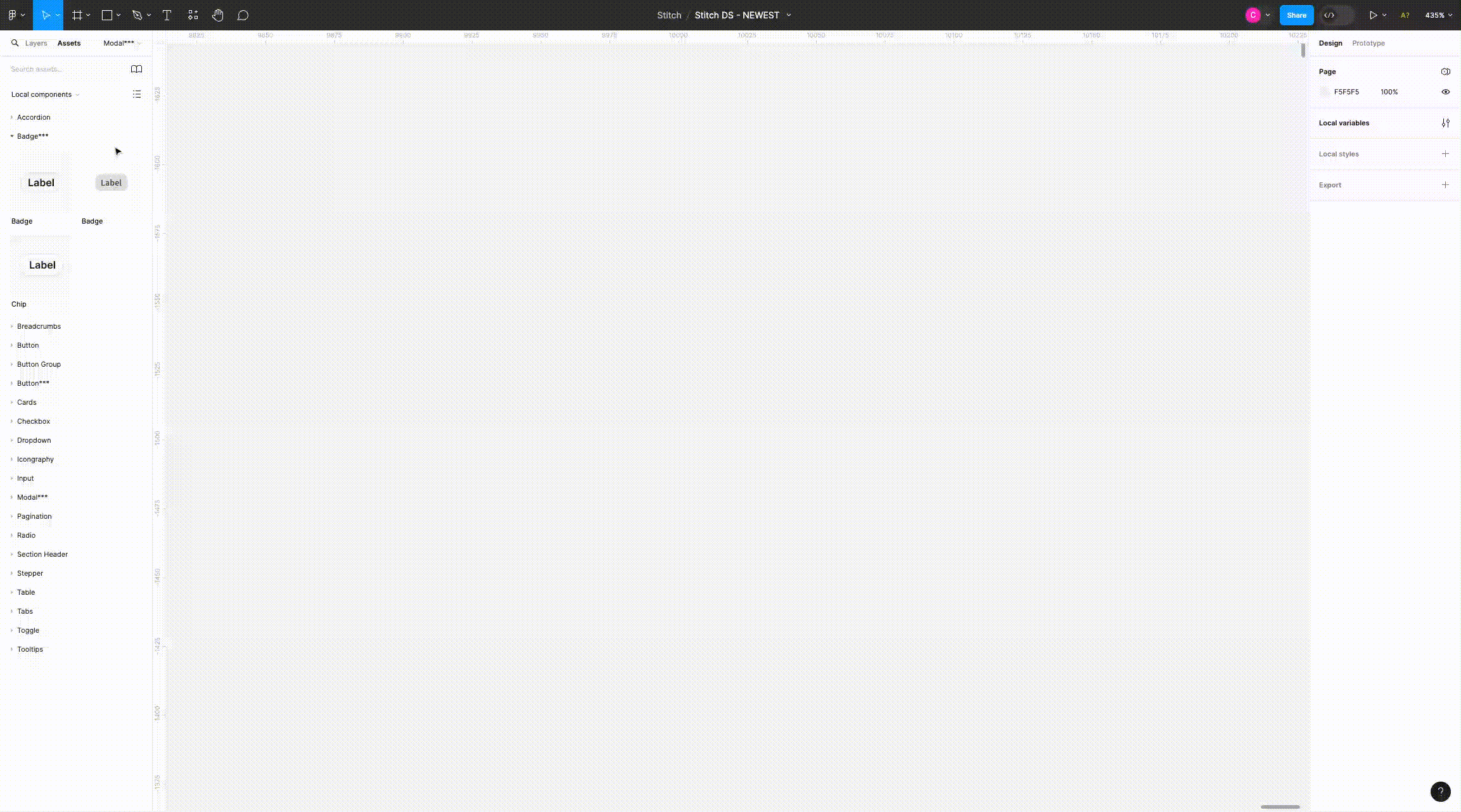
The subsequent phase involved the systematic construction of our UI elements, employing a comprehensive system approach to ensure scalability and streamlined maintenance. This endeavor was anchored in the principles of atomic design, fostering a modular structure that facilitates adaptability and efficiency. By adhering to an 8-point grid system, meticulous attention was given to consistent spacing, fostering a sense of cohesiveness throughout the interface. The overarching goal was to not only enhance the visual aesthetics but, more importantly, to deliver an optimized and harmonious user experience.
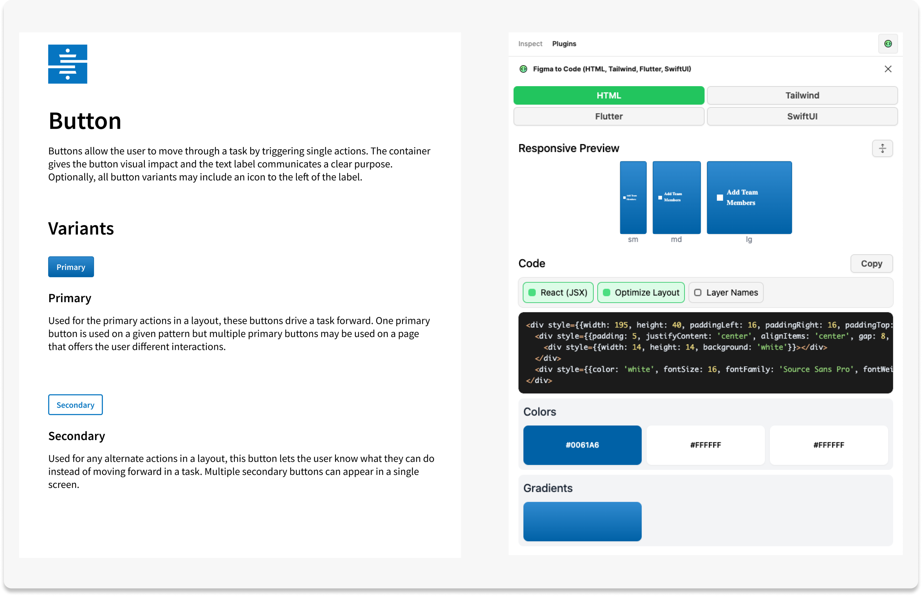
Seamless Integration: Bridging Design and Code with Figma's DEV Mode
In addition to the development of UI elements, we recognized the importance of comprehensive documentation and use cases for these elements. To bridge the gap between design and code seamlessly, we leveraged Figma's DEV mode, allowing us to generate precise code snippets for our React components. This meticulous approach ensured a one-to-one translation, facilitating a smooth and efficient implementation process.
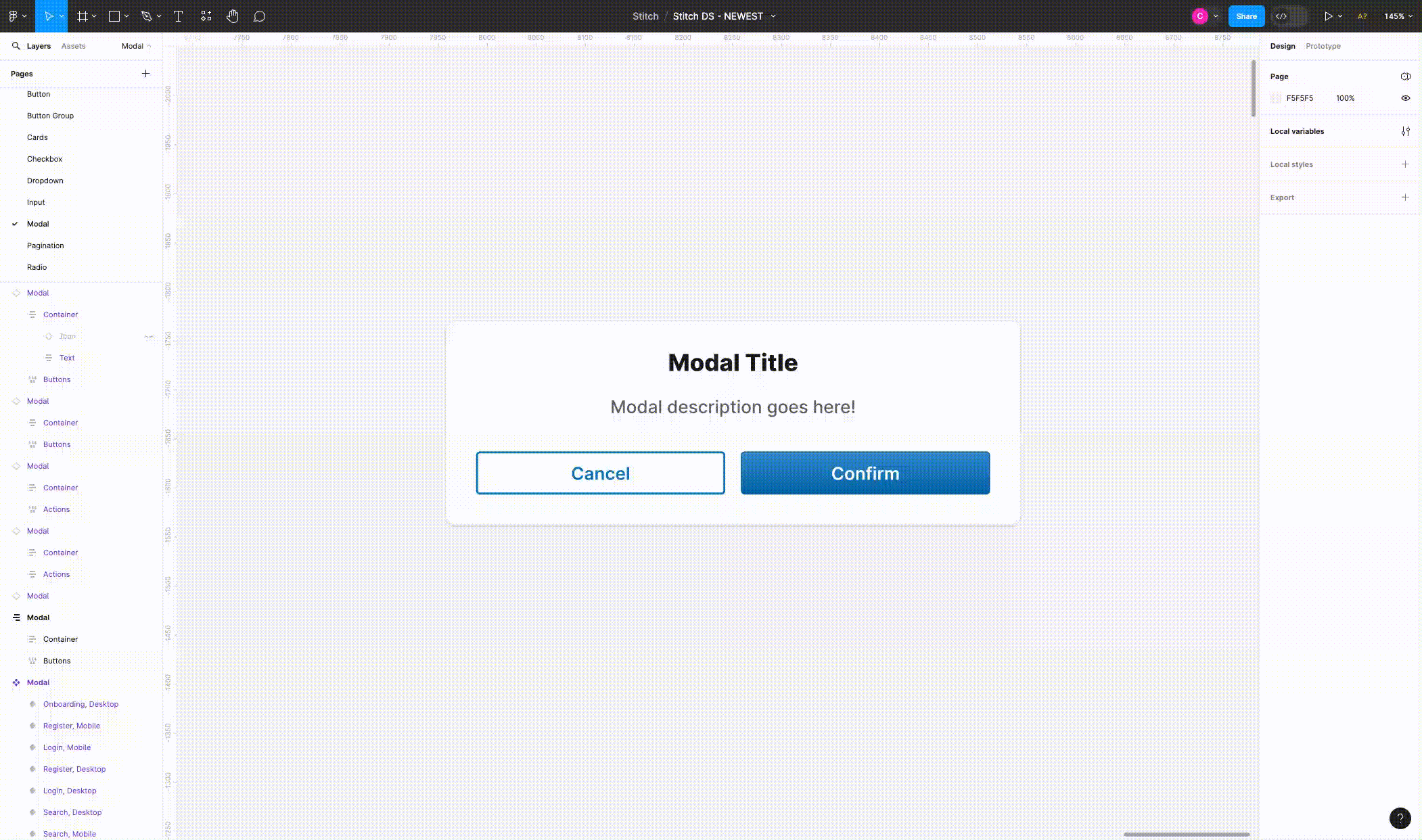
Design Flexibility and Responsiveness with Dynamic Figma Components
Leveraging my in-depth knowledge of Figma, I adeptly designed responsive components, harnessing the power of auto layout to ensure adaptability across various screen sizes. The implementation of dynamic variants further enhanced our design flexibility, enabling swift transitions between sizes, states, types, and icons. This approach not only streamlined our design process but also contributed to the creation of a more dynamic and versatile user interface.
Subsequently, the gathered information was synthesized and utilized in collaborative journey mapping sessions. Visual representation of the end-to-end user experience facilitated the identification of pain points and bottlenecks in their workflows. The process then transitioned into iterative improvement, where solutions were prioritized based on their impact, and collaborative efforts with the design and development teams were undertaken to address the identified challenges. Continuous feedback mechanisms and regular updates to the journey map ensured that the improvement process remained adaptive and user-centric. This methodical approach allowed for a deep exploration of user experiences, fostering collaborative solutions and ongoing enhancements to the design and development workflow.
Scaling for Success: A Systems-Level Approach
In crafting our components, I adopted a systematic approach that emphasizes proper scaling and adaptability to changes. One notable strategy employed was the use of a token-based system. This approach ensures a single source of truth for the design system, acting as a repository to document and track style choices and modifications. By integrating tokens into design and implementation, updates to styles seamlessly propagate throughout the entire product or suite of products, ensuring a consistent and scalable design foundation.
Putting People at the Center: A Weekly Synergy
To ensure a people-centered approach, we've implemented a series of initiatives:
- Weekly Syncs: Regular synchronization sessions foster collaboration, aligning teams, and maintaining a cohesive working environment.
- Office Hours: Open-door sessions provide an avenue for teams to seek guidance, share ideas, and facilitate a culture of accessibility.
- Onboarding for Success: Initiatives for onboarding new product team members have been implemented, ensuring a smooth integration into our collaborative processes.
Contribution & Collberation
My approach to contribution involves not only defining the strategic direction of a design system but also actively engaging with stakeholders, fostering collaborative conversations, and ensuring that the design system aligns with the diverse needs of the team and end-users. Through audits, cross-functional collaboration, and a commitment to accessibility, I have successfully contributed to and collaborated on building design systems that enhance overall product experiences.
Outcomes and Learnings
In the seamless integration of our design system into the product, I spearheaded a collaborative onboarding process. Working closely with a dedicated product team, which included a Product Manager and lead engineer, we meticulously planned and executed the integration strategy. This collaboration aimed to test the effectiveness of our components built in Figma, encompassing documentation and code, while also implementing variables into the existing codebase.
Following an iterative approach, we conducted thorough testing of our components, considering factors such as design fidelity, documentation clarity, and the ease of implementation into the codebase. This involved multiple testing cycles to refine the design system continually. After the initial phase, we implemented the design system into a new product feature, carefully measuring the velocity of this effort to gauge its impact on the overall development timeline.
As a result of implementing the design system, we witnessed a remarkable improvement in the turnaround time for both the design and development processes. Leveraging the design system as a team, we experienced a faster and more efficient workflow, allowing us to streamline our efforts and accelerate the delivery of high-quality designs into the codebase.
The systematic approach to integration proved to be a resounding success. Encouraged by the positive outcomes, we continued the process of evangelizing and onboarding additional team members into the design system. This expansion involved sharing insights, conducting workshops, and ensuring that the entire team was well-versed in utilizing the design system to its full potential.