Role-Based Access Control
Navigating the Access Dilemma: Clients Grapple with the Decision to Grant Full Access or None at All.
Overview
Stitch, a fully automated cloud-based data pipeline, confronts the dilemma where clients must choose between granting complete access or none at all. This often leads to restricted access and increased workload as clients handle change requests. Stitch envisions a solution by allowing clients to provide granular access, enabling individuals to fulfill their roles while containing the impact of potential issues. This approach aims to redefine data management, offering both efficiency and security in a seamlessly integrated platform.
The Vision
Empower our customers to effortlessly fulfill their designated roles (Administrator, General, Billing and View Only) with meticulously defined permissions tailored to their responsibilities within Stitch. Envisioning a notable surge in customer satisfaction, we consider this strategic implementation to be a potential game-changer in enhancing conversion rates and mitigating churn. Stitch has evolved beyond a mere platform; it now stands as a personalized, efficient, and user-centric solution for all our clients.
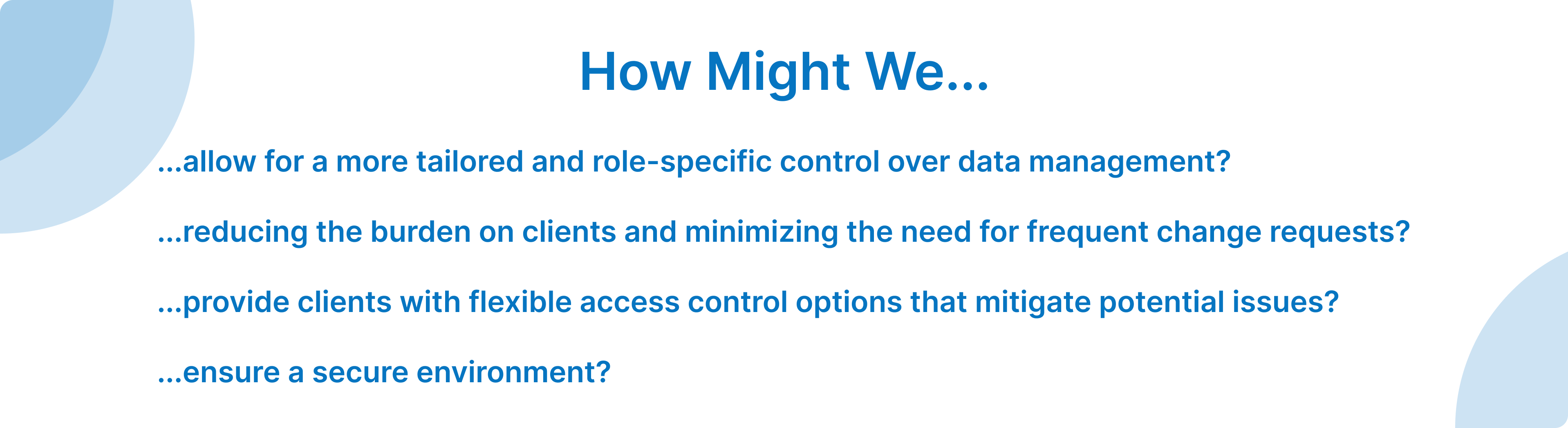
Problem Statement
The current access management system creates a binary dilemma for clients, forcing them to choose between providing comprehensive access or none at all. This choice often leads to restrictions on access, placing a burden on a select few individuals who become responsible for handling all change requests in Stitch. This bottleneck in access control hinders organizational efficiency and increases workload, necessitating a more flexible and scalable solution to streamline access management.
My Responsibilities
In this project, I applied the design thinking process—a user-centered approach that prioritizes empathy, iteration, and collaboration. This methodology fosters creative problem-solving through prototyping and testing, encouraging cross-disciplinary teamwork. It relies on extensive research to derive actionable insights, promoting adaptability and continuous learning. By reframing challenges and prioritizing user needs, design thinking aims to deliver innovative and user-centric solutions across diverse contexts and industries.
- User interviews
- Competitive analysis
- User flows
- Ideate and prototype
- Systems thinking
- Usability studies
- Defined timelines and goals
- Set and lead team meetings
- Create tasks in Jira
Understanding our Users and their Problem
In the current landscape, the primary data team within organizations bears the brunt of managing Stitch, fielding requests from across departments for data ingestion. Ideally, all data consumers should have direct access to Stitch to manage their sources independently. However, the absence of controls poses a significant challenge—there's a looming risk of accidental deletions or other detrimental actions affecting the entire pipeline. This dilemma forces data teams to make a tough choice between operational efficiency and safeguarding their infrastructure from potential harm.
Our vision is to empower data teams to freely grant access to Stitch, streamlining their workload and reducing barriers to data accessibility, all while maintaining robust application and data security. The ultimate goal is to facilitate account administrators in seamlessly expanding Stitch access throughout their organization, fostering efficiency without compromising on the integrity of the application and data security.
In translating our vision into a tangible reality, user interviews played a pivotal role in shaping the direction of our approach. Through direct engagement with data teams, we gleaned invaluable insights into their pain points, concerns, and aspirations regarding the management of Stitch. The findings from these interviews served to validate our initial hypothesis, affirming the necessity of providing distinct roles for team members within the solution. This approach aims to strike a harmonious balance between user autonomy and stringent security measures.
Current Experience
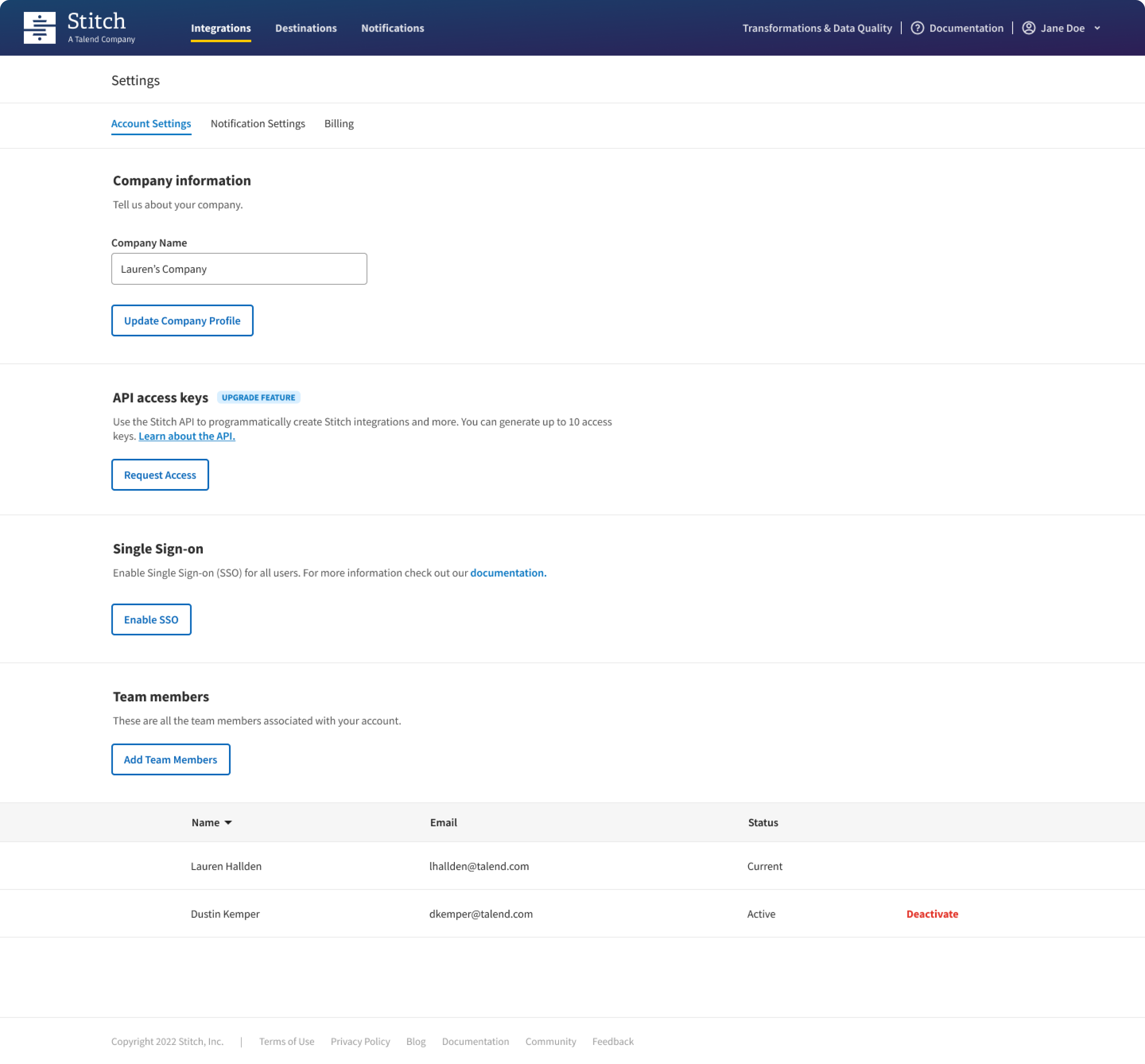
Recognizing the importance of team collaboration, we identified a significant usability issue: the team members section was previously relegated to the bottom of the account settings tab, leading to frequent oversight and an incongruent user experience. To address this, we strategically redefined its placement, giving it a dedicated space that aligns seamlessly with other account information and actions. This deliberate relocation not only ensures easy discoverability but also lays the foundation for future growth, allowing the team members section to evolve into a robust feature that meets the evolving needs and expectations of our users.
Lacking the capability to assign different roles, all users currently have admin role access. This poses a challenge in maintaining a nuanced and secure access structure within the system.
Defining Roles and User Flows
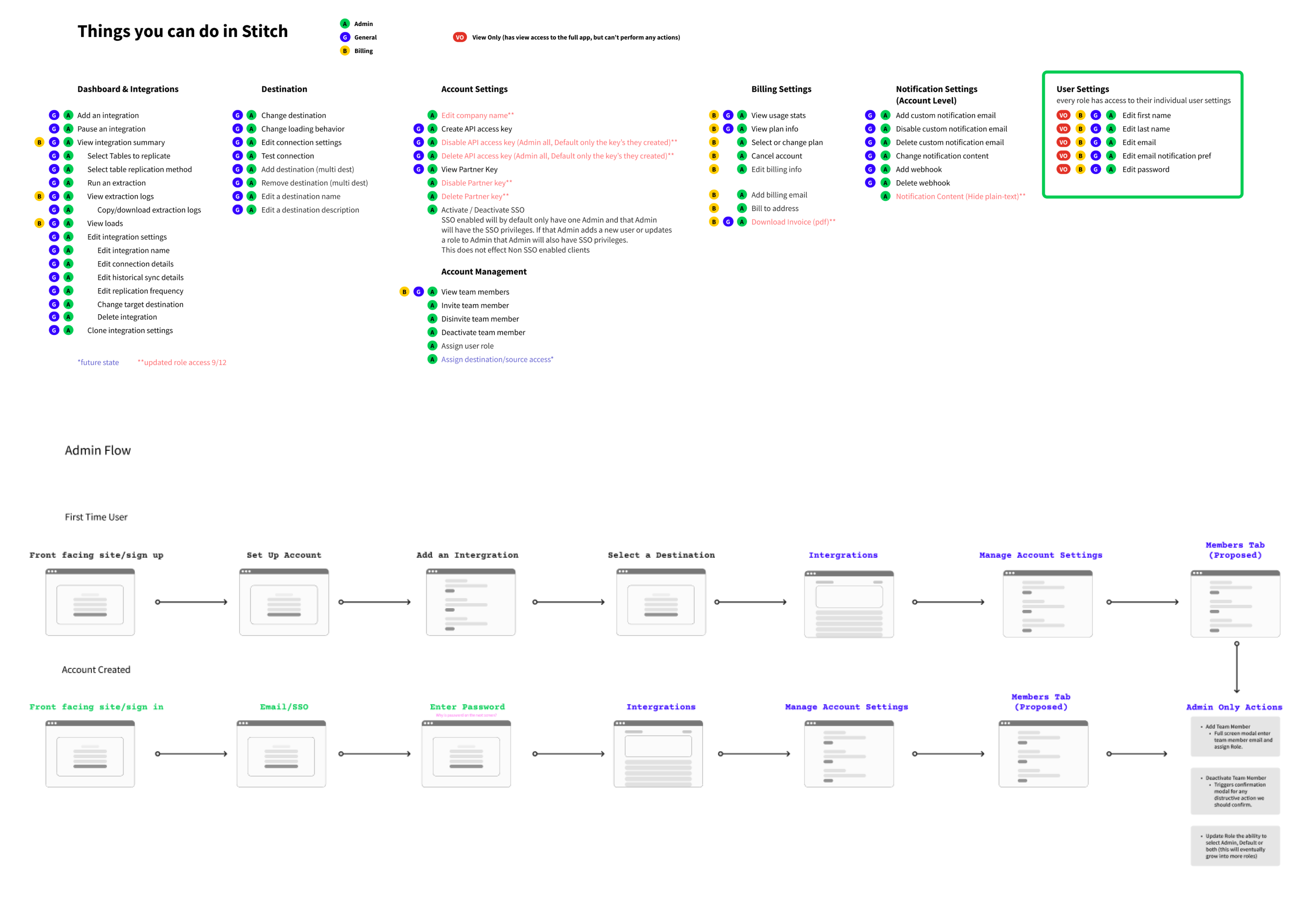
In our proposed framework, we aim to enhance account management within Stitch by introducing a clear partition of roles: Administrator and General User. This strategic division empowers our clients with the ability to tightly control access to critical account management actions, ensuring a more secure and efficient workflow.
Administrator Role: The Administrator serves as the linchpin, taking on the responsibility of configuring and overseeing the Stitch account. This role entails complete control over all actions within Stitch, making the Administrator the ultimate owner of the account. From setup to ongoing management, Administrators wield the authority to shape and optimize the Stitch environment.
General User Role: On the other hand, the General User plays a pivotal role in data ingestion and availability. Their primary focus lies in crafting and managing connections and configurations to seamlessly ingest data. By entrusting General Users with these responsibilities, organizations can ensure a smooth and effective data workflow.
Competitive Analysis
Competitive analysis for role-based access control (RBAC) involves a thorough evaluation of different solutions' features, scalability, flexibility, ease of implementation, audit and compliance features, integration capabilities, security measures, user experience, cost considerations, and user feedback. Organizations need to compare how each RBAC system allows them to define roles, assign permissions, and control user access. The granularity of control, scalability, and customization options are crucial factors, ensuring that the RBAC solution can adapt to an organization's changing needs while providing a high level of security against unauthorized access and potential vulnerabilities. The ease of implementation and integration with existing systems, as well as user-friendly interfaces for administrators and end-users, contribute to the overall efficiency of access management.
Additionally, organizations should assess the audit capabilities of RBAC solutions to track user activities and ensure compliance with industry regulations. Integration with other platforms and applications within the organization's ecosystem, along with cost considerations and overall value, play a vital role in the decision-making process. Real-world user feedback and case studies provide valuable insights into the practical successes and challenges encountered by organizations using a specific RBAC solution, assisting in making well-informed decisions that align with the organization's unique access control requirements and broader business goals.
Design Decisions
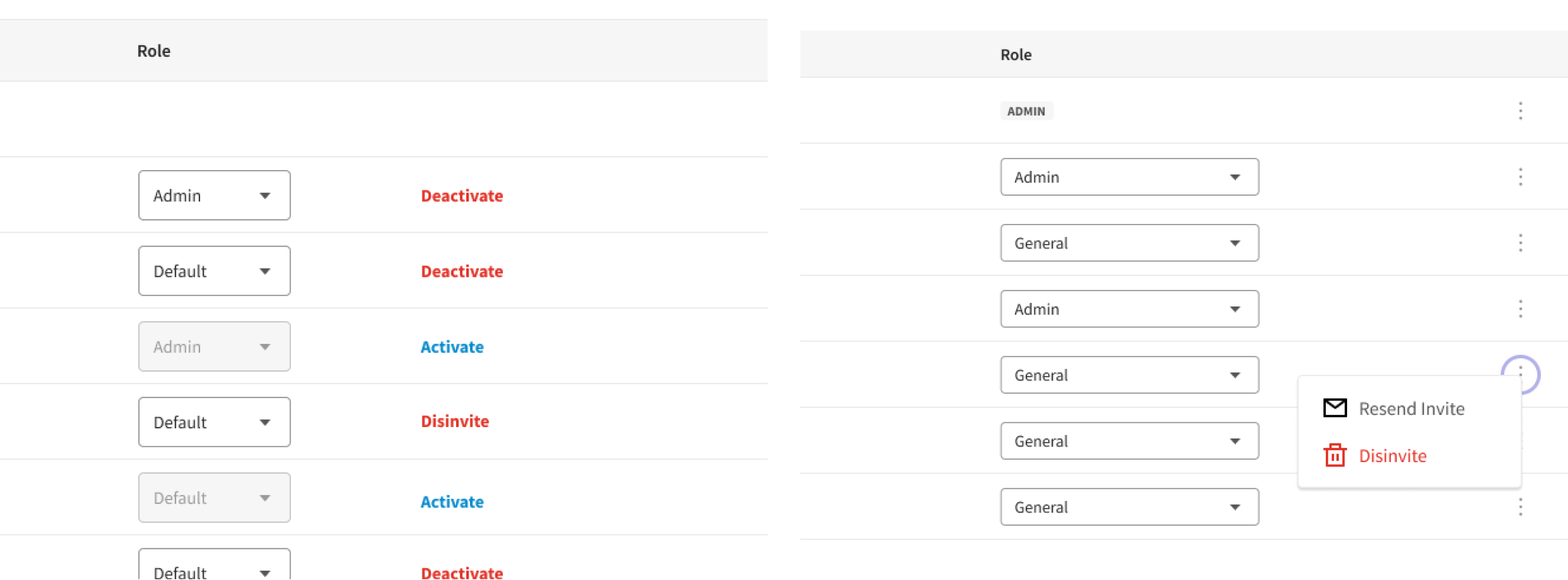
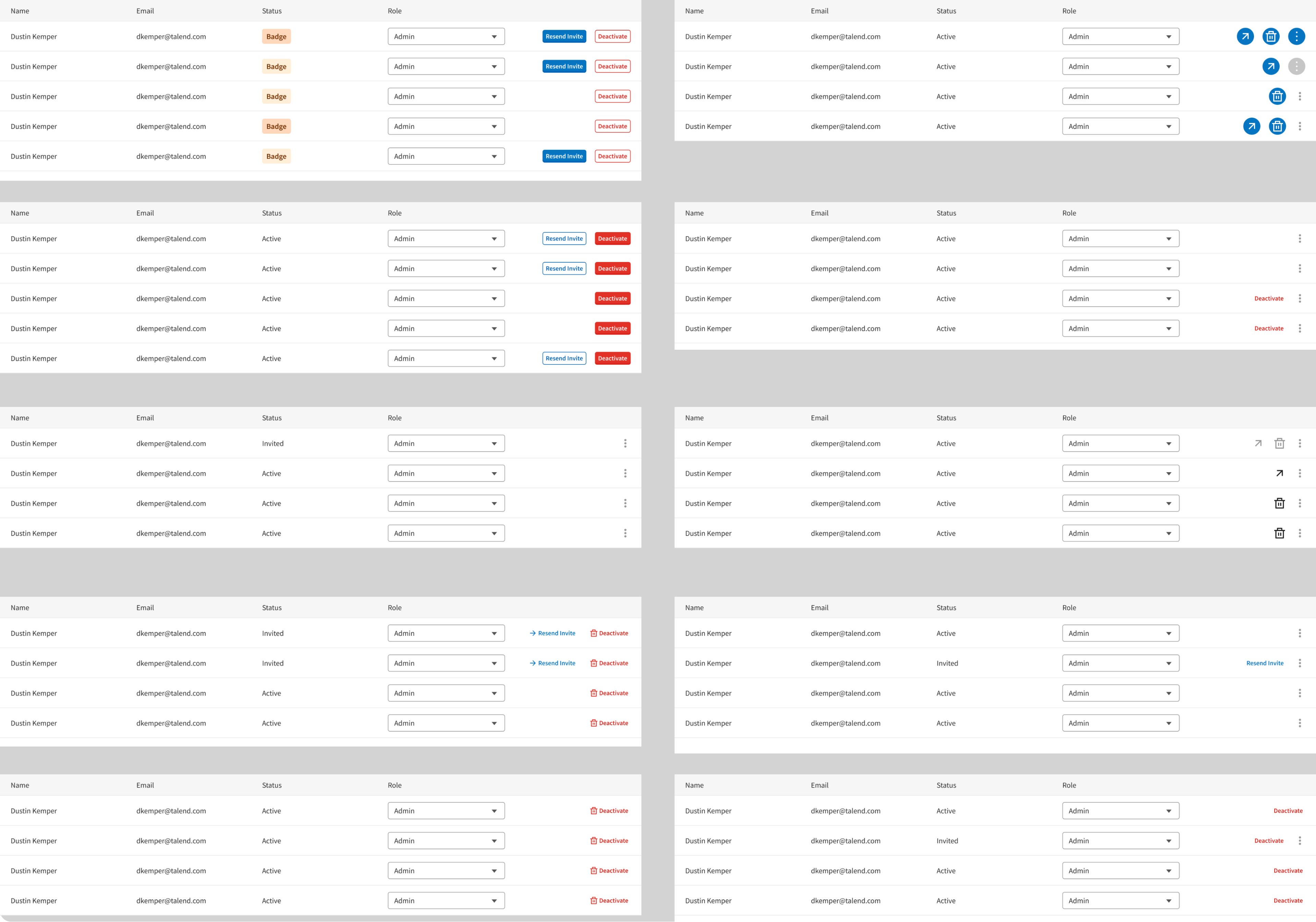
Actions: Button Links vs Ellipse Menu
When considering the presentation of various actions within our application, I delved into the challenge of finding an intuitive and user-friendly solution. The goal was to strike a balance between a clean layout, scalability, and a pattern that could be applied consistently across different parts of our application.
In my exploration, two primary ideas emerged for testing: an ellipse menu and text links. The ellipse menu is designed to contain specific items for each user, providing a clean and organized layout. This approach not only accommodates the current set of actions but also allows for future growth. Importantly, it establishes a pattern that can be extended to other areas of our application, ensuring a cohesive user experience.
Text Links: The text links concept aims to provide users with quick access to actions without the need for extensive exploration. However, it's important to acknowledge the potential risk of overwhelming users with unnecessary information. While this approach offers immediacy, there's a delicate balance to strike to prevent information overload.
Ellipse Menu: Clean Layout: The ellipse menu contributes to a clutter-free interface, promoting a visually appealing user experience. Scalability: As our application evolves, the ellipse menu can easily accommodate additional items without sacrificing usability. Pattern Definition: Implementing this pattern sets a consistent visual language for users throughout the application.
Through a comprehensive testing process involving internal evaluations and diverse user feedback, it became evident that the ellipse menu emerged as the most effective solution for our specific use case. The testing methodology encompassed a cross-section of user profiles to ensure a thorough understanding of preferences and interactions. The self-explanatory nature of the ellipse icon resonated well with users, who demonstrated a clear understanding of its purpose and seamless interaction. The majority of users expressed a preference for this streamlined approach over text links, emphasizing the visual appeal and efficiency of the design. This user-centric decision, supported by both qualitative and quantitative metrics, reflects our commitment to delivering an intuitive and preferred solution for our diverse user base.
Explorations
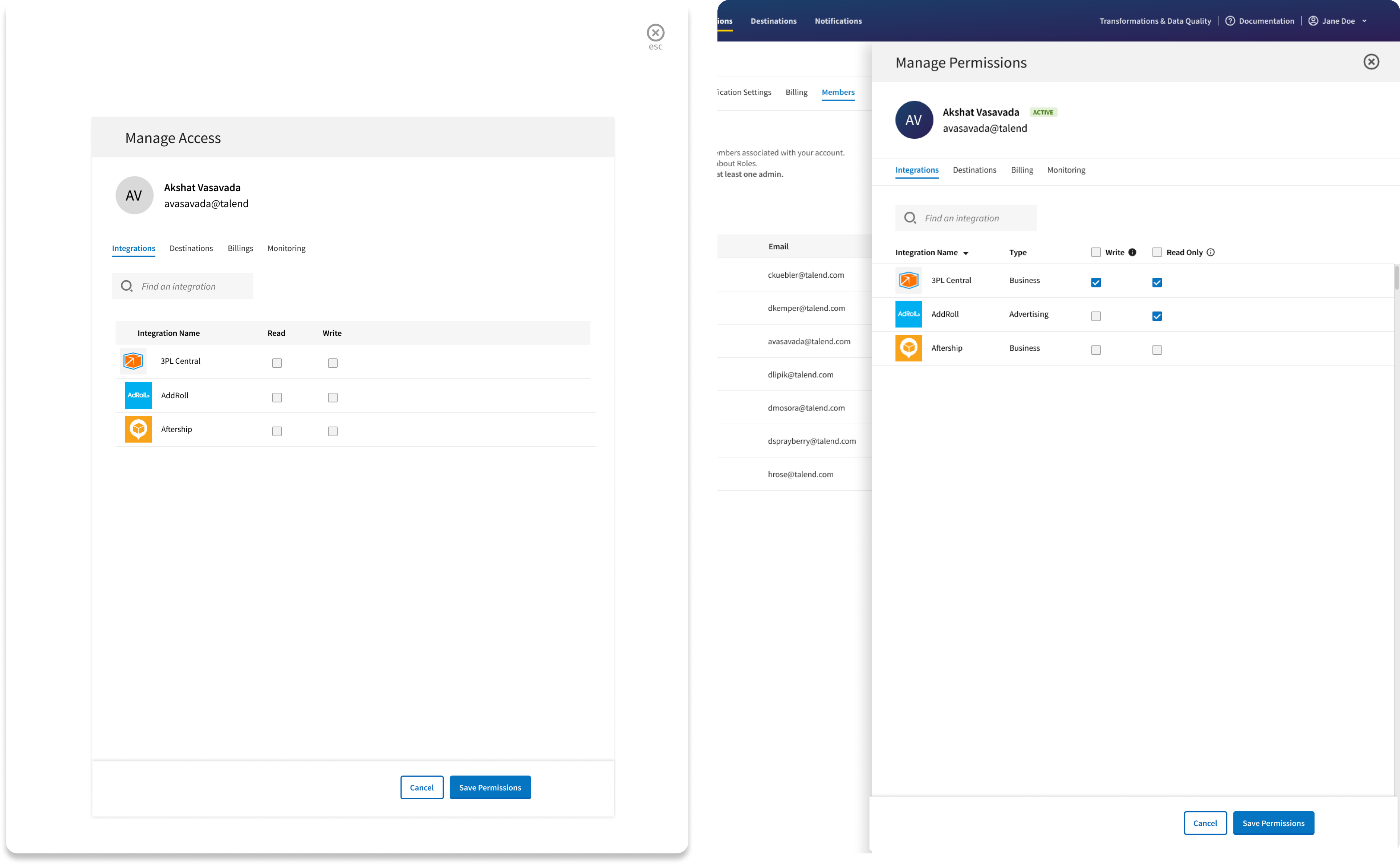
Choosing the Right Interaction: Modal vs Side Panel
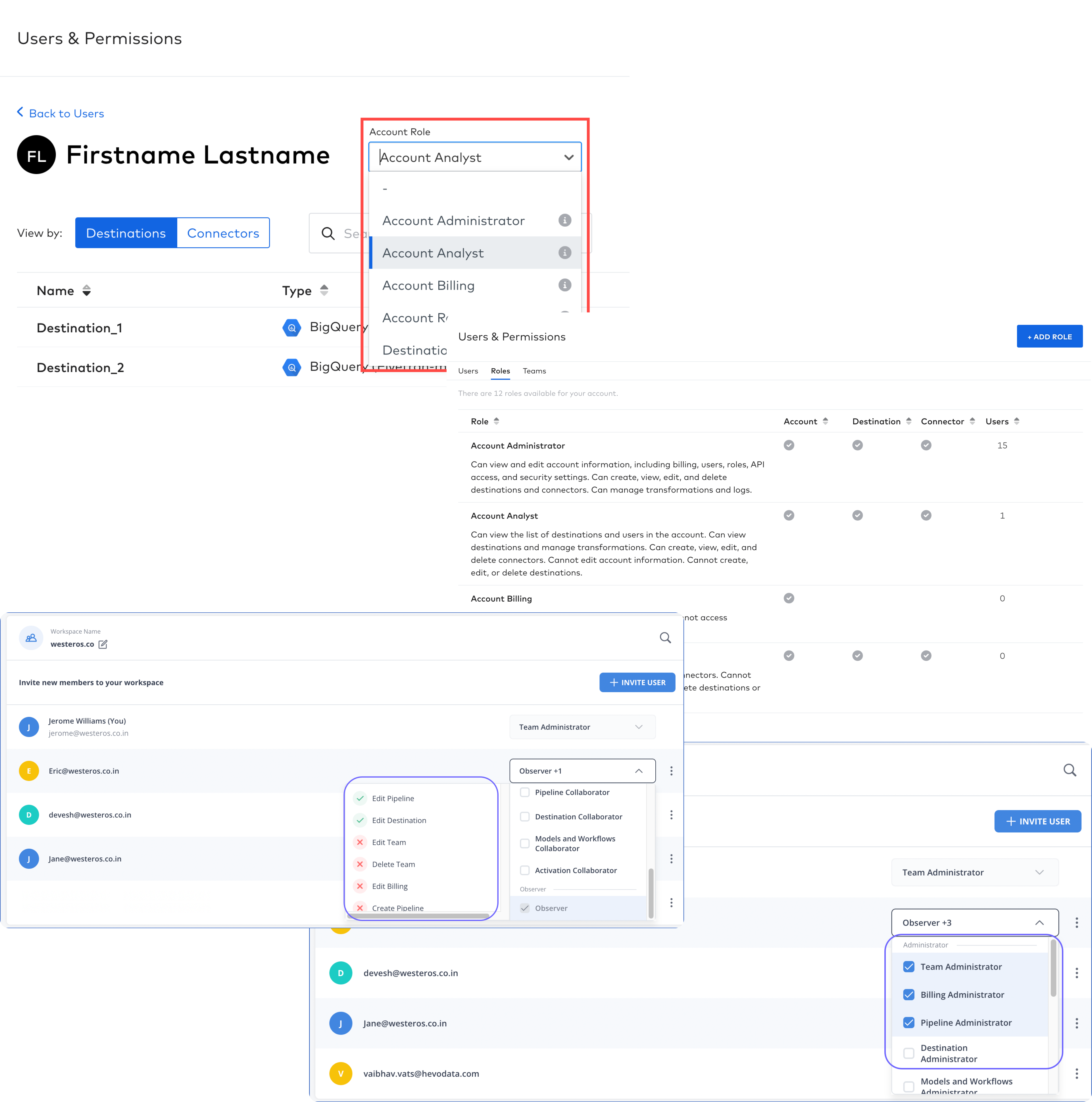
In response to a user's decision to update a team member's permissions, our team undertook a strategic evaluation to determine the optimal user experience for housing and interacting with these crucial selections. The aim was to design an interface that not only streamlines the process of permission modification but also enhances user understanding and engagement. Through careful consideration of usability, clarity, and efficiency, we sought to create a seamless and intuitive interaction that aligns with the user's workflow, ultimately contributing to an elevated overall user experience within our platform.
In the present iteration of our user interface, the prevailing design pattern for facilitating actions akin to updating a team member's permissions involves the utilization of a full-screen modal. However, a discerning evaluation of this approach has led me to assert that, in many instances, modals may not represent the optimal solution. Modals, by nature, tend to disrupt a user's natural flow, potentially causing a loss of contextual awareness and exhibiting limitations in scalability across diverse devices.
Modal: Modals are suitable for focused interactions that require user attention and prevent interaction with the underlying content until the task is completed or canceled. Modals interrupt the user flow and are best for situations where the user needs to make a decision or provide input before proceeding.
Side Panel: Side panels use screen space efficiently, especially on larger screens, and can be toggled to slide in and out, preserving the main content area. Users can access the side panel consistently across different pages or views, making it a good choice for applications with a wide range of functionalities.
Following thorough research and testing, the decision has been made to adopt the side panel pattern for our user interface. This choice is supported by several key advantages, including persistent navigation, efficient screen space utilization, and context retention, all of which contribute to an enhanced overall usability. The side panel's suitability for multi-level navigation, its role in ensuring consistency across pages, and its adaptability to responsive design principles make it a robust choice. Furthermore, the side panel facilitates quick access to essential features, maintains visibility, promotes task efficiency, and serves as a user guide, collectively leading to a more intuitive and improved user experience.
The incorporation of the side panel represents a novel design pattern that we plan to integrate into various other features. Throughout this project, I collaborated closely with the engineer to ensure the proper development of this component. This collaborative effort encompassed meticulous attention to detail, particularly in defining the behavior of the animation to align seamlessly with our overall design objectives.
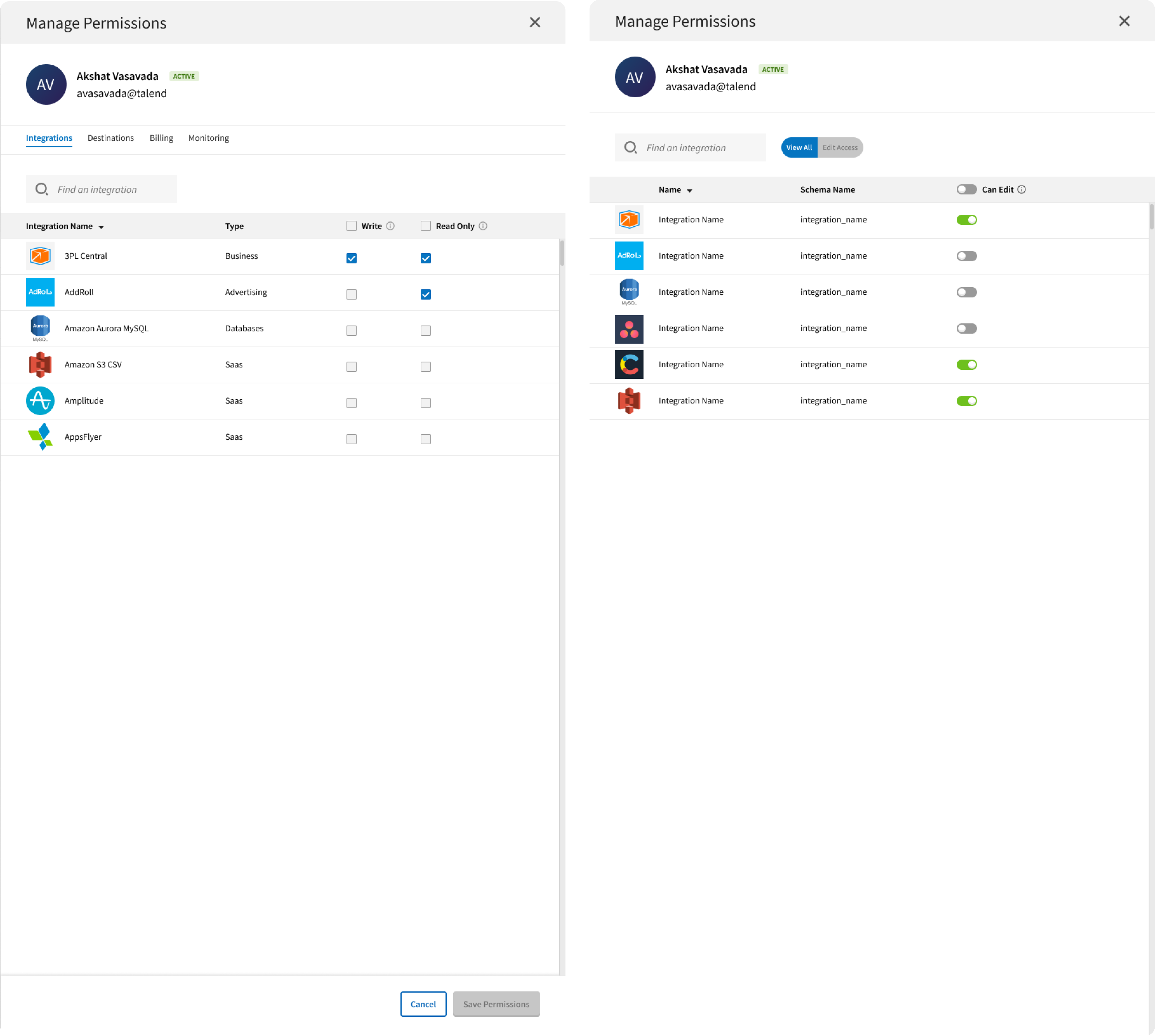
How do you envision users selecting permissions access?
To address the need for flexible integration permissions, we devised a solution empowering admin users to assign distinct permissions, either granting full control or limiting access to a read-only view. We meticulously tested two implementations to determine the most user-friendly approach.
The first solution involved a toggle option, allowing admins to swiftly grant or restrict edit access in real-time without the need for additional save actions. The second concept embraced a more traditional design, offering two checkboxes for each integration, with users required to save and confirm their selections.
Checkboxes: Has its merits, such as reduced concern about errors between selections, users leaned towards the efficiency and comfort of the toggle. The decision to adopt the toggle mechanism was reinforced by user feedback, affirming its alignment with current design trends and the seamless user experience it provided. And its execution usually requires another control.
Toggle: Characterized by its speed and modern design, emerged as the preferred choice among the majority of users. The on/off toggle aligned seamlessly with familiar patterns seen in contemporary apps, creating an intuitive experience. Users appreciated the immediacy of their selections without the need for a separate save action.
The decision to adopt the toggle solution for managing integration permissions was grounded in extensive user testing, where the majority of participants expressed a clear preference for this approach. Users found the on/off toggle design to be intuitive and aligned with contemporary application patterns, contributing to a positive and familiar user experience. The toggle solution offered notable advantages, including speed and efficiency, as administrators could swiftly grant or restrict edit access in real-time without the need for additional confirmation or save actions. Consistency with prevailing design norms and the elimination of a separate save action further streamlined the workflow. User feedback consistently emphasized the positive aspects of the toggle solution, affirming its selection as the preferred mechanism for efficiently managing integration permissions.
Outcomes and Learnings
The introduction of this highly anticipated feature has yielded significant positive outcomes for Stitch. This initiative resulted in a significant 5% surge in MAU over the next 6 months, reflecting a heightened engagement with the platform. Concurrently, there has been a positive impact on customer satisfaction, as evidenced by an uptick in the CSAT score. This success is further emphasized by a reduction in user inquiries to the support team, particularly concerning data restoration, signifying a decrease in user frustration.
Notably, the implementation of this feature has not only enhanced operational efficiency but has also garnered constructive feedback emphasizing the perceived improvements in security. The positive response from users and the tangible improvements in various metrics underscore the success and value brought about by the introduction of this anticipated feature.
A customer hailed this as a great improvement: “Security is critical for us and our data processes are a business-critical activity. An accidental or malicious disruption of any ongoing processes could come at a huge cost for the business, in terms of lost time or money...This has greatly reduced the work required from our data team and increased the speed at which other data users can operate.”
Systemic Harmoney: Navigating UI interactions with Ellipse Menu and Toggle Features
In navigating the user interface interactions of the ellipse menu and toggle features, our approach is rooted in a systemic perspective, recognizing the interconnectedness and interdependence of design elements within our system. Learning the intricacies of the ellipse menu involves understanding its intuitive iconography, streamlining access to specific actions, and maintaining a clean layout for users. On the other hand, mastering the toggle mechanism requires users to comprehend the real-time on/off functionality, providing immediate control over access permissions. Our systemic approach ensures that these UI interactions are not isolated features but are seamlessly integrated into the broader system design. By adopting a holistic mindset, we prioritize consistency and coherence in user experiences, promoting a unified and intuitive navigation process. This approach reflects our commitment to creating a user-centric environment where each UI element serves a purpose within the larger system, fostering a more efficient and satisfying interaction for our users.