Muse Design System
Elevating Design Efficiency: Streamlining Workflows and Enhancing Consistency.
Overview
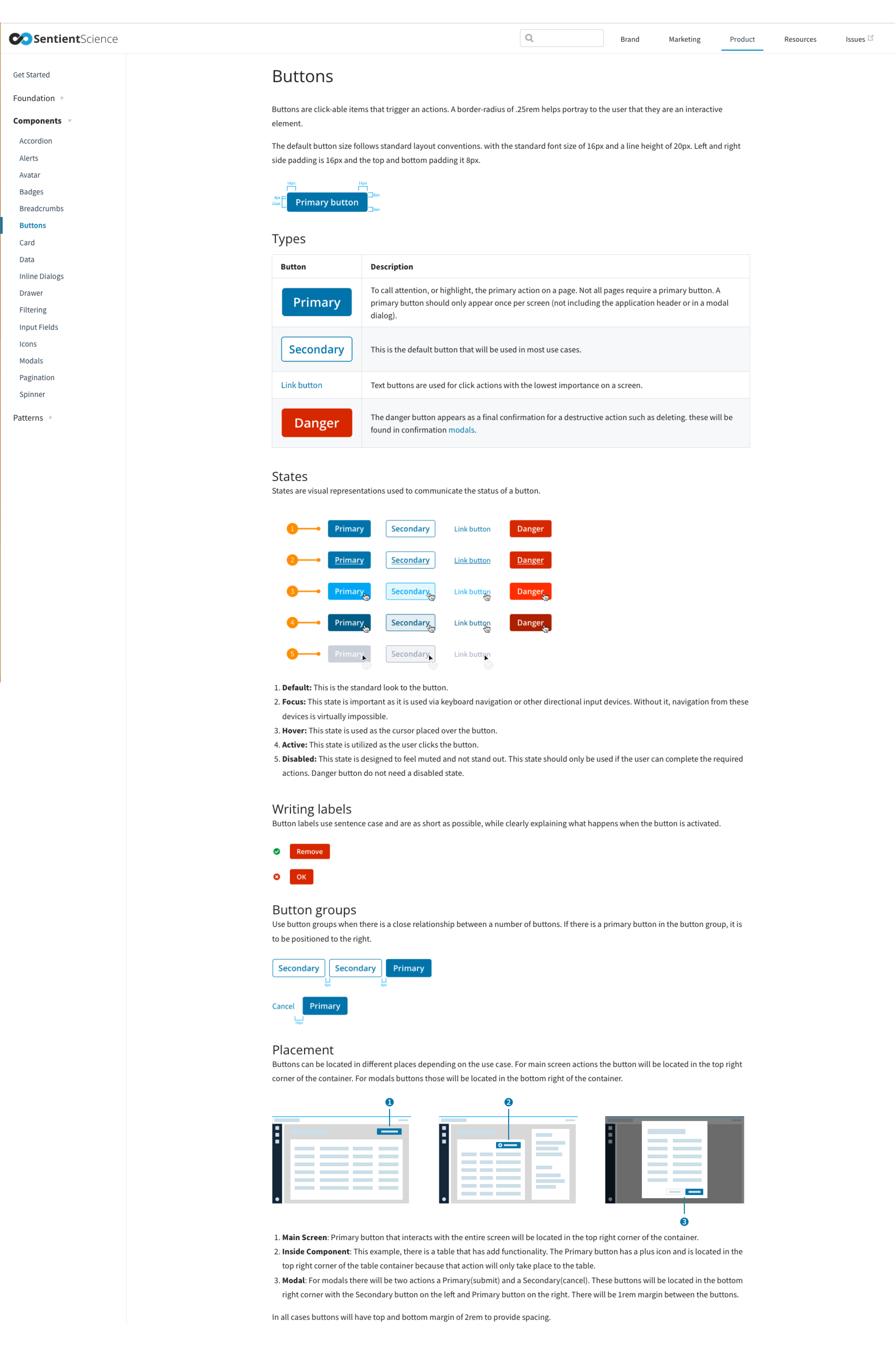
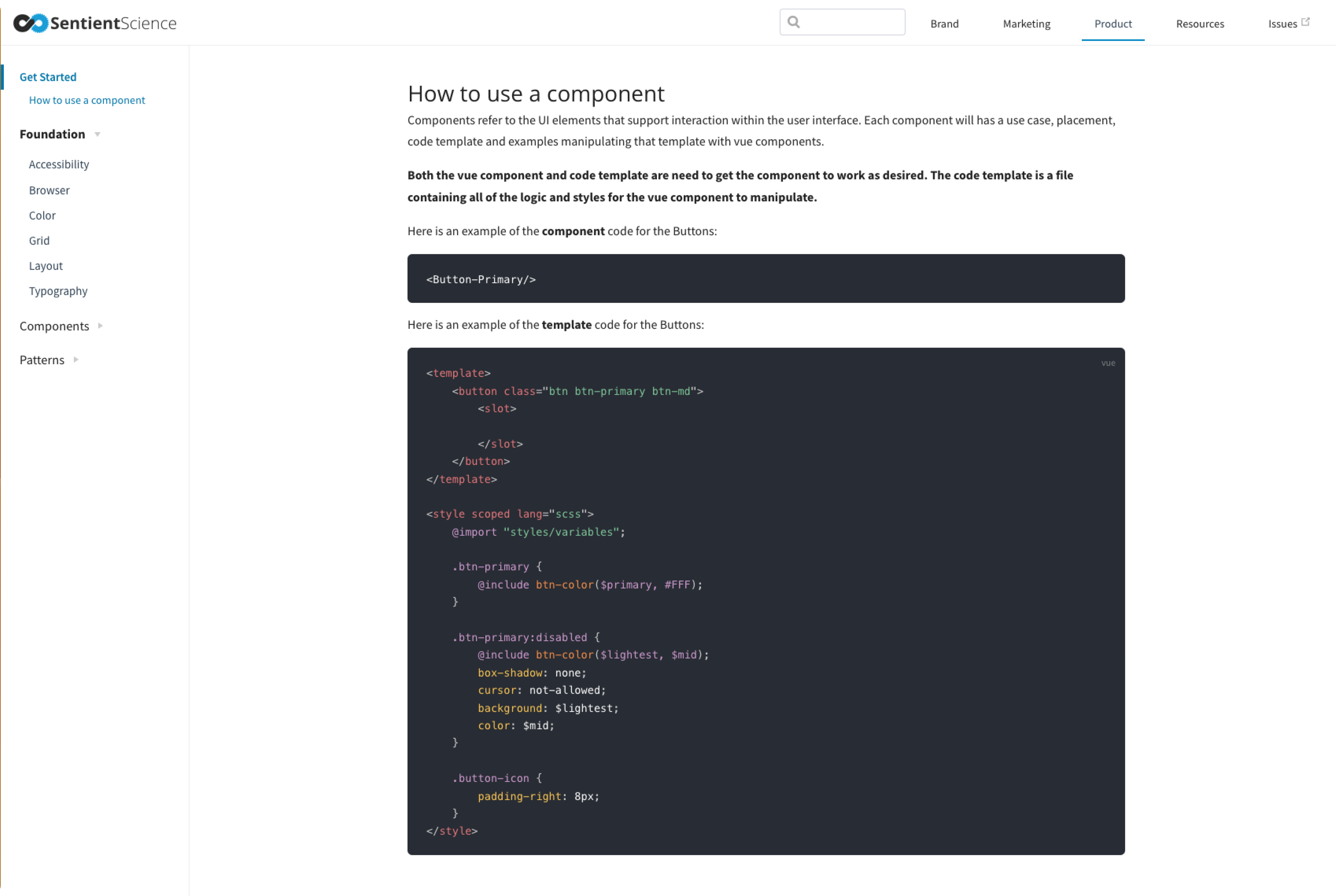
In addressing the hurdles encountered by our UI design team, marked by inconsistencies in UI elements, we identified the imperative for a streamlined and efficient workflow. Our primary goal was to elevate productivity, facilitating rapid prototyping cycles to garner timely feedback from customers. This initiative sought to enhance the quality and pace of our design processes, culminating in a more unified and responsive design system. Following the successful implementation of a system to expedite and standardize prototyping, the focus naturally shifted to providing developers with a visual repository for UI elements alongside their corresponding code.
The Vision
Embarking on a quest to enhance our internal UI design systems, I delved into extensive research on established methodologies. An enlightening discovery was Brad Frost's concept of Atomic Design, which advocates deconstructing UI elements into fundamental building blocks (atoms) and systematically constructing them into comprehensive components. This strategic approach proved instrumental in shaping a cohesive and scalable design system, aligning with best practices to elevate our UI design processes.
My Responsibilities
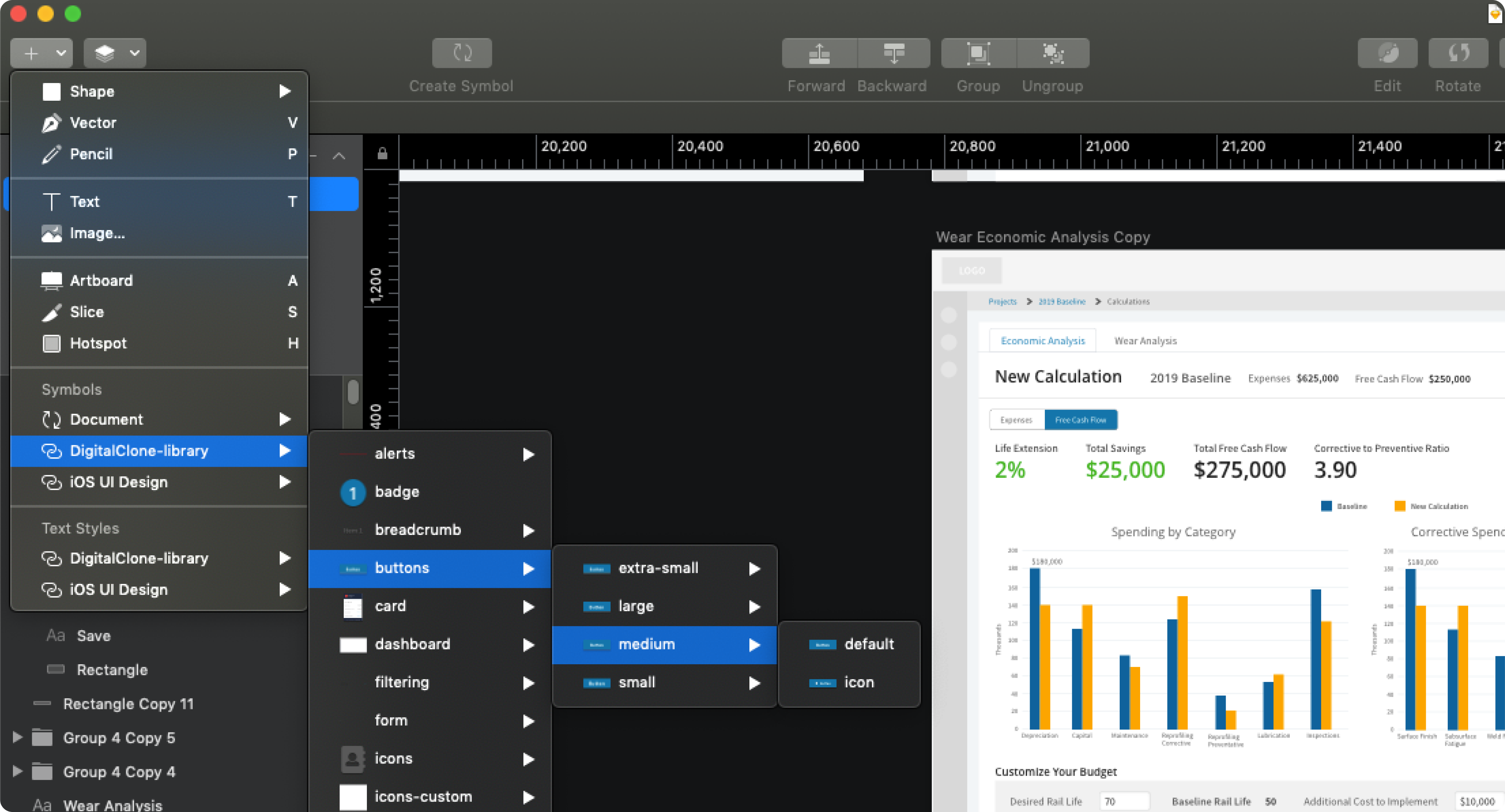
As the leader of the design system initiative, I undertook extensive research on best practices, particularly focusing on effective collaboration within a cross-functional team. I took a hands-on approach by crafting UI components in Sketch and contributing to the development of the coded components in Vue.js. A significant portion of my efforts was dedicated to conducting a comprehensive design audit across our entire product offering, capturing screenshots of various UI elements and defining their respective use cases. Additionally, I played a pivotal role in fostering conversations within the team, sharing my insights and lessons learned in the process of constructing a design system tailored to our team's needs.
- User interviews
- Roadmap
- Contribution model
- Atomic design
- 8pt grid
- Accessibility
- Systems thinking
- Usability testing
- Maintain Sketch library
- Code based components
- HTML, Sass, Vue.js
- Fostering conversations
- Stakeholder buy-in
- Workshops
Strategic Component Inventory
The initial phase involved conducting a comprehensive inventory of all components utilized within our software. This meticulous process served a dual purpose—firstly, it brought to light any existing inconsistencies, and secondly, it prompted essential questions regarding the significance of various elements. This introspective examination was pivotal in laying the groundwork for a more systematic and cohesive approach to our software design, emphasizing clarity and prioritization of key components.
In an effort to fortify our software design foundation, our comprehensive approach involved the active participation of our cross-functional team. This collaborative initiative fostered a more unified experience, cultivating a holistic understanding of the current state of our product. By engaging all team members in the process, we aimed to ensure a well-rounded perspective and contribute to the overall success of our design enhancements.
Crafting a Unified Design Ecosystem
In pursuit of establishing a scalable and resilient design system, extensive research was conducted on industry best practices. The exploration encompassed key design methodologies, including Atomic Design, the 8-point grid system, layouts, and accessibility standards. This meticulous investigation aimed to lay the groundwork for a robust foundation, ensuring not only scalability but also adherence to industry-leading design principles.
To seamlessly integrate our design system with the marketing efforts, it was imperative to establish a cohesive visual identity. This involved defining and documenting key elements such as branding guidelines, color palette, typography standards, and voice principles. The meticulous detailing of these components ensured a unified and consistent presentation of our brand across various touchpoints, reinforcing a harmonious alignment between design and marketing initiatives.
Outcomes and Learnings
As a culmination of our efforts, the Sketch UI library emerged as a dynamic repository of components and use cases, fostering seamless collaboration across the entire UX team. Additionally, we established a comprehensive documentation hub within Muse, providing a unified onboarding resource for team members. This initiative extended its utility to the product team, offering a centralized view of the foundational elements of the Design System. This encompassed a detailed inventory of components, their variants, use cases, and, for the engineering team, readily accessible code snippets for efficient integration into projects.
This holistic approach resulted in a more cohesive and consistent user experience, providing our entire team with a better understanding of how our application looks, feels, and behaves. The newfound ability to test and deliver updates and features to our users further solidified the transformative impact of our design system implementation.
Learnings
In spearheading the design system initiative, I engaged in thorough research to identify industry best practices and initiated dialogues with team members to tailor the system to enhance their workflow rather than impede it. Securing buy-in from stakeholders was crucial, emphasizing the importance of investing time in building a tool that would ultimately streamline processes rather than be a hindrance. This marked my inaugural experience in leading a design system effort, necessitating a comprehensive understanding of team dynamics and a commitment to creating a valuable and efficient tool for all stakeholders involved.