Enhancement of Account Management Features
Improved account management capabilities by implementing user-friendly features such as account grouping and streamlined selection methods.
Overview
Responding to user feedback and insights, Wilmington Trust initiated a comprehensive exploration of ways to extend functionality for account management. Recognizing the user's need for greater control over their account information, the primary focus was on enhancing the ability to edit and manage account details seamlessly. This led to the strategic consideration of introducing features that would not only provide organizational benefits but also elevate the overall user experience.
The Vision
Our vision is to pioneer a financial platform that places unprecedented control in the hands of our users. By striving to answer fundamental questions about how customers can easily edit account information and introducing innovative features like grouping similar accounts, we aim to redefine the landscape of financial platforms. Our vision is centered on delivering an exceptional user experience that goes beyond meeting expectations—it anticipates and exceeds them.
My Responsibilities
In the course of this project, I played a pivotal role in shaping the user interaction dynamics for the creation of new groups at Wilmington Trust. This involved meticulous design decisions, including the definition of two distinct methods for selecting accounts within a group: the conventional checkbox method and the innovative drag-and-drop functionality into a designated drop zone.
Leveraging the established modal design pattern within our team, I contributed to refining the user experience for editing account information. The modal design not only ensured a consistent and intuitive approach but also enhanced the overall usability of the platform. Additionally, I integrated effective notification strategies, encompassing error notifications to prompt users about invalid input fields and success notifications to confirm the successful update of their account information.
By actively participating in the design decisions surrounding user interactions and incorporating established design patterns, we aimed to create a seamless and user-friendly experience for Wilmington Trust clients, ensuring the success of their account management endeavors.
- User interviews
- UI patterns
- Ideate and prototype
- User testing/feedback
- Project Syncs
- Present Findings
Understanding the problem
Wilmington Trust currently faces challenges in providing users with a seamless and empowering experience in managing their financial accounts. User feedback and insights have highlighted the need for enhanced functionality, particularly in editing account information and organizing accounts effectively.
The existing system lacks the flexibility for users to easily edit their account information, causing friction and limiting the customization options available to them. Additionally, there is a recognized need for features that allow users to group similar accounts, providing a more organized and user-friendly financial management experience.
These challenges hinder achieving a truly user-centric financial platform, impacting user satisfaction and engagement. Addressing these issues is crucial to meeting user expectations, enhancing the platform's appeal, and fostering a sense of control and efficiency in financial account management. The goal is to transform these challenges into opportunities for improvement, creating a financial platform that aligns with user needs and expectations at Wilmington Trust.
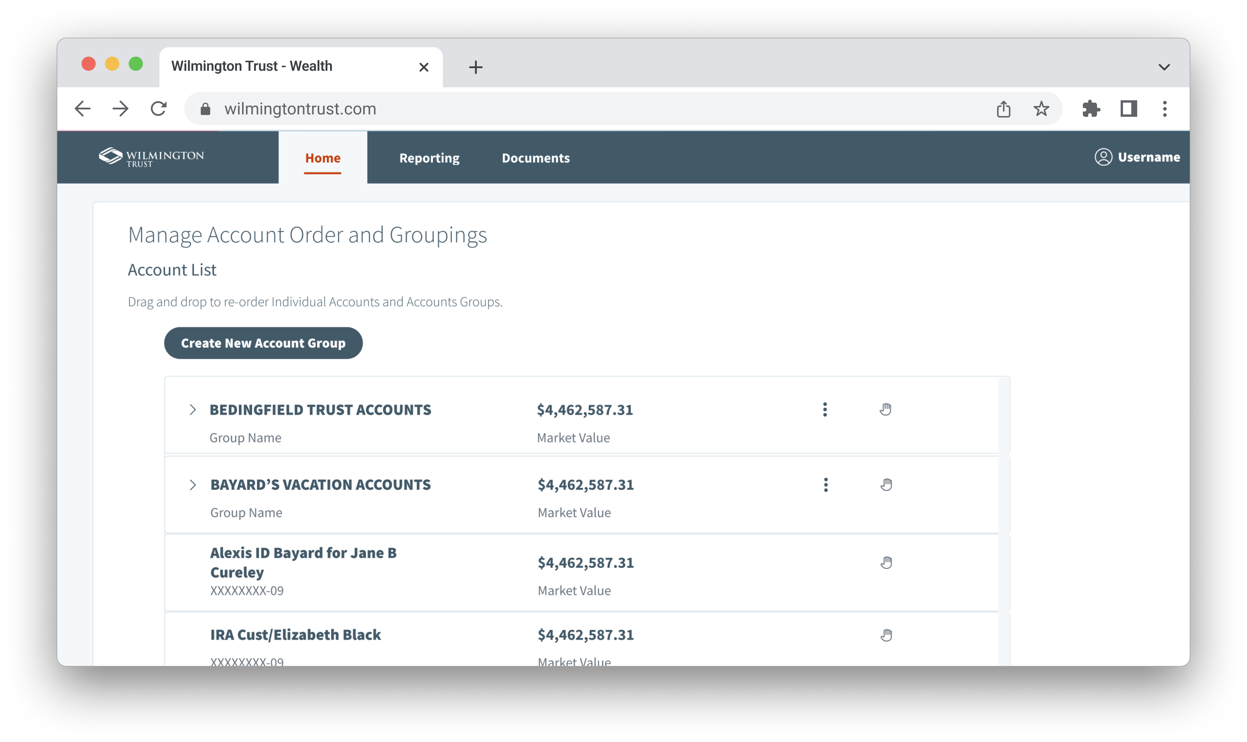
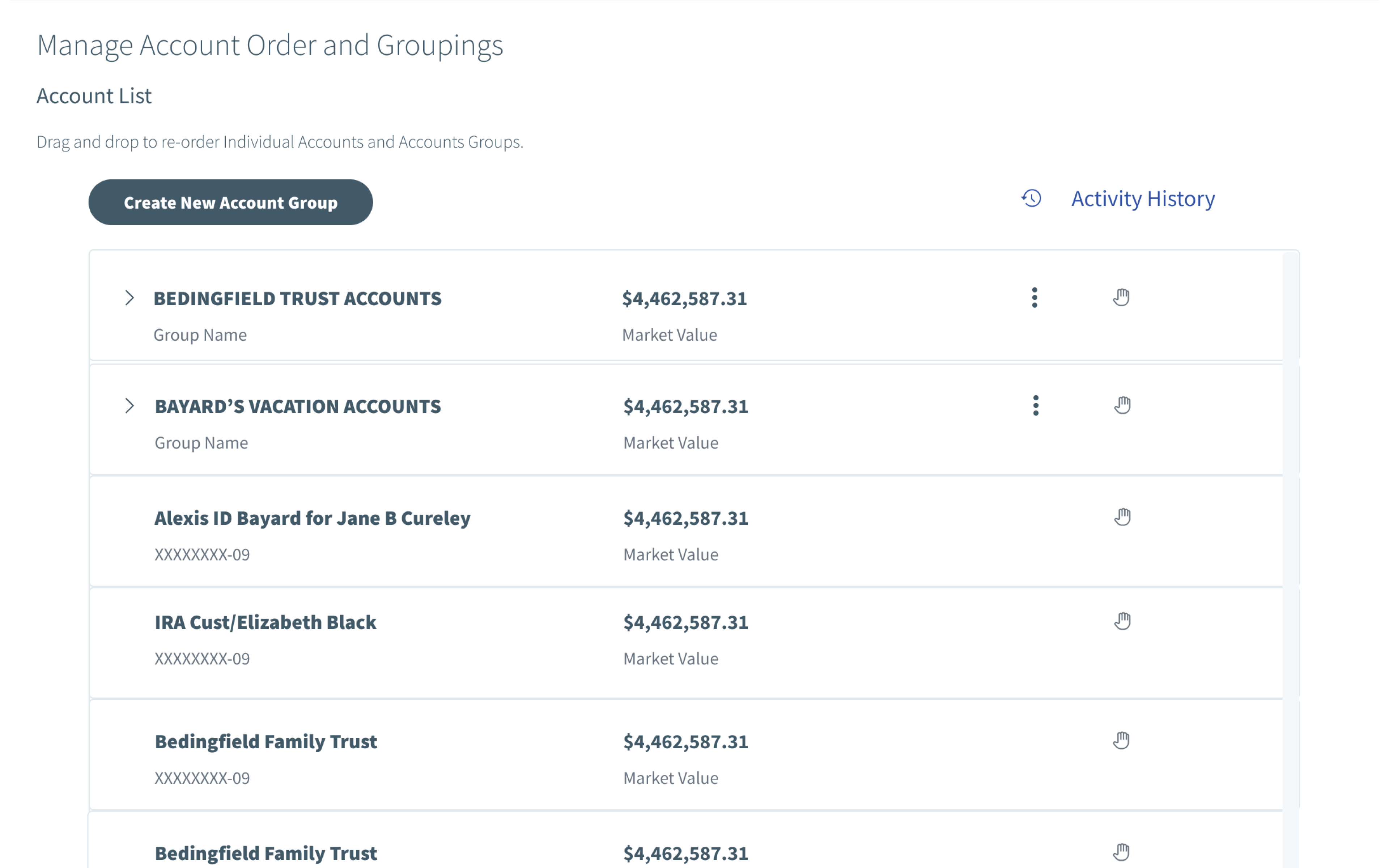
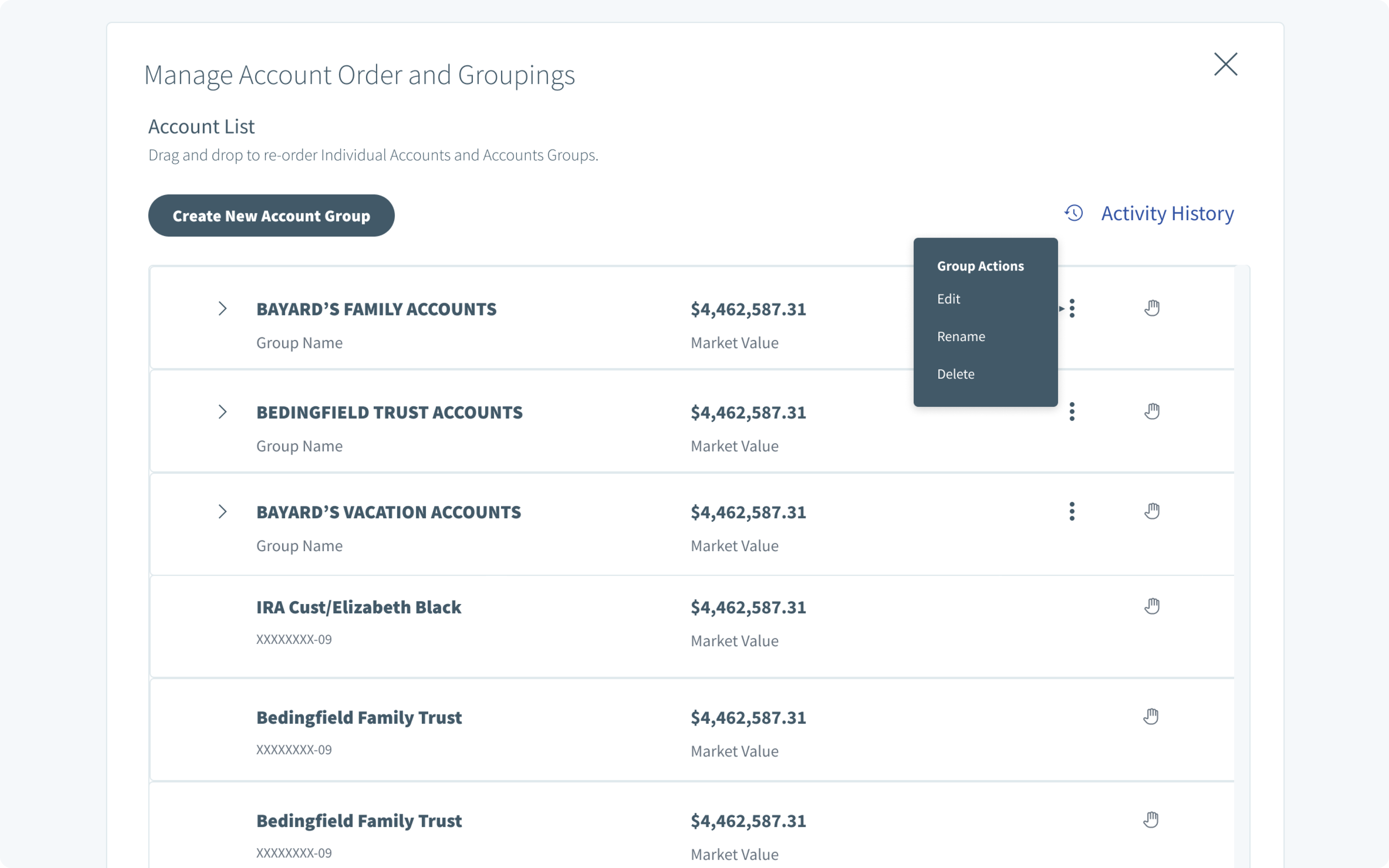
Establishing a New Group
To initiate the process of creating a new group, careful attention was given to developing a clear and compelling call to action. This foundational step was strategically designed to spark user interest, encouraging active engagement and participation in the group creation process. The emphasis on a distinct call to action aimed to provide users with a seamless entry point, ensuring a user-friendly experience from the outset.
Optimizing Account Selection
In the phase of Account Selection, we meticulously employed user testing methodologies to validate our hypotheses regarding user interactions during the account selection process. Through a series of iterative testing sessions, we gained valuable insights into user preferences and behaviors. The findings highlighted distinct use cases, leading us to implement two different options for account selection. Users were given the flexibility to choose between a checkbox selection method and a drag-and-drop option, ensuring a tailored and user-centric approach to account selection based on individual preferences and workflow requirements. This user-tested approach aimed to enhance the overall usability and effectiveness of the account selection step in the professional context.
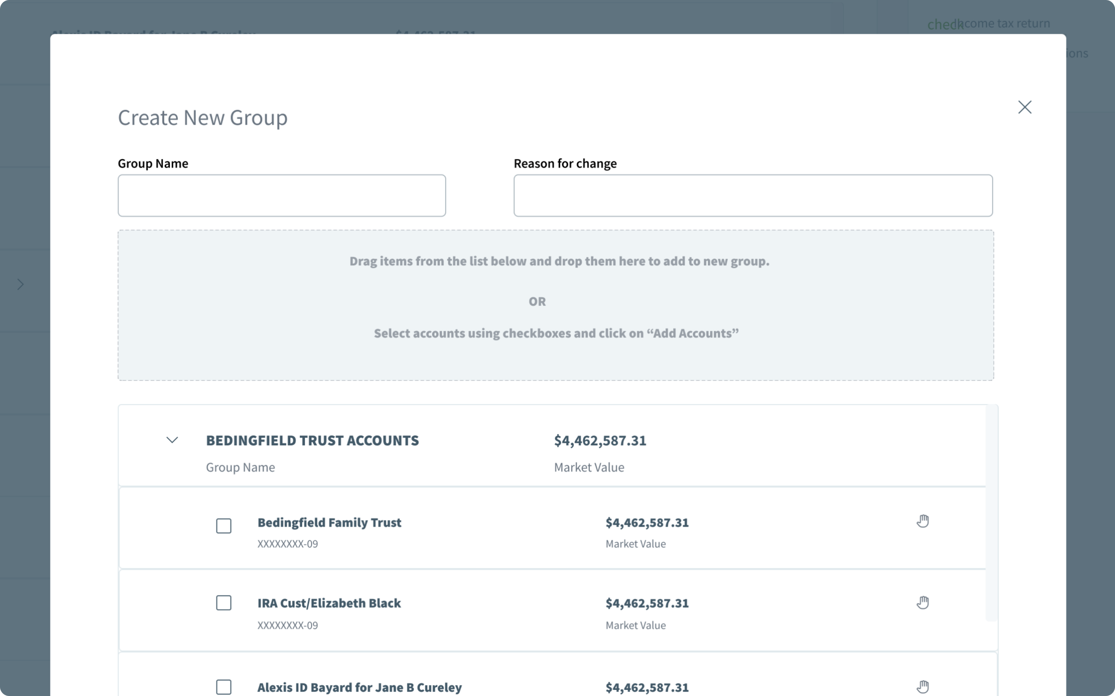
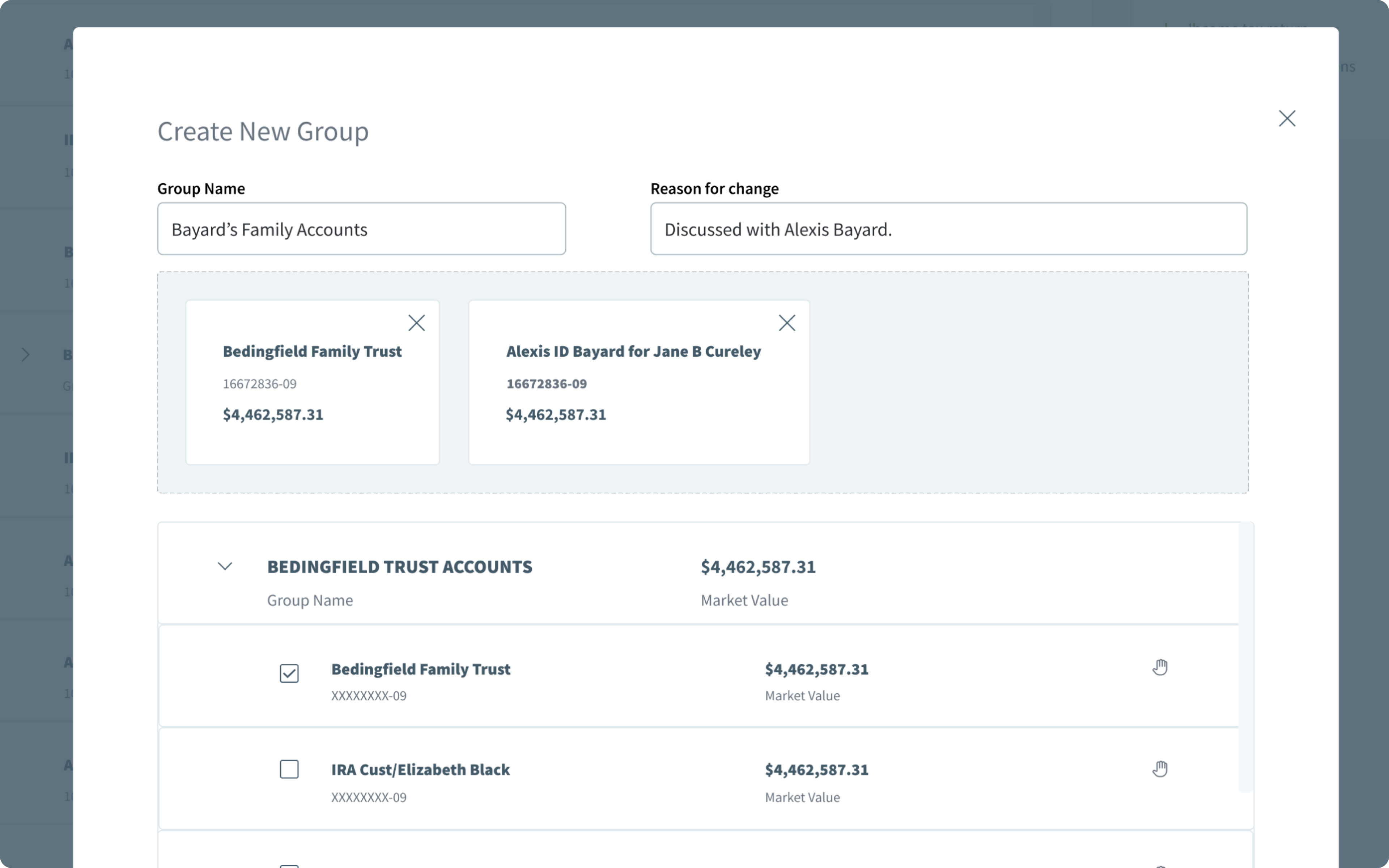
Strategic Group Naming
The process of naming a group is a crucial element in our user experience design. Once users have selected the accounts they wish to group, they are prompted to assign a name and provide a reason for the grouping. This thoughtful approach not only enhances the user's ability to organize their accounts logically but also serves as a valuable change log for future reference. The integration of a reason for grouping adds transparency and accountability to the user's actions, creating a robust system for tracking and managing changes within the application.
Streamlined Account Information Editing
In the process of refining the user interface, we dedicated specific attention to editing account information. Through meticulous testing, we explored various options to seamlessly integrate this essential functionality into the user experience. After rigorous evaluation, we settled on the use of an ellipsis icon, strategically placed to trigger the editing action. Extensive user testing affirmed that the ellipsis icon was not only intuitive but also universally understood, ensuring a user-friendly interaction that aligns with industry standards and user expectations. This deliberate choice enhances the overall usability of the application, providing users with a straightforward and efficient means of editing account details.
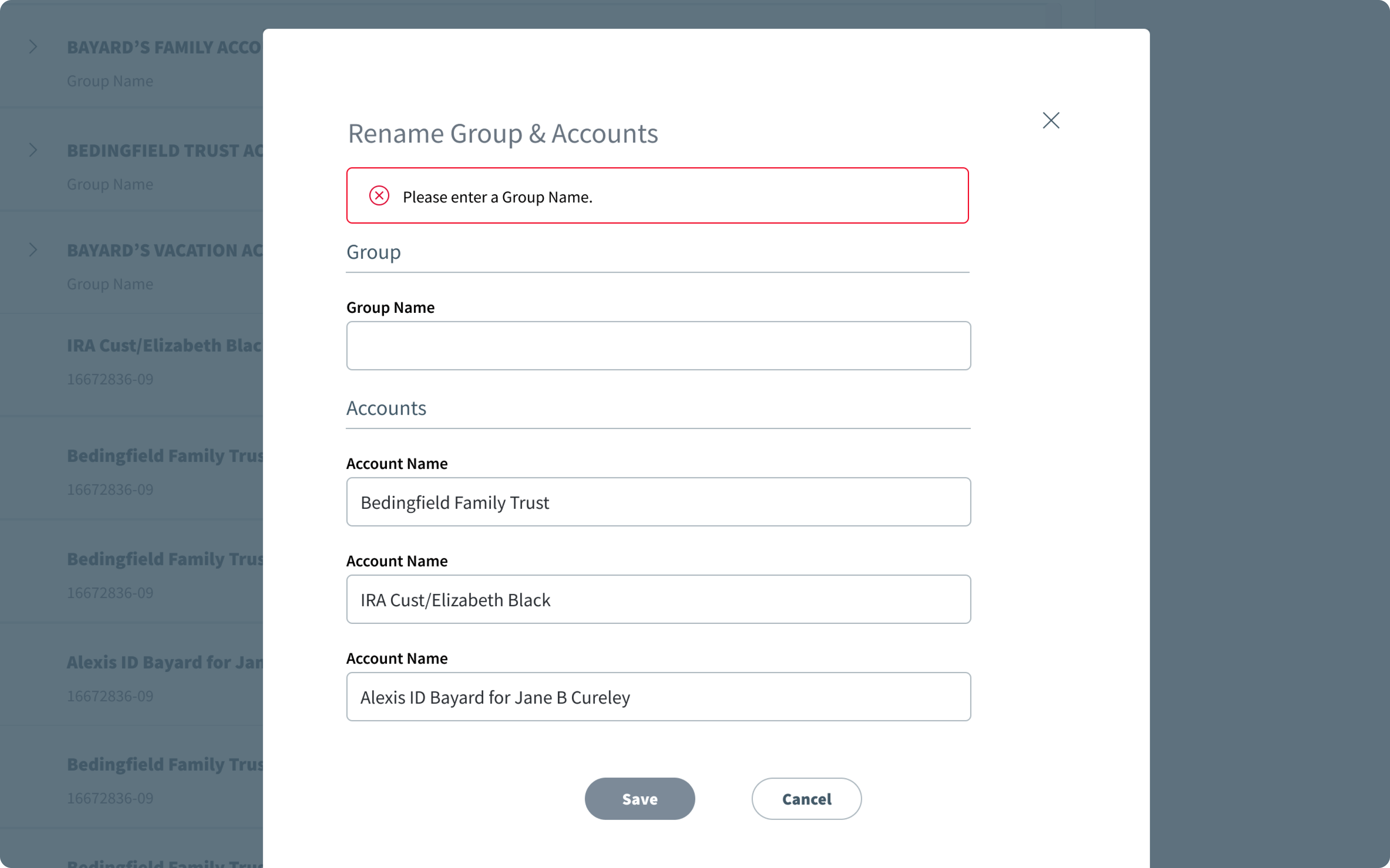
Efficient Account Validation
In the pursuit of optimizing the user experience, we implemented a deliberate approach to validating account information. Recognizing the significance of this task, we opted for a full-screen model, carefully designed to establish a clear and focused environment for users engaged in the validation process. This decision not only prioritizes the primary action but also ensures seamless scalability, with a thoughtful transition to mobile devices in mind.
Moreover, our commitment to user-centric design extends to providing valuable feedback within this validation view. Through meticulous form input validation, users receive instant and constructive feedback, enhancing the overall usability of the application. This strategic design choice reflects our dedication to creating a user-friendly environment where efficiency, clarity, and validation converge for a superior user experience.
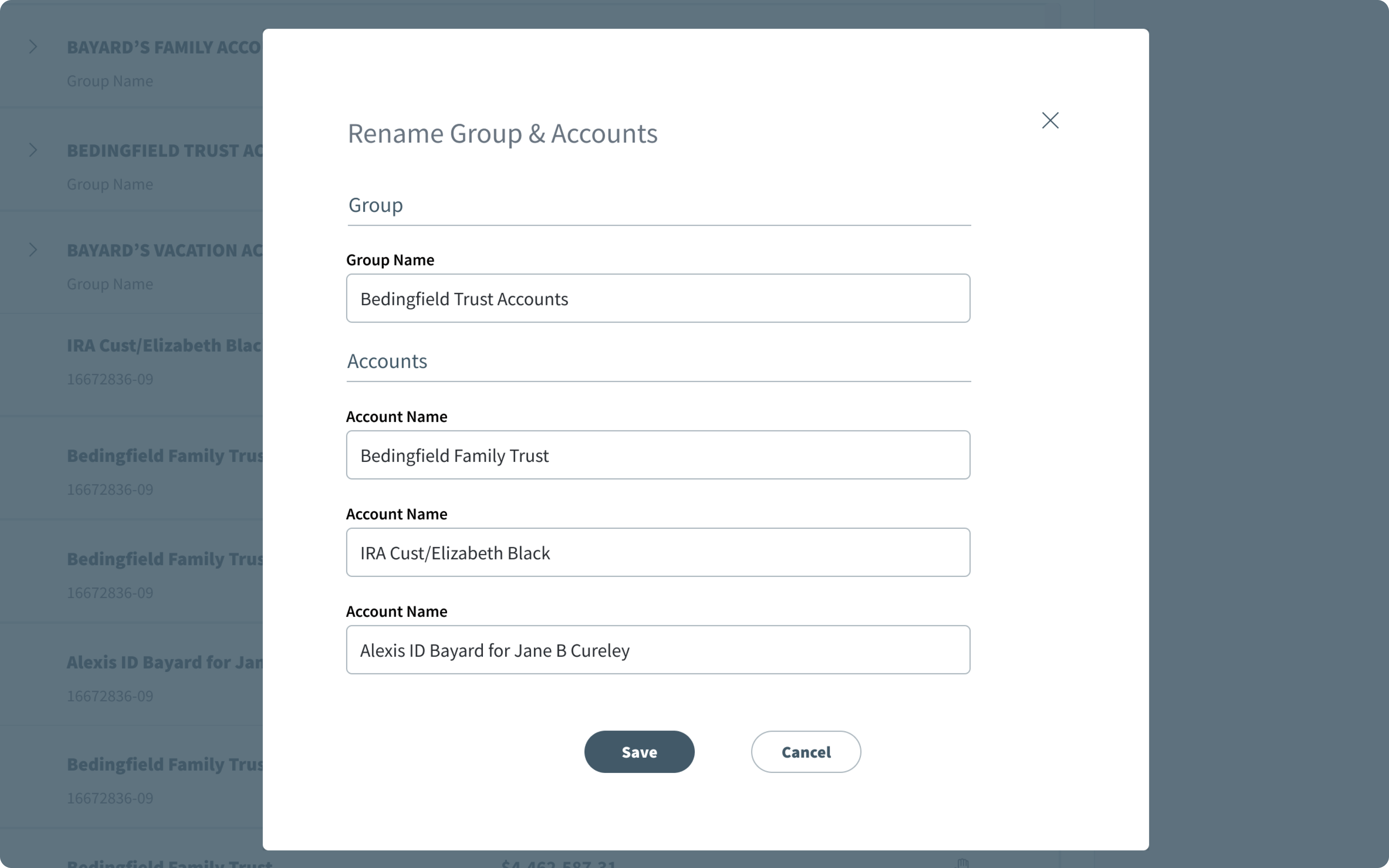
Saving Account Functionality
Our commitment to user-centric design is evident in the meticulous attention given to this process. Users, having completed all necessary inputs, can confidently initiate the save action, knowing that their data is securely stored. This strategic enhancement not only simplifies the workflow but also underscores our dedication to providing users with a hassle-free and intuitive data management experience. The optimized 'Save Account' functionality reflects our commitment to excellence in design, ensuring that users can navigate the application with ease while maintaining control over their data.
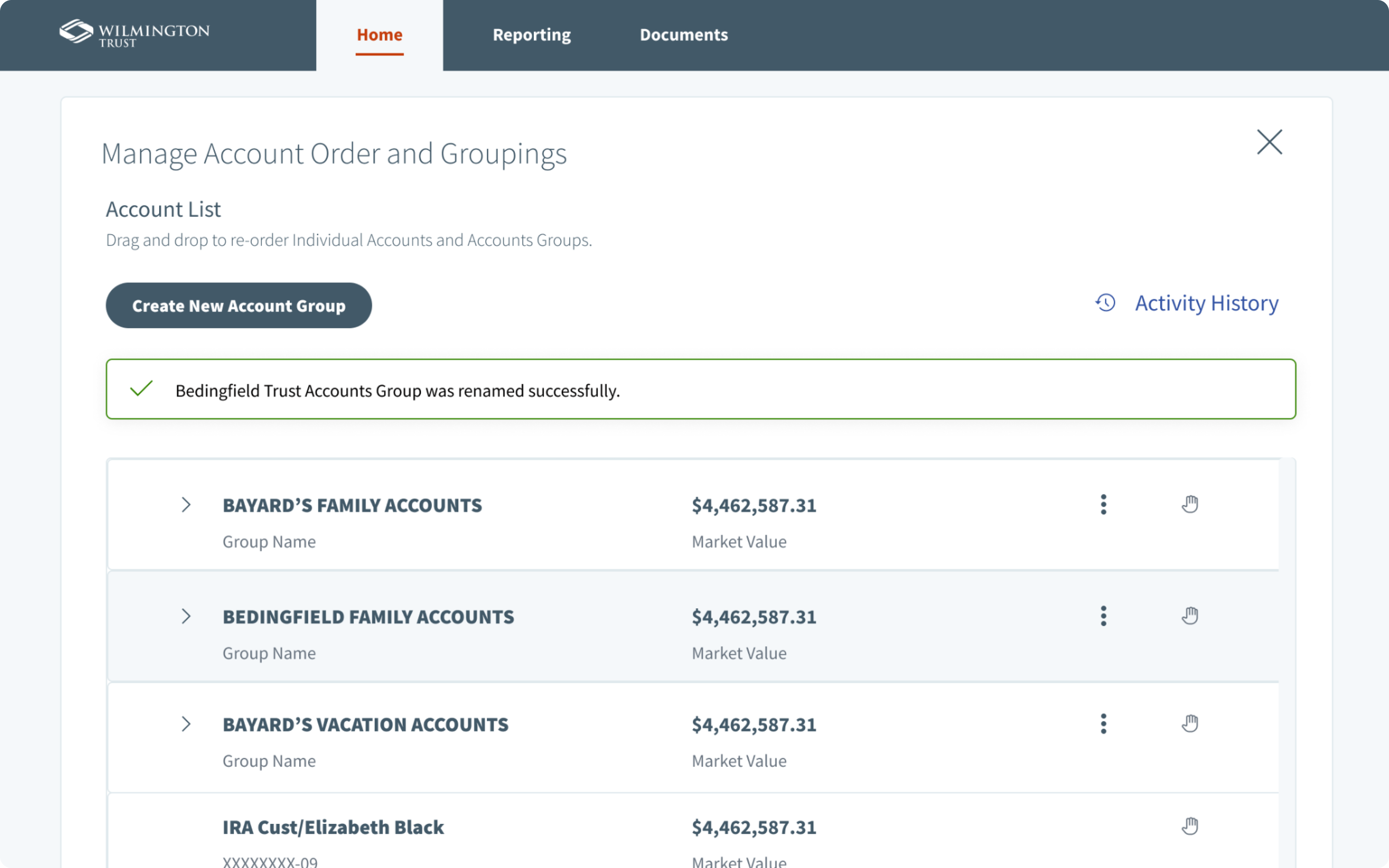
Success Account Notification
In our relentless pursuit of a seamless and user-friendly experience, we placed special emphasis on enhancing the 'Success Account' notification within our application. This crucial element comes into play after a user saves their group information, signifying the completion of a significant task.
Upon saving the group information, the modal gracefully dismisses, revealing the main screen. Simultaneously, a thoughtfully designed confirmation notification gently appears, reassuring the user that their update has been successfully saved. This strategic optimization serves a dual purpose: it provides users with immediate feedback on the success of their action, fostering a sense of accomplishment, and ensures transparency in confirming that their changes are securely stored.
Our commitment to delivering an intuitive and gratifying user experience is exemplified in this meticulous attention to detail. By refining the 'Success Account' notification, we aim to elevate the overall usability of the application, reinforcing our dedication to user satisfaction and streamlined interactions.
Outcomes and Learnings
The introduction of the account grouping functionality proved to be a pivotal enhancement that not only delivered substantial value to users but also met their expectations seamlessly. This feature was strategically designed to optimize the efficiency of users in scanning their accounts, providing them with a clearer understanding of each account's status. Moreover, this initiative harmonized with our overarching business goals, aiming to cultivate a "sticky" product that resonates with users and encourages repeated utilization.
The post-implementation analysis revealed a notable uptick in user engagement within the product. The consolidated and streamlined approach to account grouping delivered a consistent user experience, aligning seamlessly with the established design principles of our product suite. This success underscores our commitment to understanding user needs, fostering efficient interactions, and creating products that not only meet but exceed user expectations.