Enterprise Design System
Token-Driven, Brand-Agnostic, Fully Responsive Component Design.
Overview
As Elegance Health expands its portfolio, incorporating more brands and services under its umbrella, the organization faces increasing challenges in maintaining consistency across its design and codebase. These issues stem from the growing complexity of managing multiple assets while ensuring a cohesive user experience and efficient turnaround times. Establishing streamlined processes and scalable systems has become essential to address these challenges and support continued growth and innovation.
The Vision
The vision is to streamline the design and development process, enabling quicker turnaround times when adding new brands while ensuring a 1:1 alignment between design and development. By introducing design tokens—centralized decisions that store visual properties—we can enhance business goals and simultaneously deliver a superior experience for our users.
My Responsibilities
My role was to define the token nomenclature, ensuring it was scalable across components and brands. I also led the effort to build out components in Figma, leveraging local variables and modes to create dynamic components that adapt seamlessly to brand identities, light/dark modes, and device types.
Additionally, I took on the responsibility of educating and mentoring other designers on best practices for building components. This included using Auto Layout, implementing a 4-point base spacing system, utilizing booleans to create dynamic components rather than multiple variants, and effectively binding variables to component properties to enhance efficiency and scalability.
I also took ownership of collaborating with our lead developer to provide tokens for Storybook and a package that developers could use to implement the design system effectively. This ensured seamless alignment between design and development, fostering consistency and efficiency across the system.
- User interviews
- Roadmap
- Contribution model
- Atomic design
- 4pt grid
- Accessibility
- Systems thinking
- Usability testing
- Maintain Figma library
- Responsive components
- Design tokens
- Lead product team syncs
- Workshops
- Onboard team members
Designing an Inclusive and Accessible Framework
Collaborating with the branding team and other designers, we defined and aligned branding elements such as colors for light and dark modes, font sizing, line heights, and target areas for components, ensuring compliance with Web Content Accessibility Guidelines (WCAG 2.2 AA). By thoughtfully strategizing color choices and establishing precise guidelines, we aimed to create a visually inclusive and accessible design framework. This initiative not only enhanced the accessibility of Elevance Health’s digital properties but also reinforced our commitment to upholding the highest standards of inclusivity and delivering an exceptional user experience.
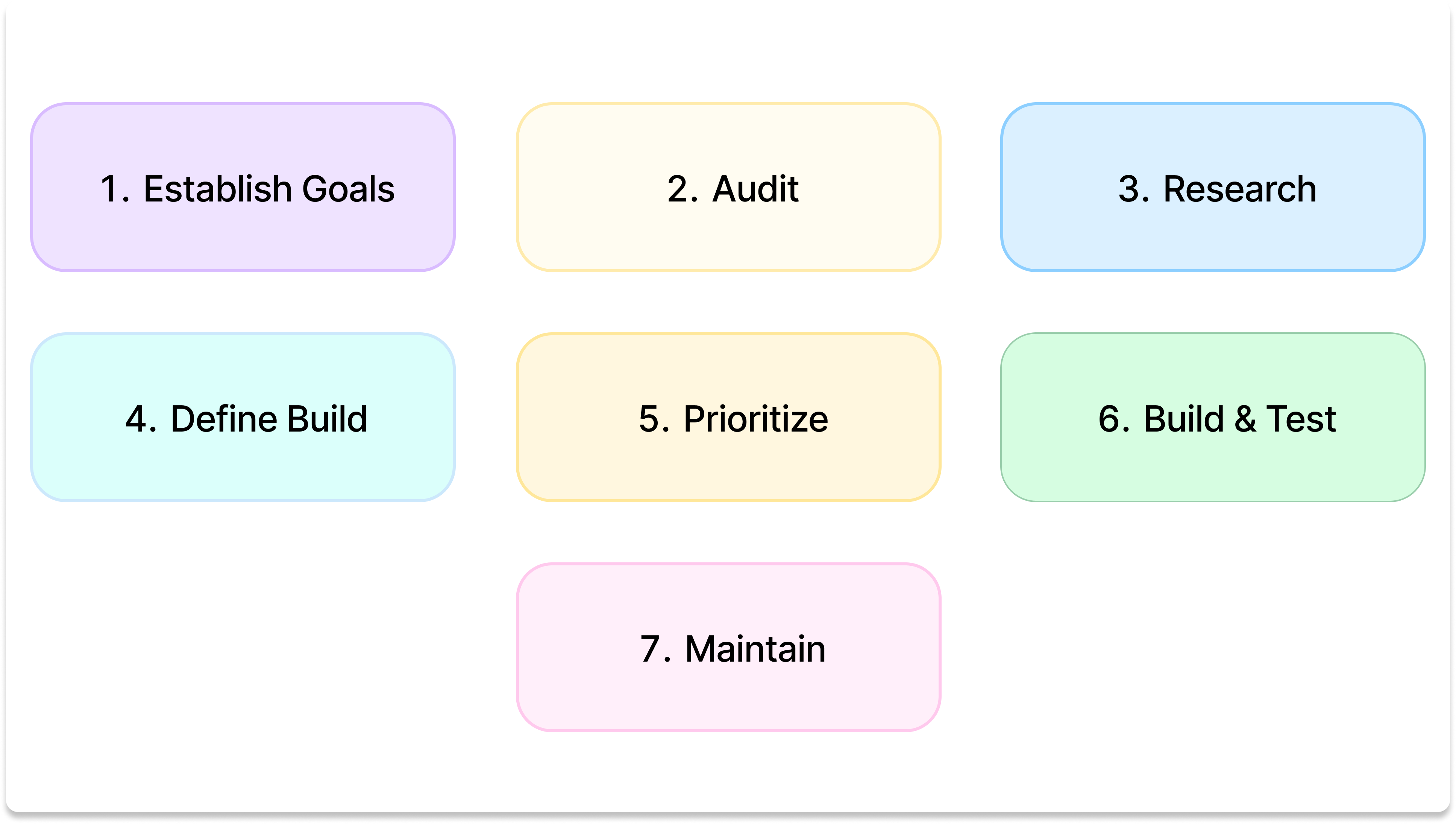
Building a Scalable Design System
OA design system roadmap outlines the steps to build a cohesive system that includes dynamic Figma components, design tokens for developers, and a central portal site with comprehensive documentation for both designers and developers. The first milestone in this process was delivering a proof of concept (POC) with five core components, covering design, development, and documentation. This POC helped validate design decisions, streamline the design-to-code process, and ensure accessible documentation. Moving forward, the roadmap focuses on expanding components, refining the system, and providing valuable resources for cross-functional teams to ensure alignment and effective collaboration. The goal is to create a scalable, adaptable design system that supports long-term success.
Tokens, can we talk about Tokens
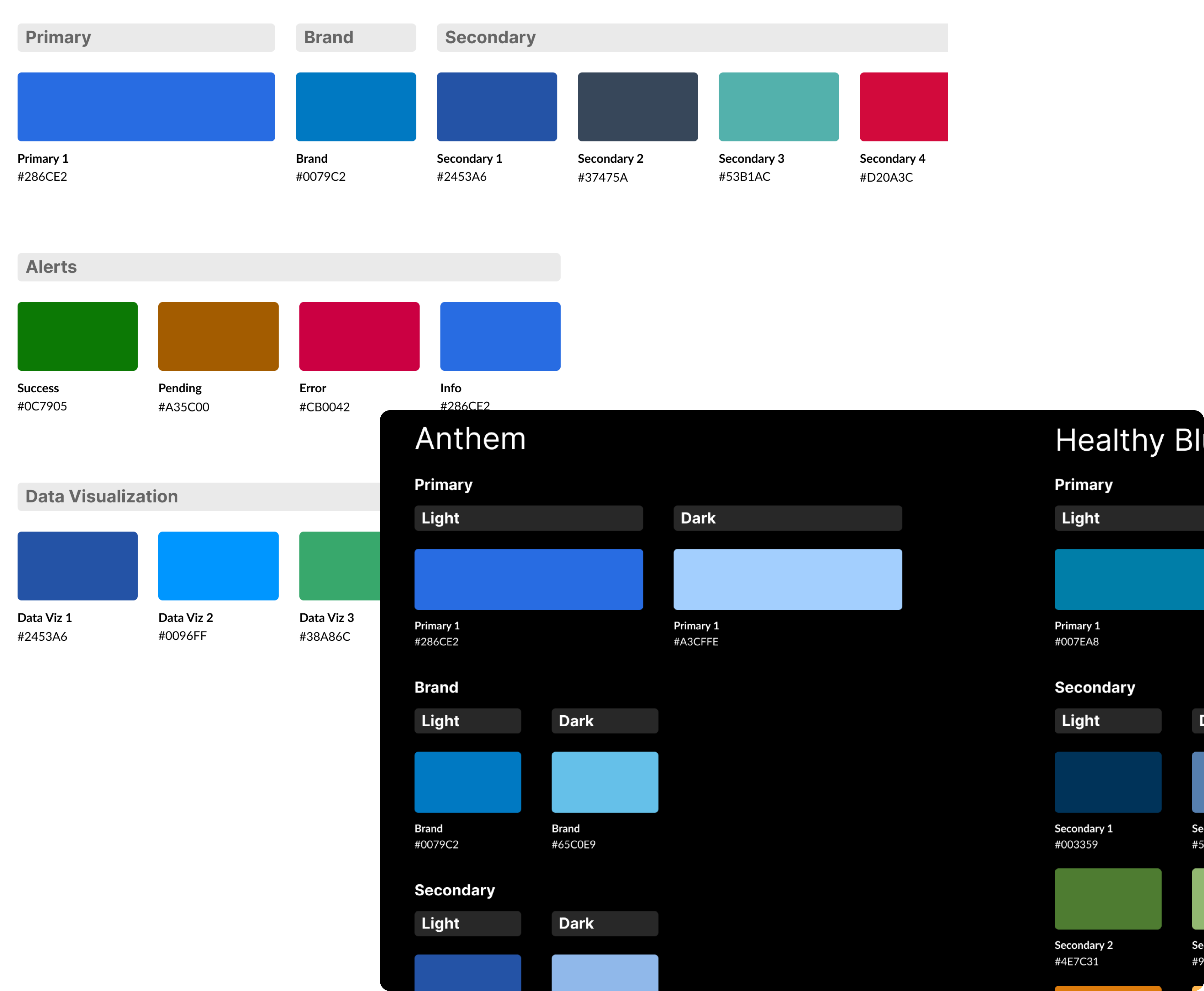
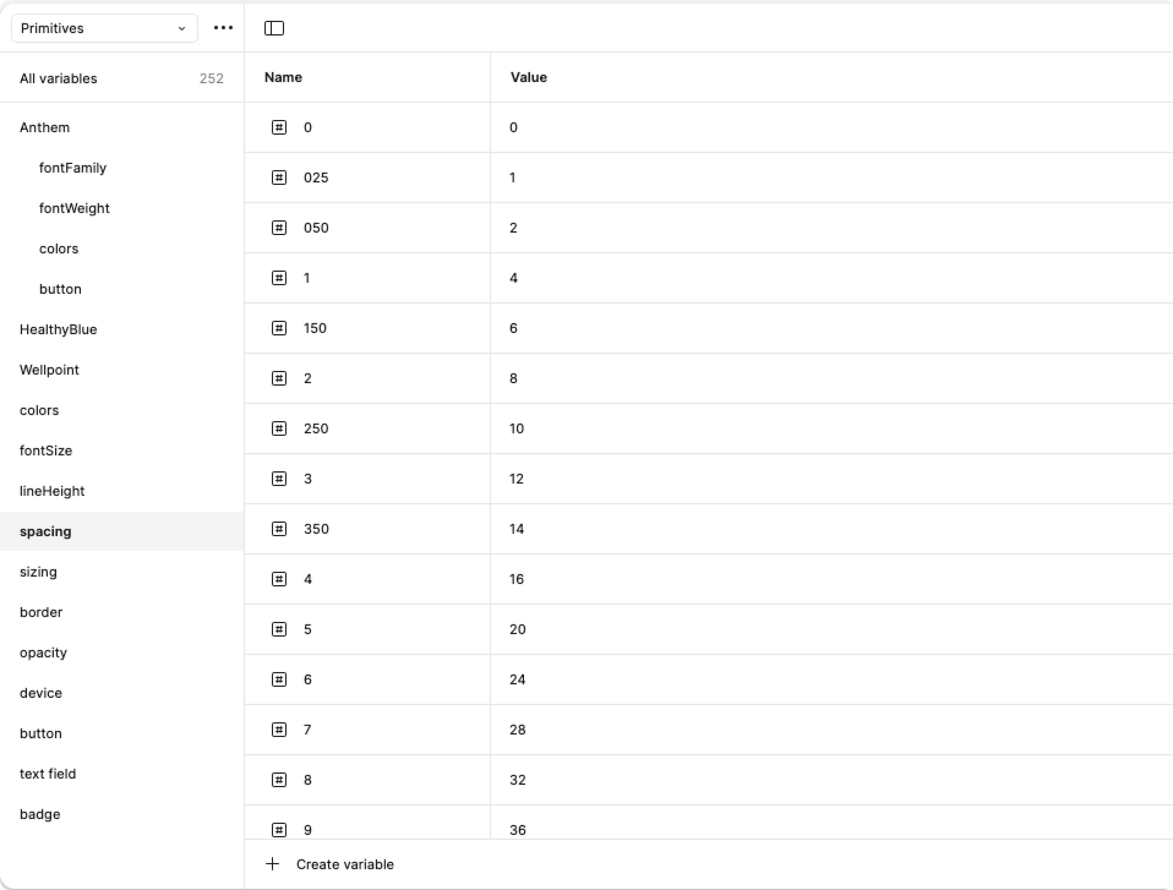
Primitive design tokens are fundamental design values that serve as the building blocks for a consistent and scalable design system. These tokens typically include brand colors, spacing units, font sizes, and border radius values. Brand colors define the visual identity of a product or company, ensuring consistency across all touchpoints. Spacing tokens represent consistent units of measurement for margins, padding, and layout, which help maintain alignment and hierarchy. Font sizes are defined tokens that control typography across various UI elements, ensuring readability and coherence. Border radius tokens specify the rounding of corners, contributing to the overall aesthetic and feel of the interface. By using these primitive tokens, design teams can create a unified, responsive system that ensures visual consistency, easy updates, and efficient collaboration across platforms.
Semantic Tokens
Semantic design tokens go beyond basic visual properties and represent values tied to a design system's intended user experience and accessibility goals. These tokens are context-specific and define design elements based on their functional role in the interface rather than their visual characteristics. For example, semantic tokens could include values like "button-primary-background," "text-body-font," or "input-border-focus," which convey the intended purpose and behavior of UI components rather than just their color or size. By using semantic tokens, design systems can create more flexible, maintainable, and accessible interfaces, where designers and developers are working with concepts that align directly with the user's needs and the product's functionality. This approach ensures that visual styles and behaviors are applied consistently, regardless of the specific design decisions or brand changes.
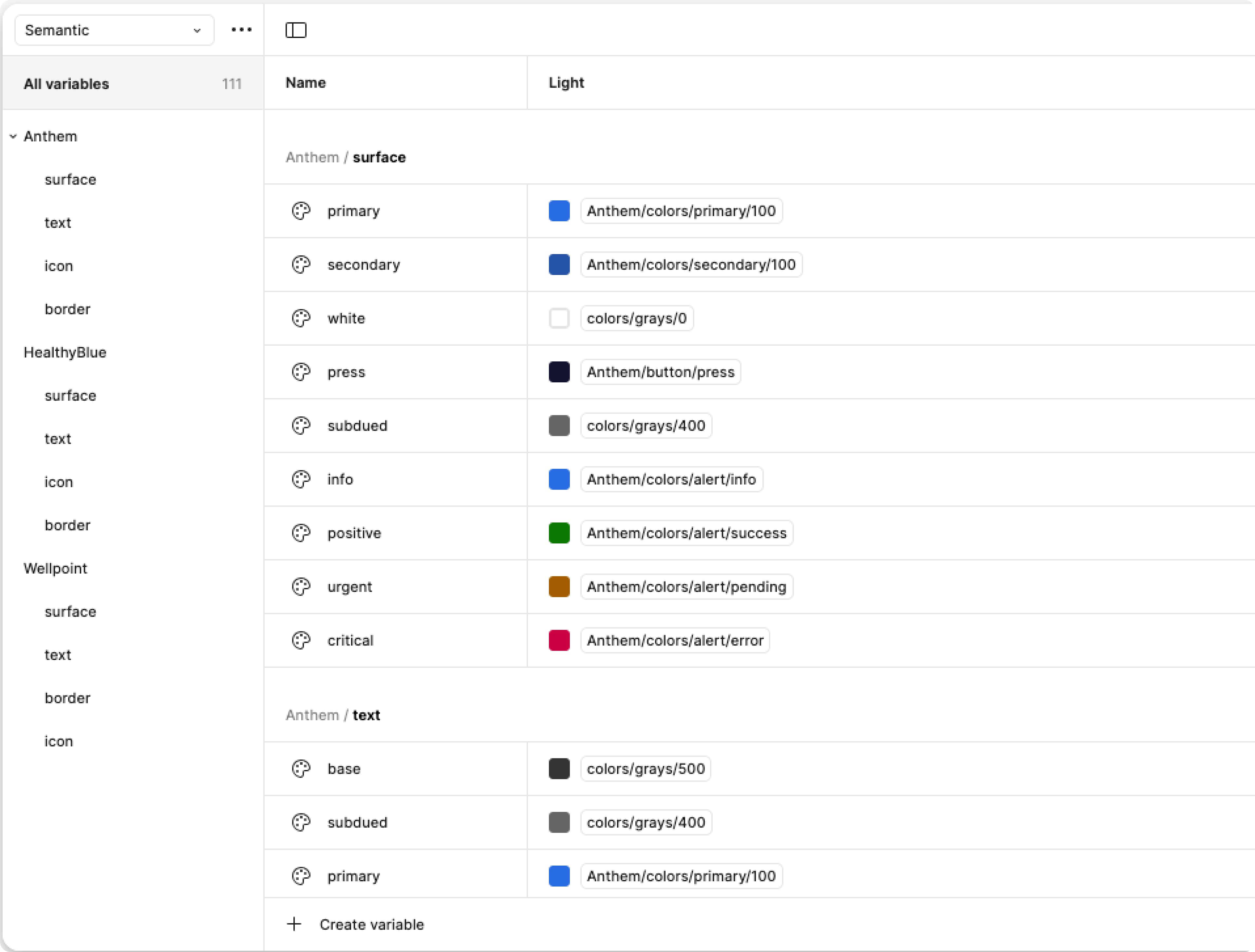
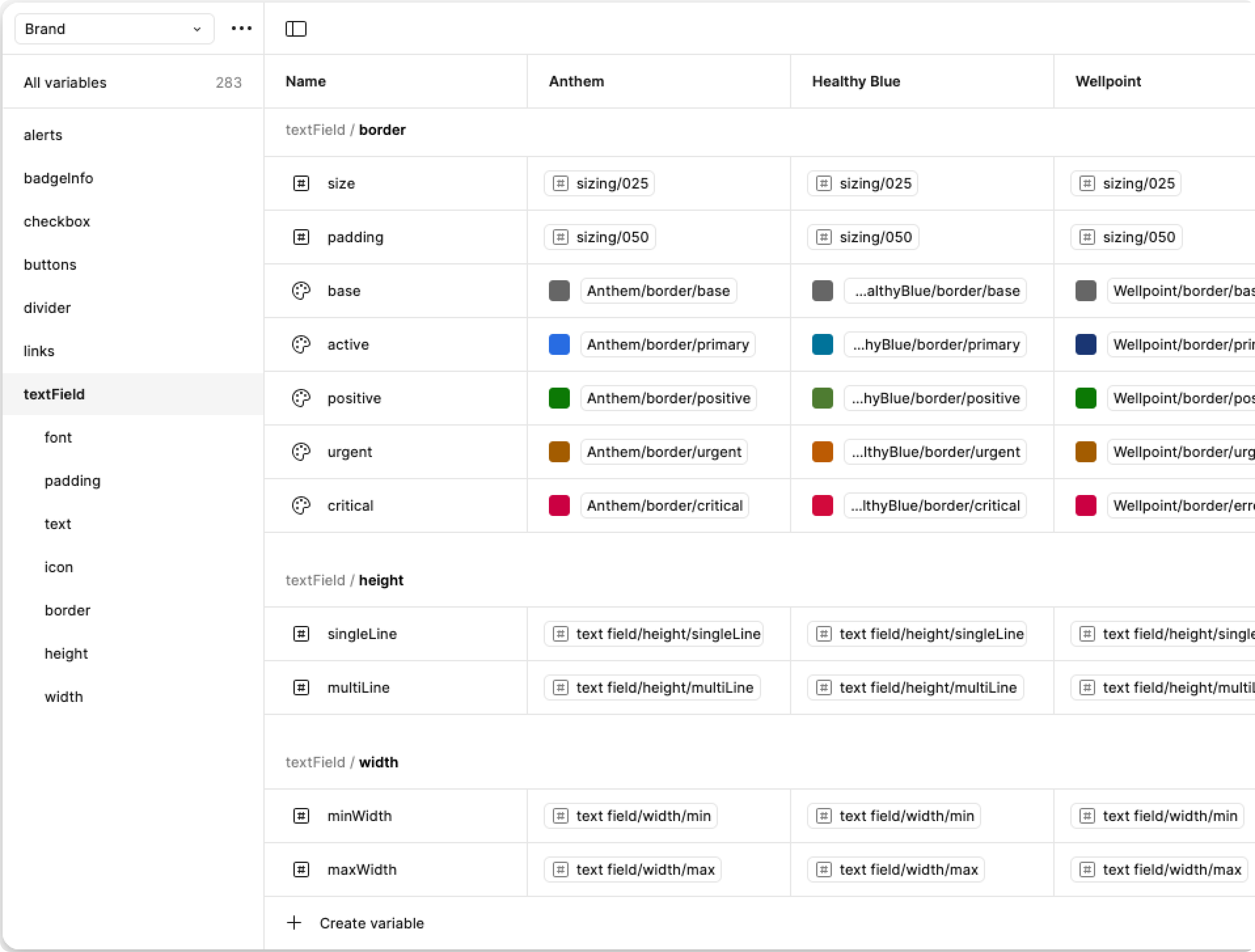
Brand Tokens
Brand or component-specific tokens are design values that are tailored to a particular brand or component, allowing for detailed customization while maintaining consistency within a design system. These tokens often include elements like brand-specific colors, typography, iconography, or component states that define the look and feel of distinct sections of a product or user interface.
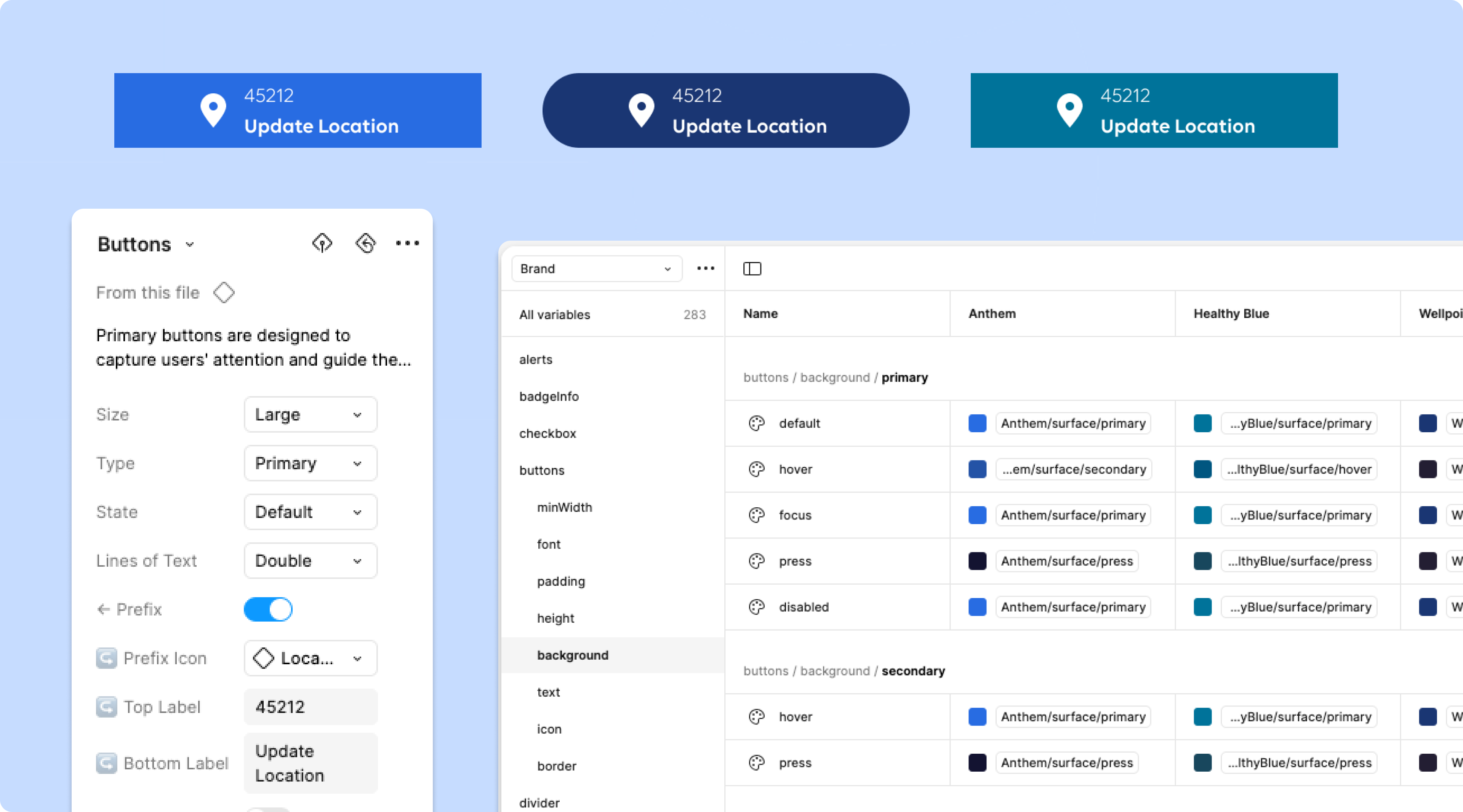
In Figma, brand-specific tokens can be used alongside Figma's "modes" feature, which allows designers to create dynamic components that can adapt to different brand themes or use cases. By leveraging modes, designers can define different sets of properties (like color schemes, typography styles, and other visual elements) that automatically switch based on the mode being used, such as "light" or "dark" themes or different brand variants. This enables the creation of a single, flexible component that can be reused across multiple brands or contexts, ensuring that updates to the design system can be made centrally and propagated to all instances, fostering consistency while reducing the need for redundant work.
Power of Figma Modes
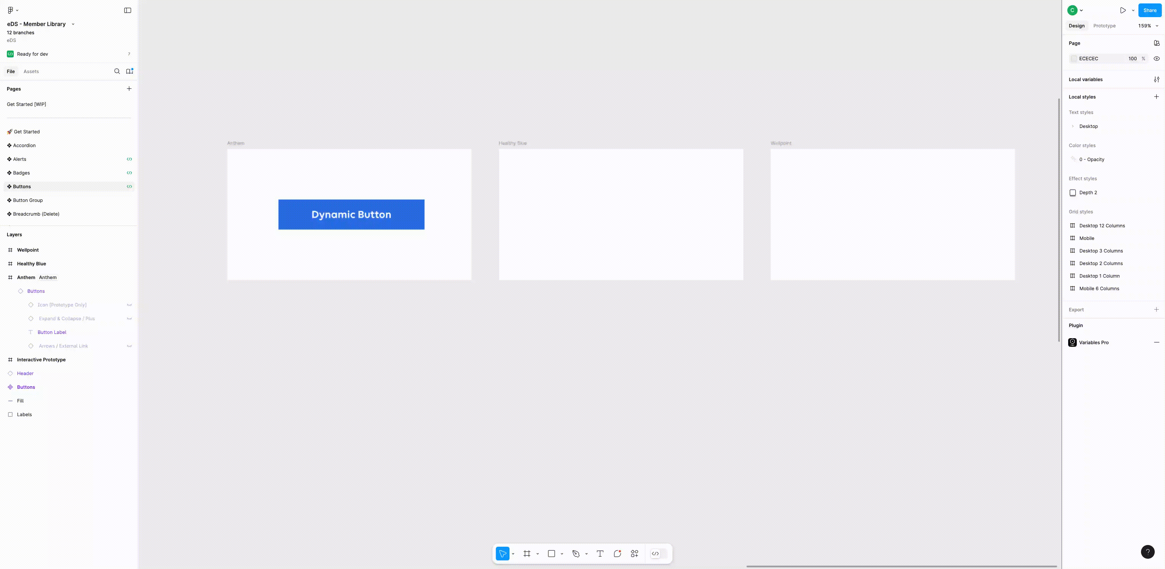
Figma's modes feature allows designers to create dynamic, responsive components that can adapt to different conditions, like screen sizes or themes, within a single design file. Using modes, you can define multiple variants of a component, such as desktop and mobile views, and switch between them with ease. By creating a component that toggles between these views (e.g., a button that switches from desktop to mobile), designers can maintain consistency while managing different layouts without duplicating work. This approach streamlines the design process, ensuring updates to the master component automatically apply to all variants.
Here's the same header component swithcing to a desktop and mobile view.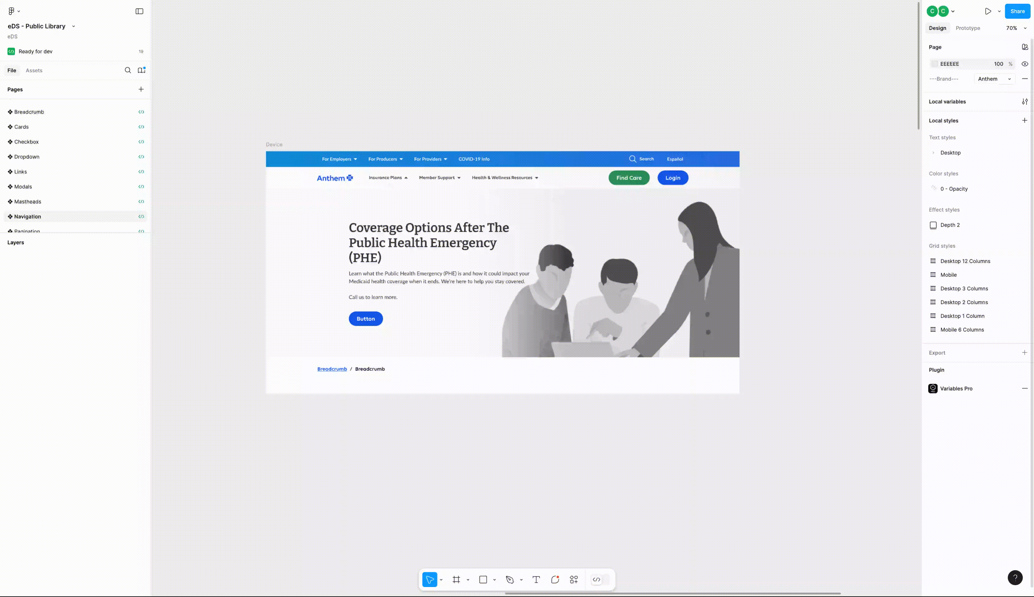 A single button componet share across 3 brands.
Ensuring Consistency Between Design and Code
Design tokens play a crucial role in bridging the gap between design and development, ensuring a 1:1 translation from design to code. By defining consistent values for properties like colors, typography, spacing, and border radius, design tokens provide a single source of truth that both designers and developers can rely on. These tokens are language-agnostic, which means they can be used in various coding environments (CSS, JavaScript, Swift, etc.) while maintaining design consistency across platforms. This unified approach allows design systems to be easily implemented and scaled, as both the visual and functional aspects of the product are tied to these reusable tokens, reducing the likelihood of discrepancies between the design and the final product.
Leveraging Figma’s developer tools and a well-structured portal site with documentation further strengthens the connection between design and development. Figma’s developer tools allow designers to share design tokens, measurements, and assets directly with developers, ensuring that the specifications are always up-to-date and easy to access. In addition, the portal site, which includes comprehensive documentation such as component use cases, metrics, and anatomy, provides developers with the context they need to implement components accurately. Clear guidelines on "what, when, and how" to implement components ensure that developers are aligned with the design vision and can follow best practices in coding and styling. This streamlined communication between design and development helps ensure that the end product closely matches the initial design, saving time and reducing errors in the handoff process.
Scaling for Success: A Systems-Level Approach
In crafting our components, I adopted a systematic approach that emphasizes proper scaling and adaptability to changes. One notable strategy employed was the use of a token-based system. This approach ensures a single source of truth for the design system, acting as a repository to document and track style choices and modifications. By integrating tokens into design and implementation, updates to styles seamlessly propagate throughout the entire product or suite of products, ensuring a consistent and scalable design foundation.
Putting People at the Center: A Weekly Synergy
To ensure a people-centered approach, we've implemented a series of initiatives:
- Weekly Syncs: Regular synchronization sessions foster collaboration, aligning teams, and maintaining a cohesive working environment.
- Office Hours: Open-door sessions provide an avenue for teams to seek guidance, share ideas, and facilitate a culture of accessibility.
- Onboarding for Success: Initiatives for onboarding new product team members have been implemented, ensuring a smooth integration into our collaborative processes.
Contribution & Collberation
Contribution and collaboration are vital for the success of any design system. A well-maintained design system is not a static entity but a living, evolving resource that thrives through the collective input and ongoing cooperation of both design and development teams. Designers, developers, product managers, and other stakeholders should all have a role in contributing to the design system, ensuring that it accurately reflects the needs of the product and the users. This collaborative approach fosters a sense of ownership across teams, leading to better quality, more thoughtful solutions, and a more robust system overall.
Outcomes and Learnings
After the success of our POC, we expanded the project by building out 21 components specifically for our Member offering. This phase involved close collaboration between our design system team, the Member's product owner (PO), designers, and art directors to ensure that the components met all requirements, adhered to accessibility standards, and were scalable for future needs. The goal was to create a truly enterprise-wide design system that not only served the current needs of the Member offering but also had the flexibility to grow and support other products in the future. This collaborative approach helped align the team on key objectives, ensuring that each component was functional, visually cohesive, and ready for widespread implementation.
This project marked the first time I fully leveraged Figma's local variables to their full potential, allowing for greater flexibility and consistency in our design system. By incorporating local variables, we were able to efficiently manage design tokens across multiple components, ensuring that updates could be applied universally with ease. This was a significant step forward in streamlining our workflow and reducing redundancy, as it allowed for centralized control over design values like colors, typography, spacing, and border radius.
In parallel, a significant amount of research was invested in understanding the best practices for token naming conventions. This process was essential in ensuring that our design tokens were not only functional but also scalable and maintainable over time. Proper naming conventions allow both designers and developers to easily interpret and apply tokens across various platforms, reducing ambiguity and enhancing collaboration. By establishing a clear, consistent naming structure, we set a strong foundation for future expansion and ensured that our design system could evolve with minimal friction, meeting both current and future needs of the enterprise.