Account Overview, Anytime, Anywhere
Seamless Insights, Unbound Access: Your Account Overview, Anytime, Anywhere.

Overview
Addressing the challenge of delivering a high-level overview of customer accounts, encompassing various account types with universal accessibility, our strategic approach focuses on designing an intuitive interface. This interface, rooted in design thinking principles, aims to distill complex account information into a visually coherent and easily navigable format. By incorporating insights from user research and feedback, we seek to tailor the interface to user expectations, fostering a sense of control and convenience. Responsive design principles will ensure seamless accessibility across devices, aligning with the modern paradigm of anytime, anywhere account management. Our overarching goal is to provide a sophisticated and user-centric solution, positioning our platform as a beacon of convenience and efficiency for managing diverse account portfolios.
The Vision
Envisioning a cutting-edge solution, we propose the development of a mobile-first dashboard view meticulously designed to aggregate diverse customer accounts seamlessly onto a single screen. This innovative approach ensures a consolidated and real-time presentation of account information, empowering users with the latest insights necessary for making informed decisions. Our emphasis on a user-centric design philosophy guarantees an intuitive and visually engaging interface, promoting ease of navigation and accessibility. By prioritizing the mobile platform, we acknowledge the evolving dynamics of user behavior, catering to the contemporary preference for on-the-go accessibility. Through this strategic initiative, we aim to elevate the user experience by delivering a cohesive and responsive dashboard that not only meets but exceeds user expectations, setting a new standard for personalized and efficient financial management.
My Responsibilities
In collaboration with another designer, I played a key role in understanding user needs, identifying pain points, and aligning them with overarching business goals. My contributions included offering feedback on user flows, ensuring alignment with UI components, and actively participating in the interaction design process. Through rigorous testing, feedback sessions, and adherence to design system guidelines, I ensured that the components not only matched the use case but also seamlessly integrated into our design ecosystem.
In the initial phase, we strategically defined the hierarchy, placing a premium on user needs. This involved presenting rolled-up values followed by a breakdown into specific categories. To address these requirements, we employed components like cards to encapsulate data sets and utilized tabs to effectively group and categorize pertinent information.
- User interviews
- UI patterns
- Ideate and prototype
- User testing/feedback
- Project Syncs
- Present Findings
Understanding our Users
In addressing a diverse user landscape encompassing customers with bank accounts, brokerage accounts, and a combination of both, our strategic solution is founded on a comprehensive understanding of the myriad use cases. Recognizing the varying needs of our users, we have engineered an inclusive approach, ensuring that all users, irrespective of their account types, enjoy seamless access to pertinent information and functionalities.
Take control of your portfolio performance anytime, anywhere.
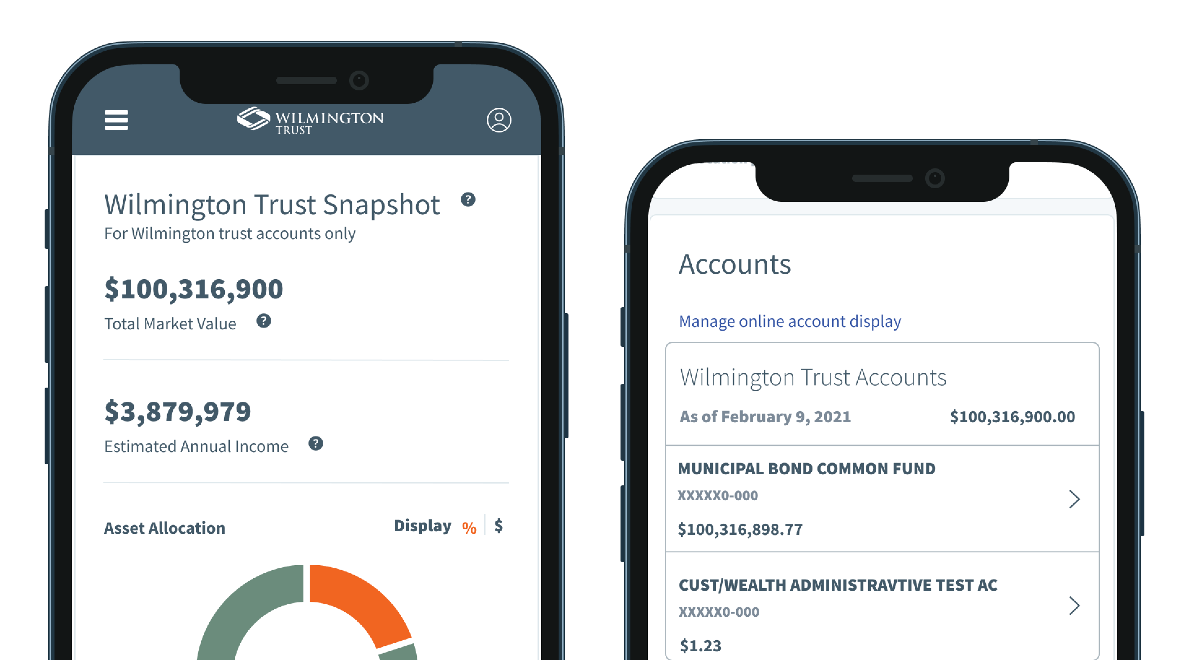
Upon logging in, users are greeted with a high-level overview of their assets' performance, providing a snapshot of their financial landscape. Immediately following this, they are presented with the most up-to-date information spanning all their accounts, including brokerage accounts.
This intuitive design not only caters to users seeking a quick summary but also allows for a deeper exploration of each account. Users have the flexibility to delve into transaction details and assess individual account performance, offering a tailored and insightful financial experience. Our user-centric approach guarantees that the platform meets the diverse expectations of our user base, fostering transparency, accessibility, and user satisfaction at every interaction.
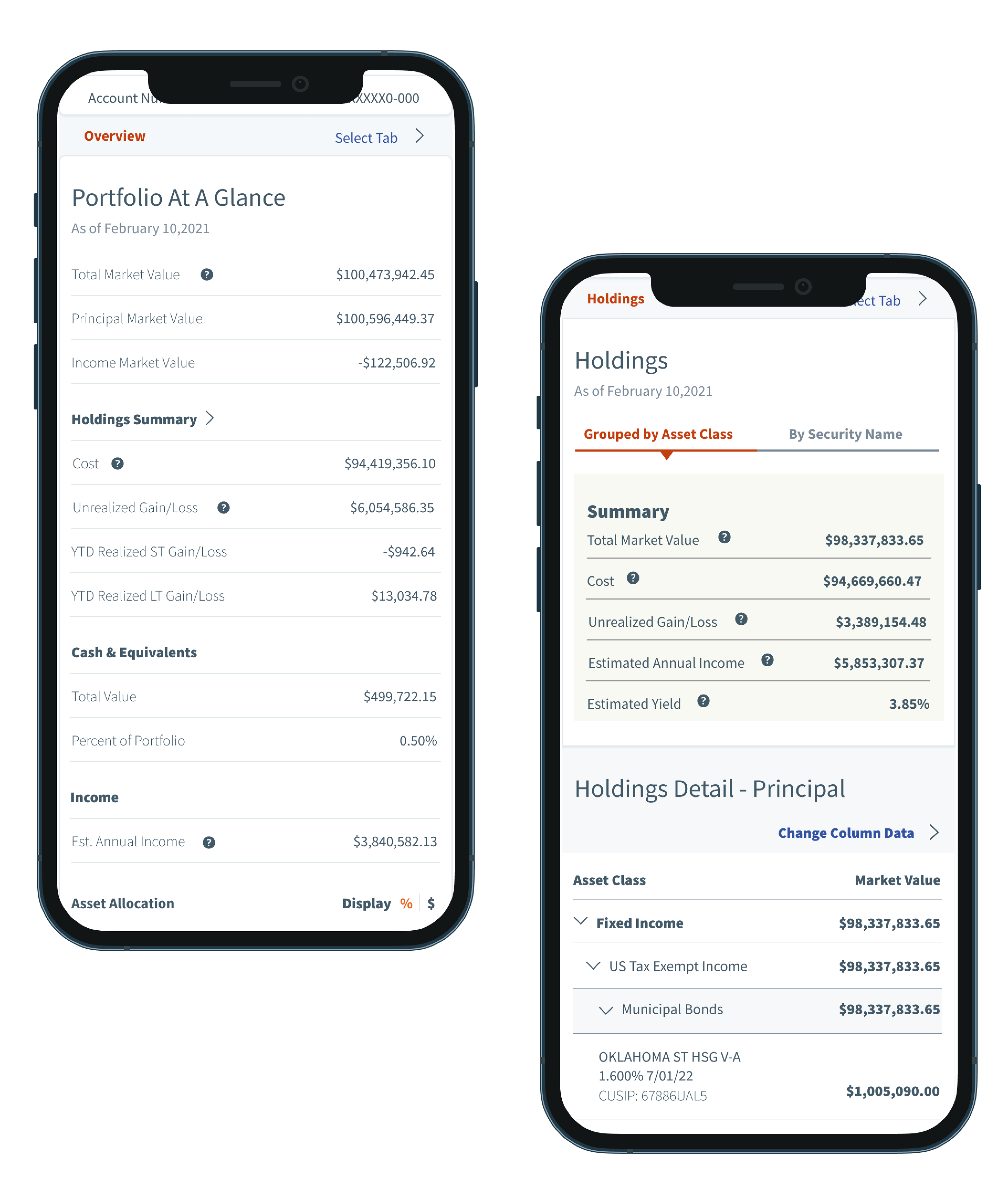
In response to user insights, we've introduced a valuable secondary feature, offering users a comprehensive view of their holdings. This includes real-time data on the current value, gains and losses, estimated yearly income, and the projected yearly yield. Enhancing your financial insights for a more informed investment strategy.

Outcomes and Learnings
We successfully implemented a mobile-centric solution, achieving our primary objective of offering users real-time account access on their mobile devices. This accomplishment seamlessly aligned with our broader business goal of boosting engagement rates on mobile platforms. Post-launch, our metrics validated the success of our efforts, showcasing an increase in mobile device usage, average page views, and click-through rates.
This project marked a significant milestone by introducing a new component to the Wilmington Trust's design system—the card component. Since its inception, we have iteratively enhanced this component by incorporating several versions. These improvements have collectively contributed to an elevated user experience within the application, aligning seamlessly with our commitment to continuous enhancement and user satisfaction.